Jotform Report Builder gives you all the tools you need to customize the reports of your submission data. You can set a custom dimension for your report and change the background color on each page. You can also customize your report by adding texts, headers, images, shapes, and icons. You can resize, position, and style each element you add to your preference. The Jotform Report Builder page has customization settings for its layout, page, and elements.
Updating the Report Layout
In Report Builder, you click on the Paint Roller icon on the right side of the page to open the Layout Settings. The changes you make here affects the overall layout and style of your Visual Report.

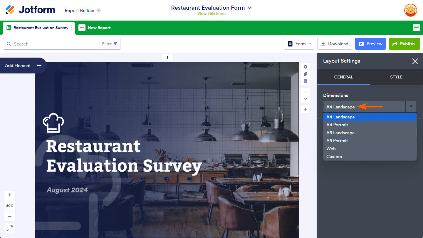
Changing the Dimensions of your report
By default, your Visual Report’s dimensions are set to A4 in landscape orientation. You can customize them by selecting your preferred option from the Dimensions setting in the General tab of the Layout Settings.
The Web option in the Dimensions setting shows the Web Resolution dropdown menu, allowing you to select a web size resolution that optimizes your report for online viewing.

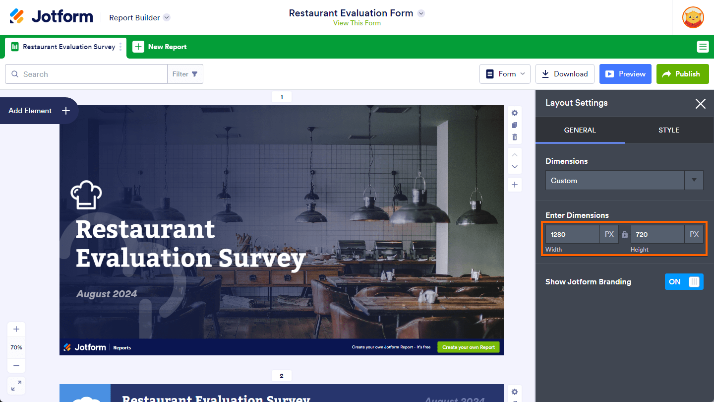
On the other hand, you can select the Custom option in the Dimension setting to enter specific width and height dimensions in pixels, adjusting the report to your exact size requirements.
Pro Tip
The Padlock icon, located between the boxes where you can manually enter specific width and height dimensions, is locked by default to maintain the aspect ratio. Click on it to unlock and adjust the dimensions independently.
Displaying the Jotform Branding on your report
You can toggle the Show Jotform Branding setting in the General tab to the On or Off position to display or hide the Jotform Branding on every slide in your report.

See Also: How to Remove Jotform Branding.
Changing Slide Backgrounds
In the Style tab of the Layout Settings, you can change the background color of your slides by entering a color name in the Background Color setting. You can also use the color picker tool that pops up to choose a color or enter its hexadecimal or RGB codes. This helps you keep a consistent look that matches your brand or project.

Customizing Data Series Colors
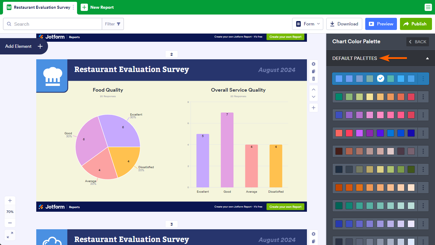
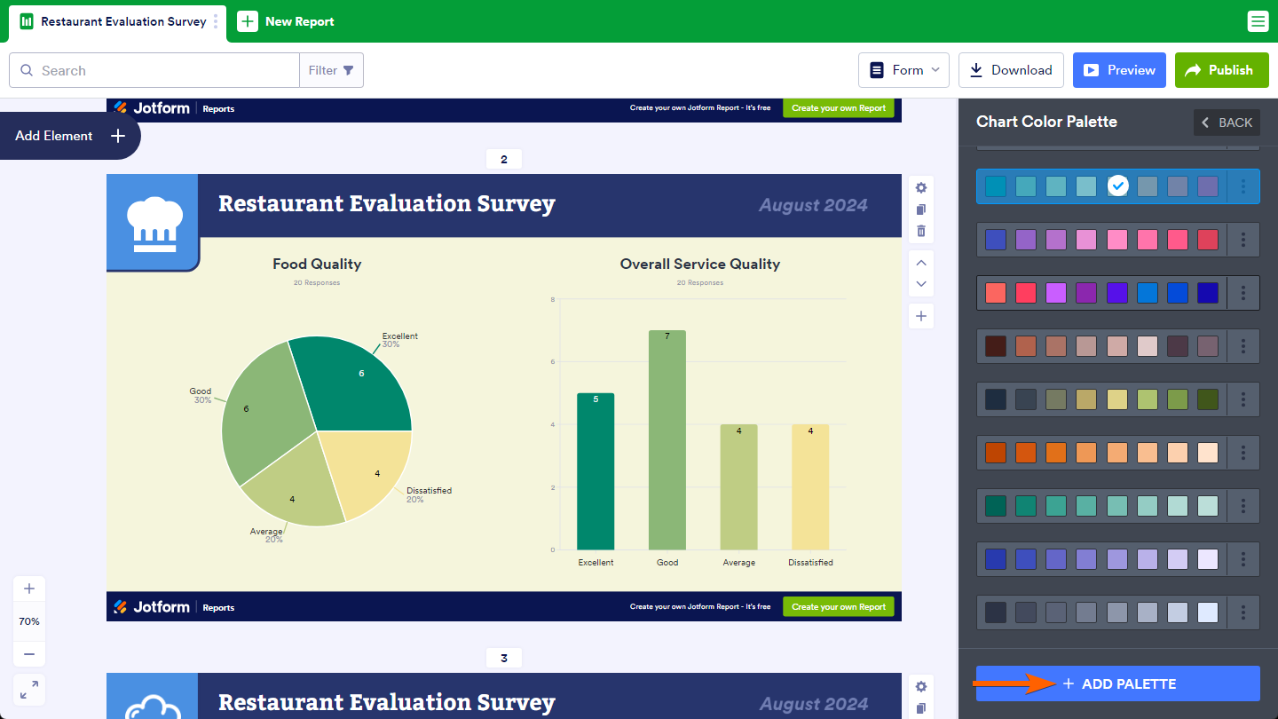
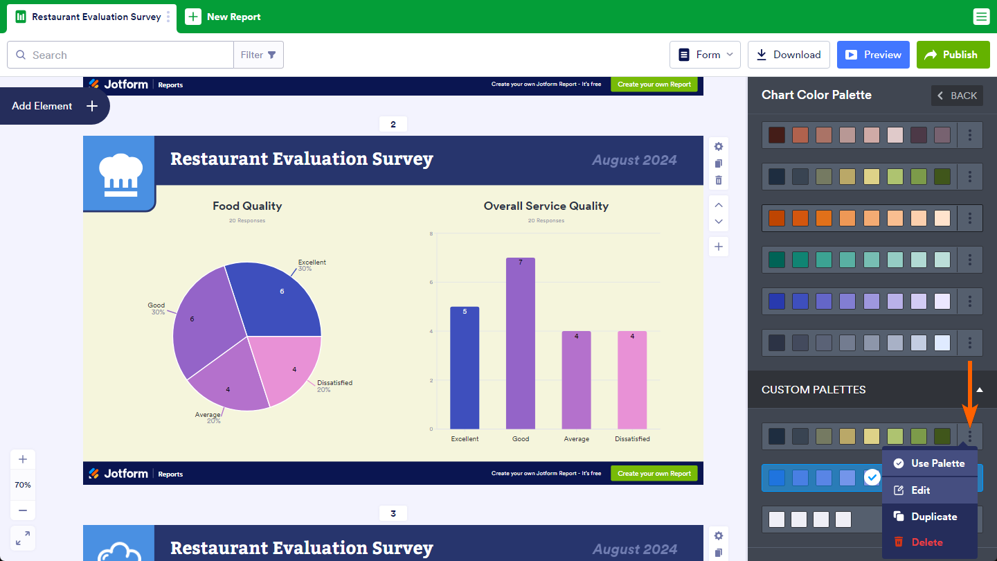
You can change the colors of the data series in your charts. This lets you highlight important info and make your data points stand out, helping to show trends, correlations, or comparisons easily. Click on the current color palette in the Style tab of the Layout Settings to view all the different available color palettes you can choose from for your charts.

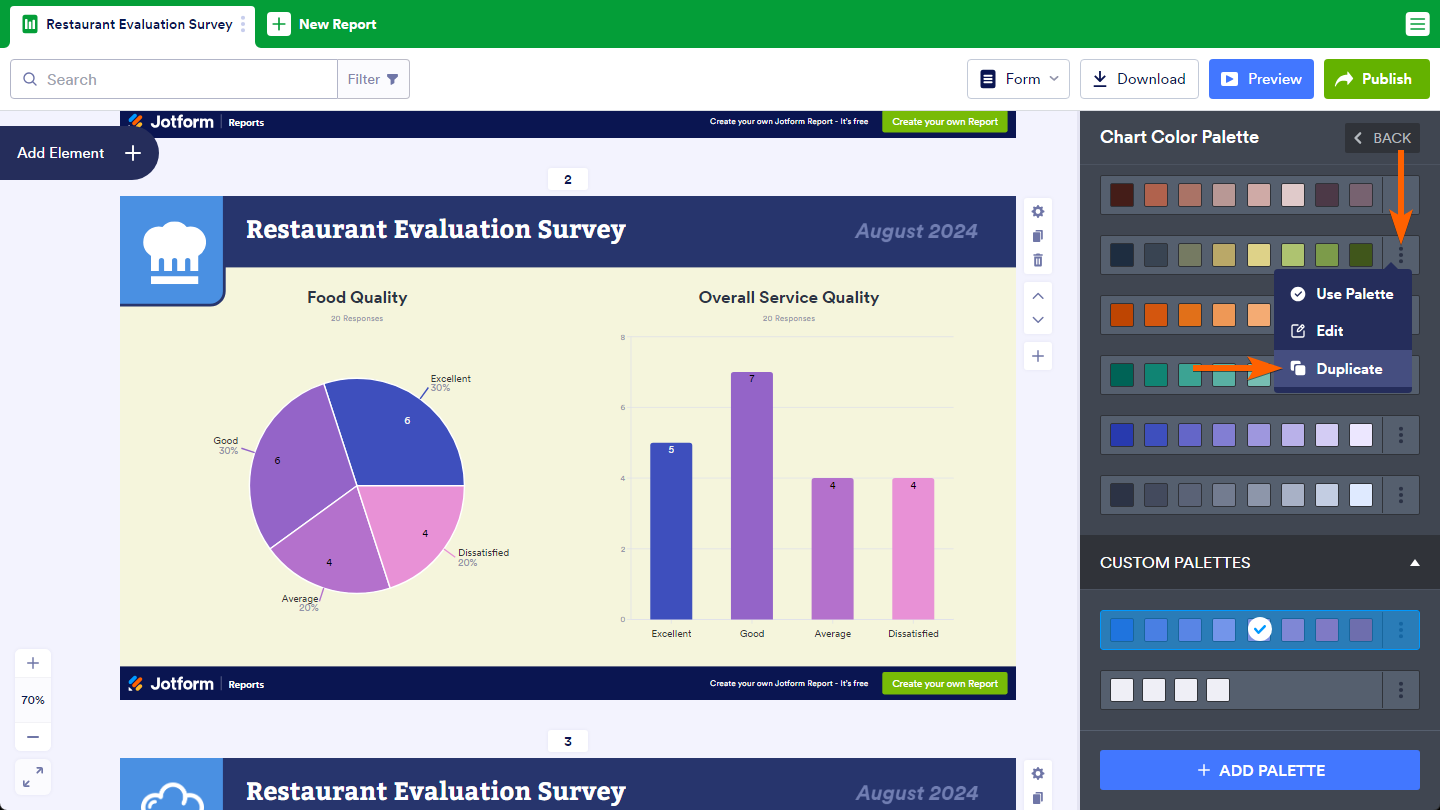
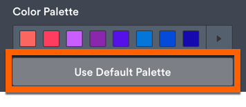
The palettes under the Default Palettes section of the Chart Color Palette setting offer well-balanced, pre-designed color combinations that are carefully selected to work well together, making your charts look great with matching colors so you don’t have to choose each one individually.
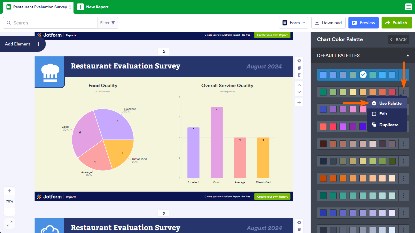
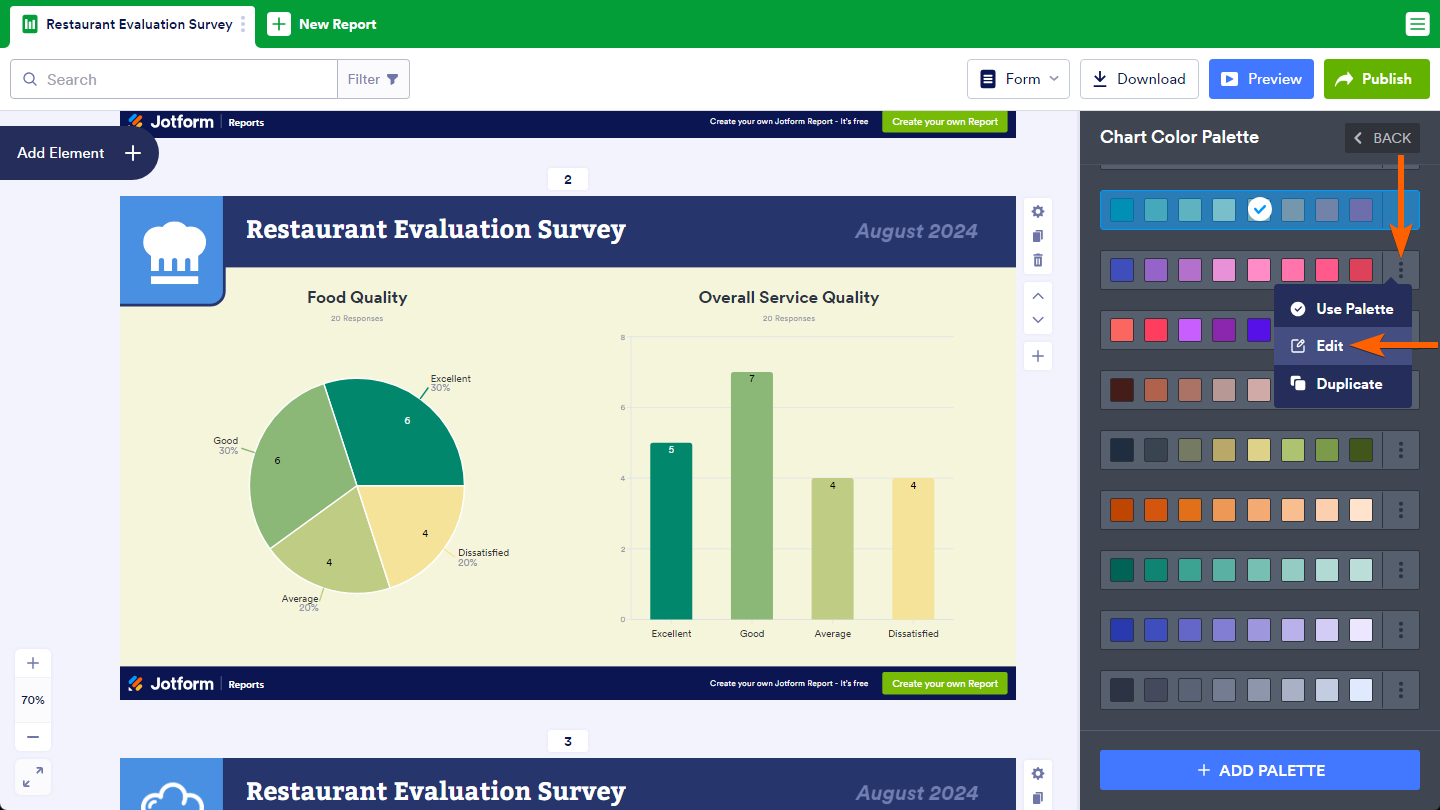
You can apply a different palette by clicking on an unselected one or the Three Dots icon next to it, then selecting Use Palette from the menu. Your chosen palette will be checked and highlighted in the Chart Color Palette setting.
Note
The color palette you set in the Layout Setting of the Report Builder will automatically be applied to every chart in your report that doesn’t have a specific palette set in its settings.
If you prefer adding a personal touch to your charts’ data series colors, you can customize a new palette or edit an existing one. The Add Palette button at the bottom of the Chart Color Palette setting would allow you to create a new custom palette that starts with just four default colors, all in #EFEFF6. It’s the closest to starting from scratch. You can keep, update, or remove any of these colors to match your preferences, instead of adjusting an existing palette.
On the other hand, the Edit option from the palette’s menu lets you start modifying a custom palette. If you click on this option from the menu of any default palette, a custom copy of that palette will be created instantly. This approach gives you a ready-made set of colors, making it easy to just change a few shades to fit your needs while keeping the original look intact.
Note
- You can create as many custom palettes as you like—there’s no limit.
- New custom palettes will show up at the top of the Custom Palettes section list.
- Custom chart color palettes in the Layout Settings will also be available for selection in individual chart settings.
When you click the Add Palette button or the Edit option, it selects and applies the new or custom palette automatically to your charts’ data series and opens the Custom Palette settings where you can update and rearrange its colors.
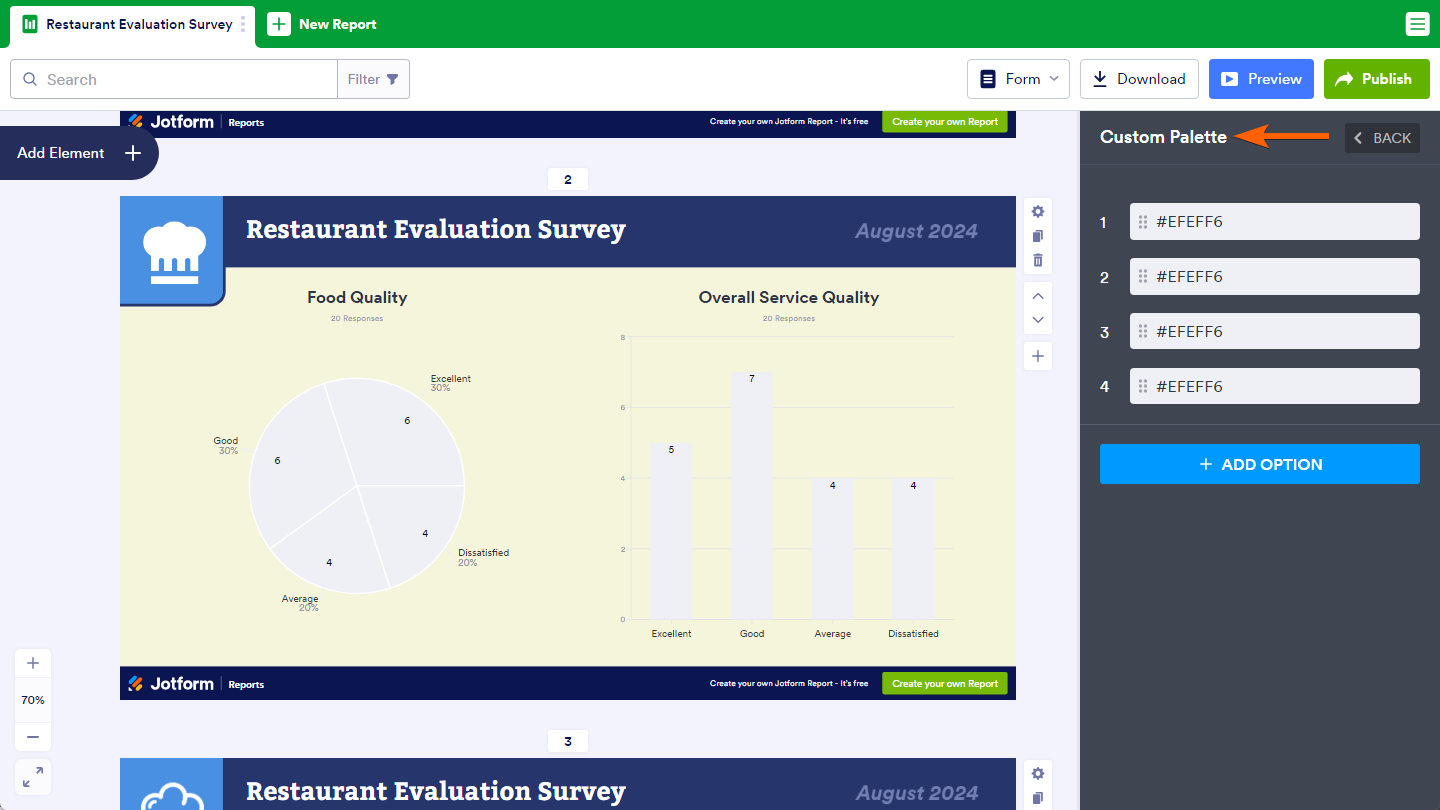
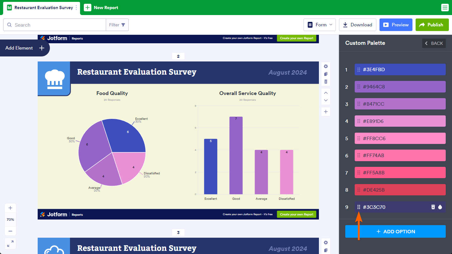
Adding palette colors. You can add new colors to your palettes by clicking on the Add Option button at the bottom of the Custom Palette settings. The new color will be #EFEFF6 and will appear last in the palette.

Note
You can keep adding color options to a palette without any limit.
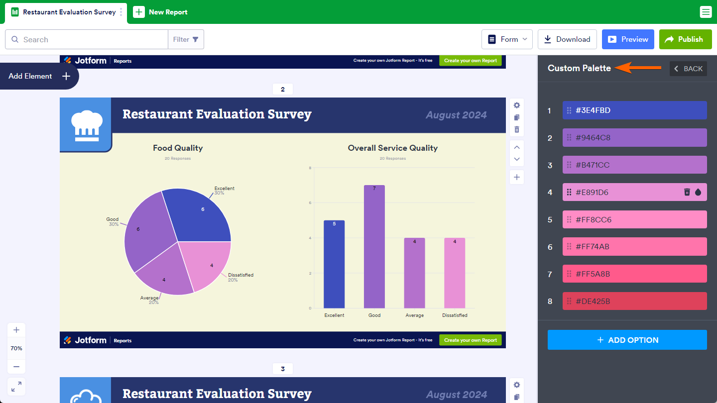
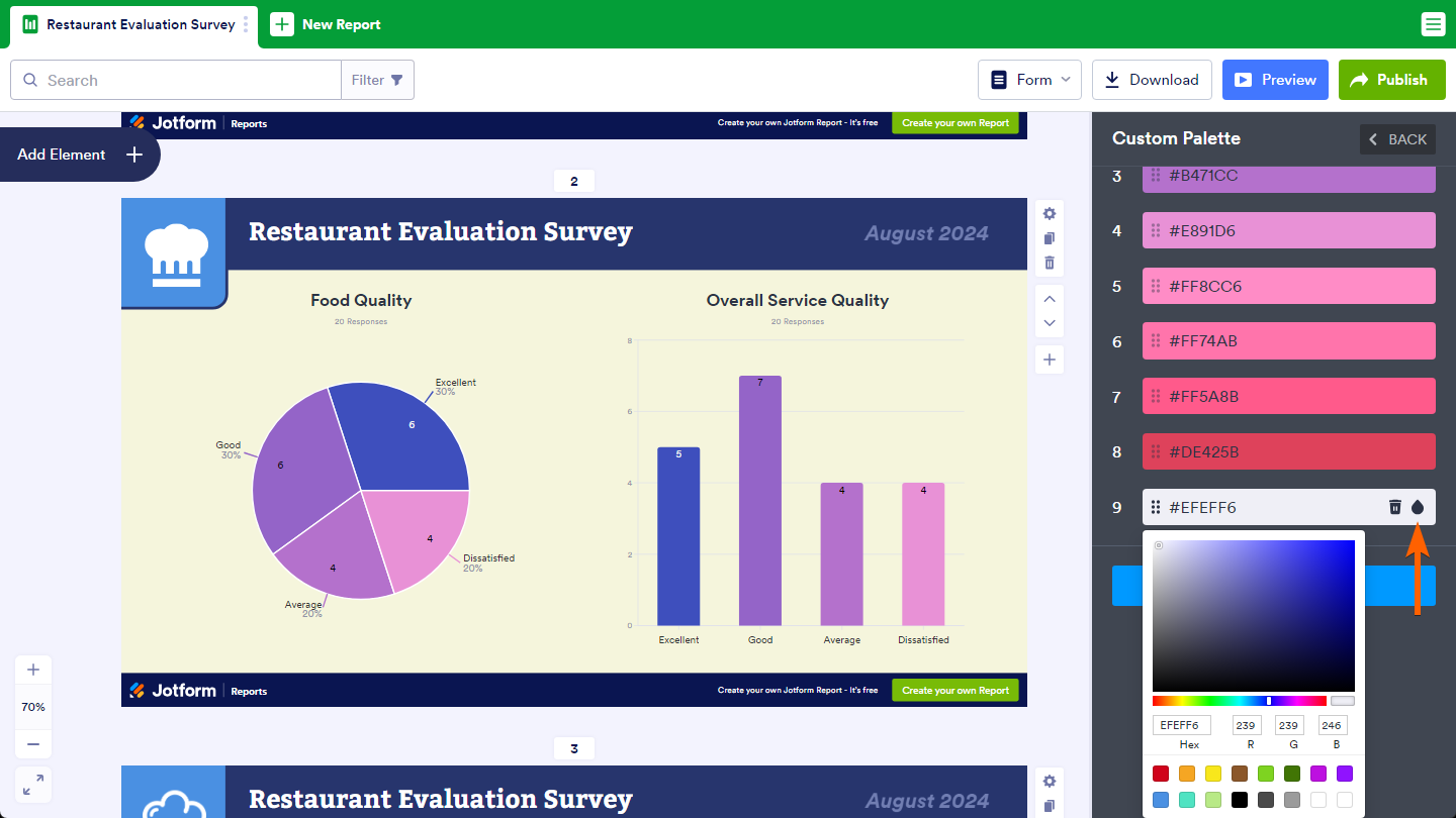
Changing palette colors. When you click on a color option or the Ink Drop icon that appears to its right when you hover over it, the color picker tool pops up, letting you choose or enter a different color.
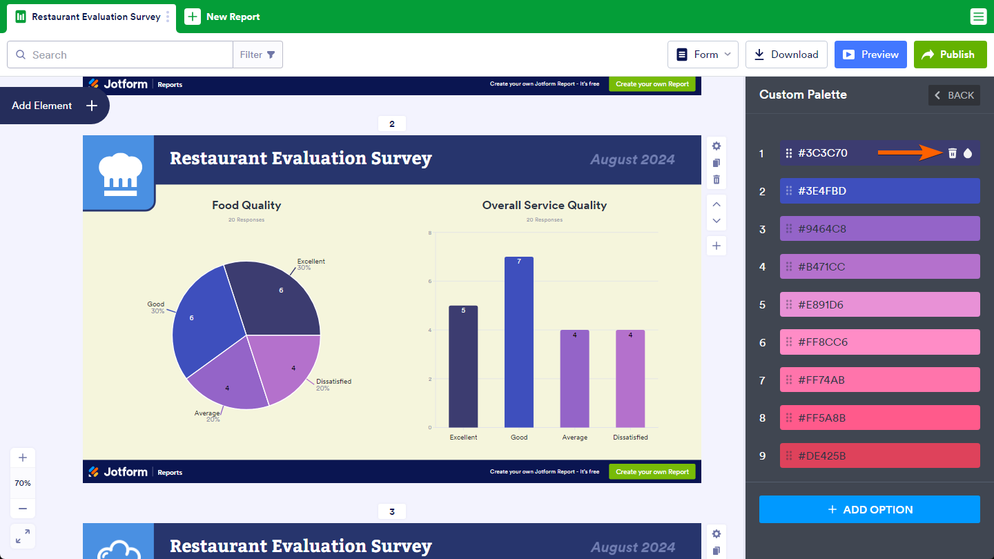
Rearranging palette colors. You can click and hold the Drag Handle icon on the left of a color option to grab it, then move it to where you want to drop it, arranging the colors in the palette.
Deleting palette colors. To delete a color, you can click on the Trash icon that appears to the right of a color option when you hover your mouse over it. The color will be deleted upon clicking
Note
- Any colors you add, change, rearrange, and remove in a selected palette will reflect instantly on your charts, allowing you to see the updates in real-time. This makes it easy to adjust the colors that will match your charts and achieve the design you’re going for.
- If you delete all colors in a palette, your charts’ data series will default to black.
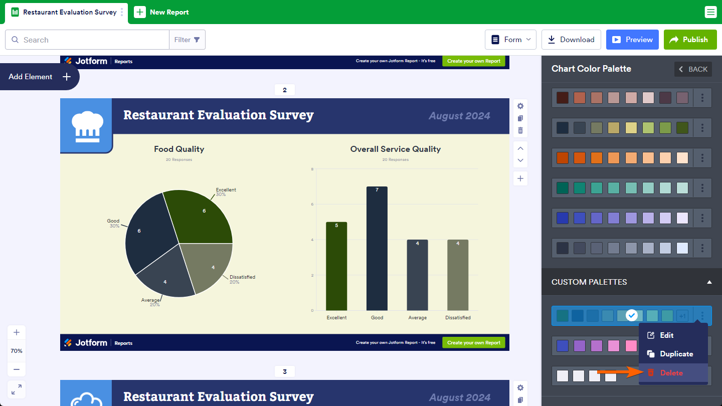
You can choose the Duplicate option from the palette’s menu if you want to create a custom copy of any palette without immediately applying its colors to your charts. You can find the duplicated palettes under the Custom Palettes section, which you can modify and use later.
Selecting the Delete option from a custom palette’s menu will delete it right away. Deleting custom palettes can help keep your workspace organized and make it easier to find and manage the palettes you actually use. Even though there’s no limit to how many palettes you can create, removing unused or outdated ones can simplify your workflow and reduce clutter.
Note
- You can only delete palettes from the Custom Palettes section in the Chart Color Settings.
- When you delete a selected palette, the first palette in the Default Palettes section will be selected.
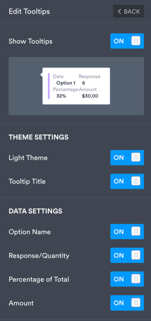
Adjusting Tooltip Themes and Data
Tooltips show additional information when you hover.
You can enable/disable tooltips in the layout settings, customize showing data.
Slide Settings
The default background color of a report page is white (#FFFFFF). You can update the background color on each page of your report on the Slide Settings, PAGE STYLE section. The Page Settings can be accessed by clicking the icon that is on the right side of every page.
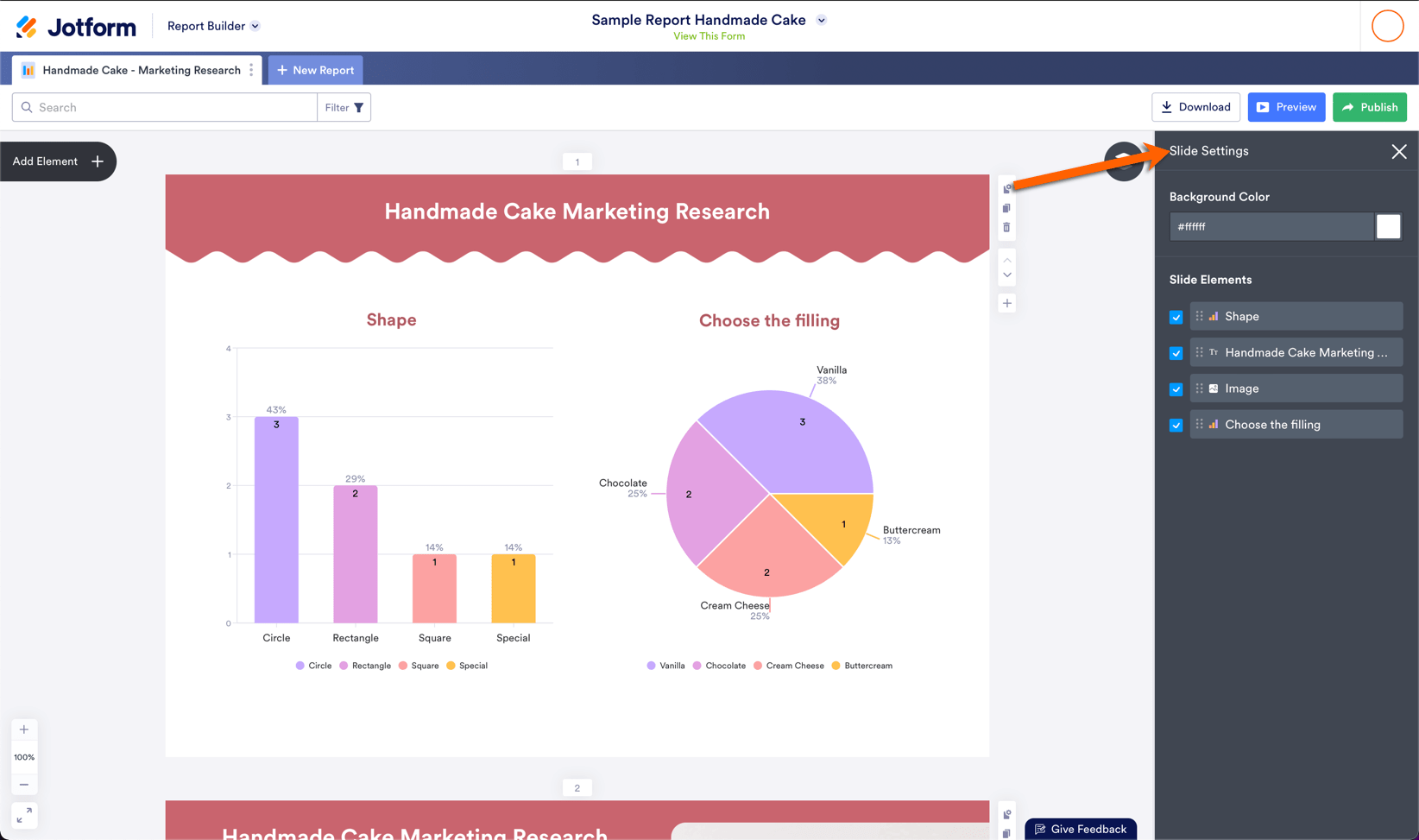
Under the ELEMENTS section of the Page Settings, you’ll see Layers where you can hide an element on your report by unchecking it on the list. You can also change the layer order of each element by dragging. One way to put this feature to good use is when you would like to add watermarks to your charts.
Element Settings
There are different kinds of elements settings as there are different kinds of elements that can be added to the report. Element settings open when you click the gear icon on the right side of the selected element.
1. Basic Elements
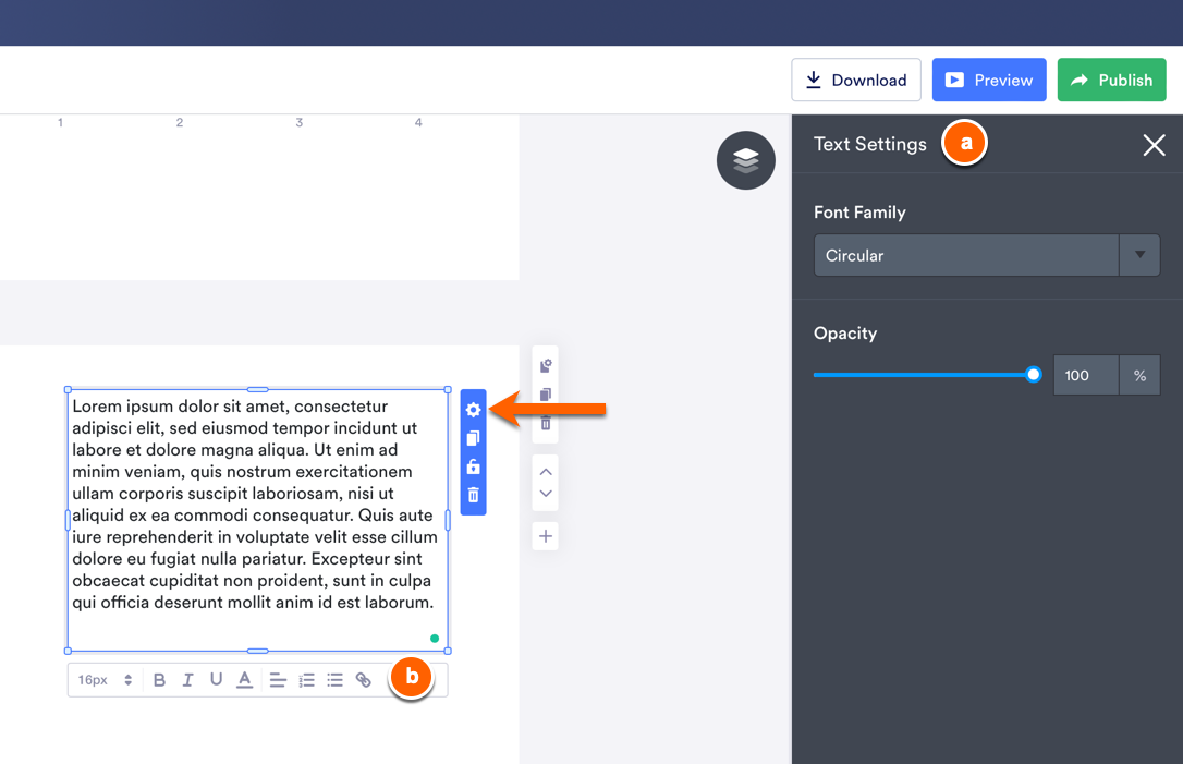
Text Settings: In addition to the (a) editing tools that this element has, its font and opacity can also be updated from its (b) settings.
Header Settings: The Header element has three parts: (a) Header, (b) Line, and (c) Subheader.
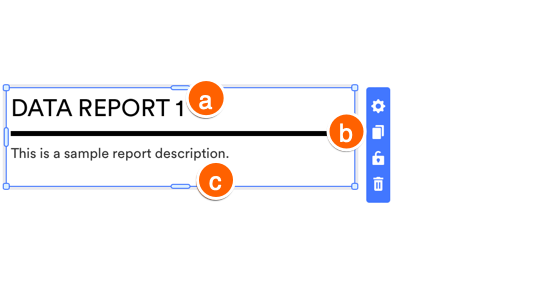
Each one can be customized under its respective tab in the Header Settings.
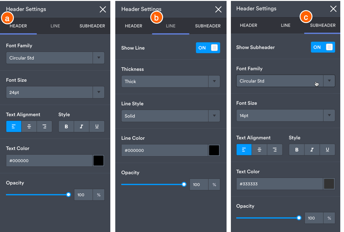
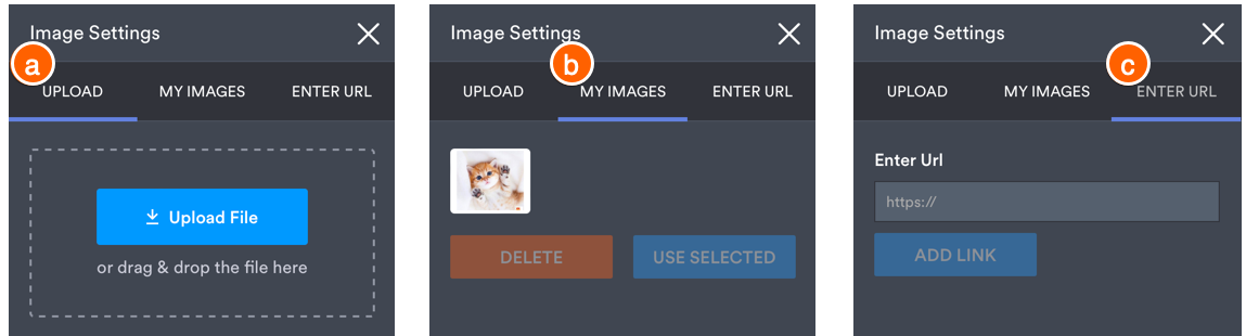
Image Settings: Jotform Report Builder makes it easy to upload a business logo to your report. There are three ways to add an image to your report.
(a) Upload tab: Upload an image file directly from your computer.
(b) My Image tab: Use an image you previously uploaded to your Jotform account.
(c) Enter URL tab: Add the link to your image.
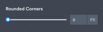
Shapes Settings: You can add five different shape types to your report (Rectangle, Ellipse, Line, Triangle, Star).
Each shape type, except Line, has different Fill, Border, and Size customization settings.
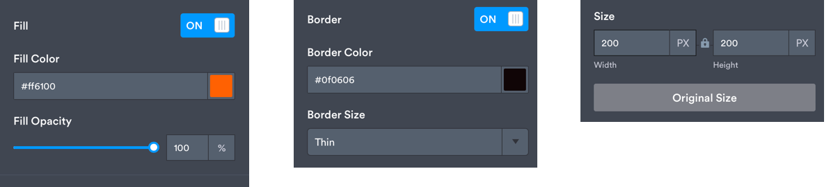
Rounded Corner is a setting available only to the Rectangle shape type.
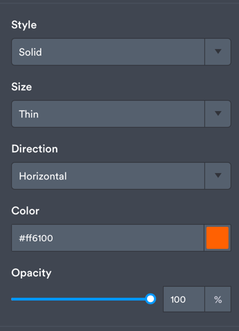
The Line shape type, on the other hand, has its own different settings for Style, Size, Direction, Color, and Opacity. The Line shape type can be used as a divider on the report.
Icon Settings: There are a lot of icons to choose from. The icons are divided into categories and there is also a search bar under the Star category that can help you find the icon you are looking for easily.
Under the Style tab of the Icon Settings is where you can change the color, opacity, and size of an icon.
Grid Settings: The Grid element offers you a way to show your form entries in a table and each field is presented in a column. Its settings allow you to check and uncheck the fields to select which one you only want to include in the table. You can drag and drop the fields listed in the settings to arrange the order of the columns. You may also pin the most important ones to the top by clicking the pin icon on the right of each field. Clicking (or double-clicking) the field name in the settings will let you rename the column headers to your preference.
The width of each column on the table can also be resized. Hover over to the line that divides each column header until your mouse cursor changes to this double arrow. Click and hold to start resizing the width of a column and then release it after you set the perfect column width.
2. Report (Chart) Elements
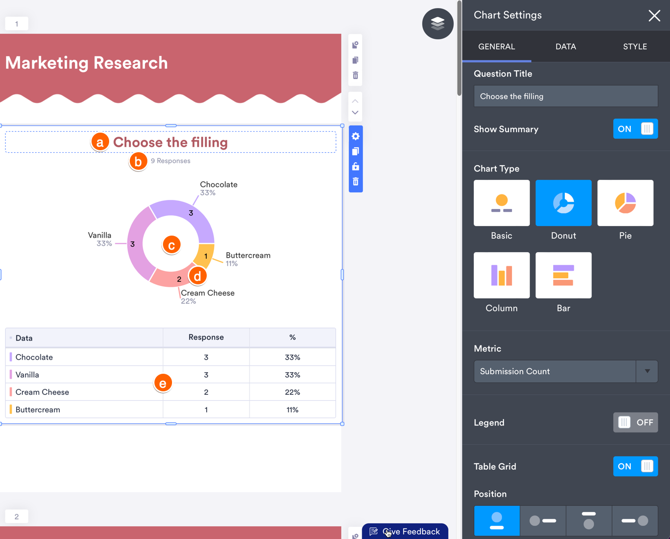
Chart Settings has 3 tabs; General, Data, and Style.
Under the General tab, you can set:
(a) Chart Title, which is by default the name of the field in your form.
(b) Form submission summary or the number of total entries.
(c) Chart Type that suggests which chart best suits the option in your field the most.
(d) Metric for your chart.
(e) Chart legend or table grid for your chart.
Different Chart Types: Basic, Text, Donut, Pie, Column, Bar, and Line.
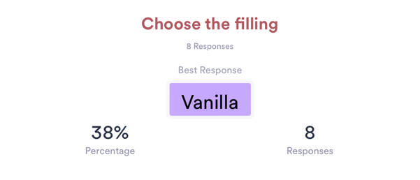
Basic Chart shows the option with the most responses. It also shows the number of times the option was selected and its percentage based on the total responses received.
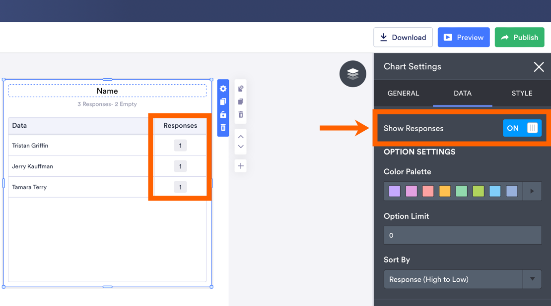
Text Grid shows the number of responses you received from the same field entry. This option is for the Name field, Email field, or other text entry fields. For Example, in the chart below it shows that the form received 9 out of 11 responses with John Smith in the Name field.

The Line Chart is only available to form payment fields. It uses lines to connect individual data points that display the total quantity of purchases over a specified time interval.

Bar Charts has a way to increase the width of the option’s text by dragging. When the double arrow cursor appears while hovering over on the right edge of the text options, click and drag it to the right to increase the width of the options making the entire option texts visible on the chart.
Table Grid Toggle will show the number of responses of each option and its percentage compared to the other options in a table format while the Legend Toggle will list the options side-by-side. Basic Chart doesn’t have the Legend Toggle option.
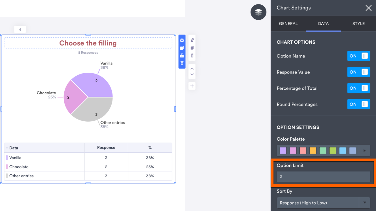
The Data tab is where you enable the details and options that you would like to be included in the chart. It is where you also sort, limit, and style each option data.
CHART OPTIONS
Option Name: Toggle to show the name of each data.
Response Value: Toggle to show the total number on each data.
Percentage of Total: Toggle to show the percentage on each data.
Round Percentages: Toggle to round percentage on each data.
The options that appear under this section depend on the selected chart type.

Show Responses is a setting under the Data tab that is only available to the Text Grid chart type. It refers to the Responses column of the Text Grid table.
OPTION SETTINGS
Color Palette
Similar to the Chart Color Palette Setting under the Style tab of the Layout Settings, this option also allows you to change the colors of the chart options as a group. However, unlike the one in the Layout Settings, this setting only changes the colors of the options in a single chart. The selected Color Palette in this setting will override the selected Chart Color Palette in the Layout Settings.
This setting is set to the selected Chart Color Palette in the Layout Settings by default and once a different Color Palette is selected in this setting, a button to revert to the default Chart Color Palette you have set in the Layout Settings of the report will become available.
Option Limit
By default, this setting is set to zero (0) and all options are shown in the chart and in the Data Order section. Entering a number greater than the total number of options a chart has will also show all the options in that chart and in the Data Order section. For example, if a chart has 5 options, you can set it to 6 or higher to show all the options.
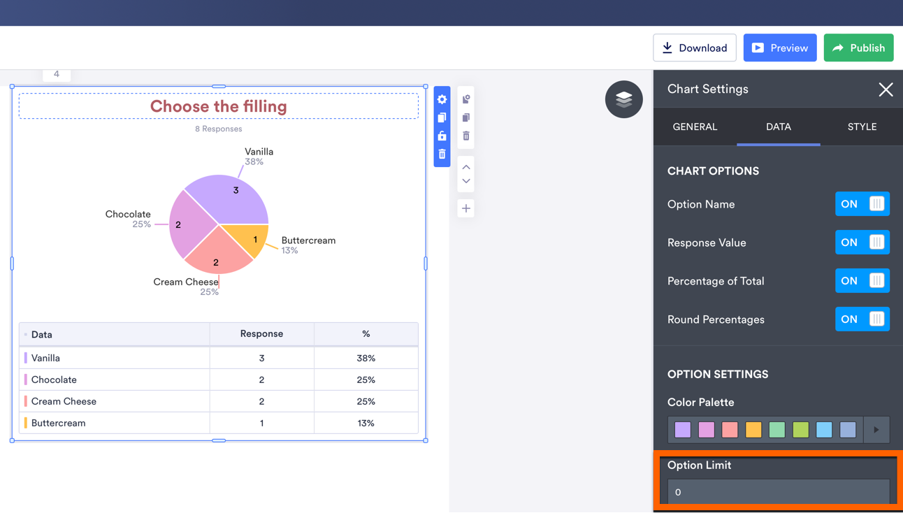
Changing it to a value that is less than or equal to the exact number of options a chart has will show the top options first, which is the number of options set less than 1 to make room for the “Other Entries” option. For example, a chart with a total of 4 options (a, b, c, d) and has an Option Limit set to 3 will show the top 2 options (a, b) and an “Other Entries” option that represents the remaining options (c, d) in the chart and in the Data Order section. In other words, the “Other Entries” option represents the total data of all the options that are not shown based on the number set in this setting.
Sort By
There are five options under this setting:
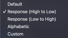
Default will sort the options in the chart based on the order the options appear on the form.
Response (High to Low) will sort the options based on response quantity from high to low.
Response (Low to High) will sort the options based on response quantity from low to high.
Alphabetic will sort the options in alphabetical order.
Custom will sort the options based on how you arranged it in the Data Order section of the Data tab.
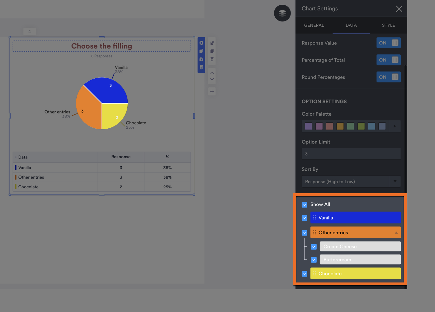
Data Order section
Located at the bottom of the Sort By option, this section allows you to show/hide an option, change the color of each option, and manually arrange the order of the options in a chart.
Show/Hide options: You can check/uncheck the option to show/hide it on the chart
Change an option color: To individually set a color to an option, you can click it or click the color picker (water-drop) icon on the right of the option. Changing the color of the option individually, under this section, will override but will not affect the Color Palette set in the Chart Settings nor the Chart Color Palette in the Layout Settings of the report.
Arrange option order: Click and hold the 6-dotted icon on the left of an option to start dragging the option. Drop to release the color option after you place it in position. The moment you change the order of the options it will be set as the Custom option of the Sort By setting.
Other Entries option is by default set to color gray and is positioned last. You can arrange and change the color of this option, but you cannot arrange the order or change the color of each option it represents. You can see the option it represents by clicking the drop-down menu on the right of the option.
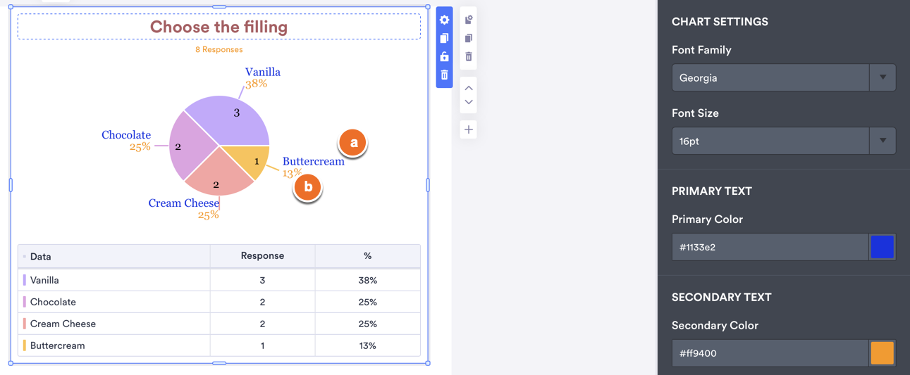
The Style tab is where you customize the appearance of the details in a chart. It has two sections: Title Style and Chart Style
Title Style. You can change the font of the chart title, its size, color, style (bold, italic, underlined), and alignment in this section.
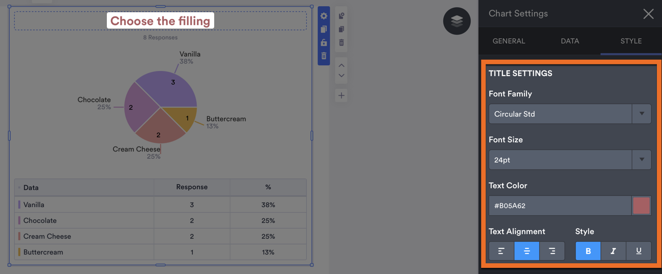
Chart Style. You can change the font, font size, and color of the text details on the chart in this section.
(a)The Primary Color refers to the option labels and the legend of the chart texts.
(b)The Secondary Color refers to the form submission summary and the percentage of total texts.
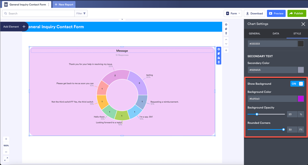
Show Background. Toggle the Show Background switch to on to change your chart’s background colors, background opacity, and round the corners of your chart.

Send Comment:
14 Comments:
August 20, 2025
Some of my data from my form is not displayed on my visual report. Specifically, it's the star rating data from my form. How can I get it to display?
February 5, 2025
Is there a way for the report to only show data/slides for questions that have responses, and automatically update?
April 16, 2024
I have a "checkboxes" form element where people can choose option 1, 2, 3, or 4 -- or they can choose any combination of those options. I need a way to show not just how many people selected option 1, but how many people selected 1+2, 1+3, 1+2+3, etc. What's the best way to do this on a "visual report"?
February 15, 2024
As input to development:
- could you use the fuller text edit found in the rest of Jotform please ? the current one is really clunky and basic. One example is when you edit, the editing features appear at the bottom.... often hidden
- in the Chart option, e.g. Bar charts, the style splits it into 50% chart and 50% detail - say on the left. I need more chart and less detail space but there's no way to adjust this - manually or by dragging
- Lastly, the filter capability does work - e.g. a specific respondent. So if you managing a project you can isolate to a specific respondent. However, it would be helpful to be able to provide access to the report while applying the filter. For example, I can send a link for viewing but with the filter in place ? or embed the report - with a filter in place so as not to share all the content.
January 25, 2024
Can we schedule this report to be sent to certain people automatically every week?
November 30, 2023
Can filters be set to present data from custom dates? Like say data collected today only.
September 24, 2023
Is there a way to calculate a total when using the grid feature for a report? For example, we have a form where donations are made in honor of members. The member has their own report where they can check the status of donations made in their honor. What I can't figure out is a way to show the total dollar value of donations made just for that member to be reflected as a total using the grid.
April 18, 2023
What does the lock feature do? Does this lock the formatting but allow for new data to be “live update”?
February 3, 2023
Hi In my Chart i want to show Total Revenue by each type of boat.
i cant get both data fields in one graph how do i select the data fields to be used?
November 13, 2022
In Reports can you add page numbers, Headers & footers?
September 19, 2022
How can I set a default palette which will be available to use in any report? If I create a palette in one report, it does not show up in others.
July 19, 2021
Greats,
Will I find a kind of report (table or graphs) some interactive features as filter, drill-down, navigation through forms...?
Best Regards,
JBB
June 15, 2021
Are you planning to introduce a visual report that is designed for viewing in mobile phone?
April 20, 2021
Is there a way to set the default pie chart to the doughnut style?