With Jotform, you can easily add a Date Picker to your form so users can select dates from an interactive calendar instead of typing them manually. This helps ensure accurate entries and keeps your form simple to complete.
Here are a few ways to use it:
- Collect dates for appointments, bookings, or events.
- Let users choose dates from a calendar view.
- Minimize errors from manual date input.
- Keep date formats consistent across submissions.
Adding the Date Picker Element
Whether you’re creating a new form or updating an existing one, you can add and set up the Date Picker element in a few easy steps. Here’s how to do it:
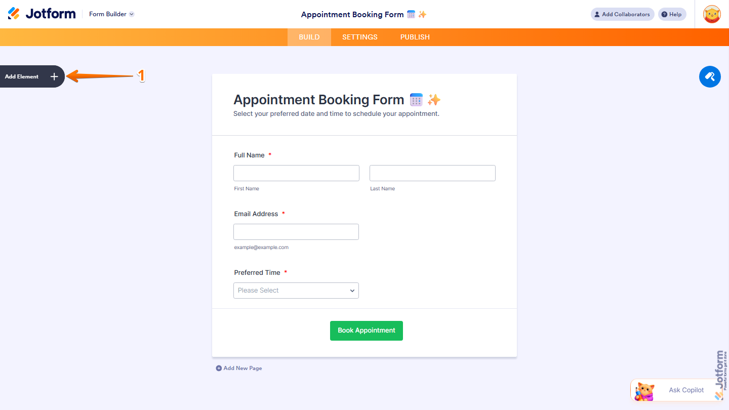
- In Form Builder, click on Add Element on the left side of the page.
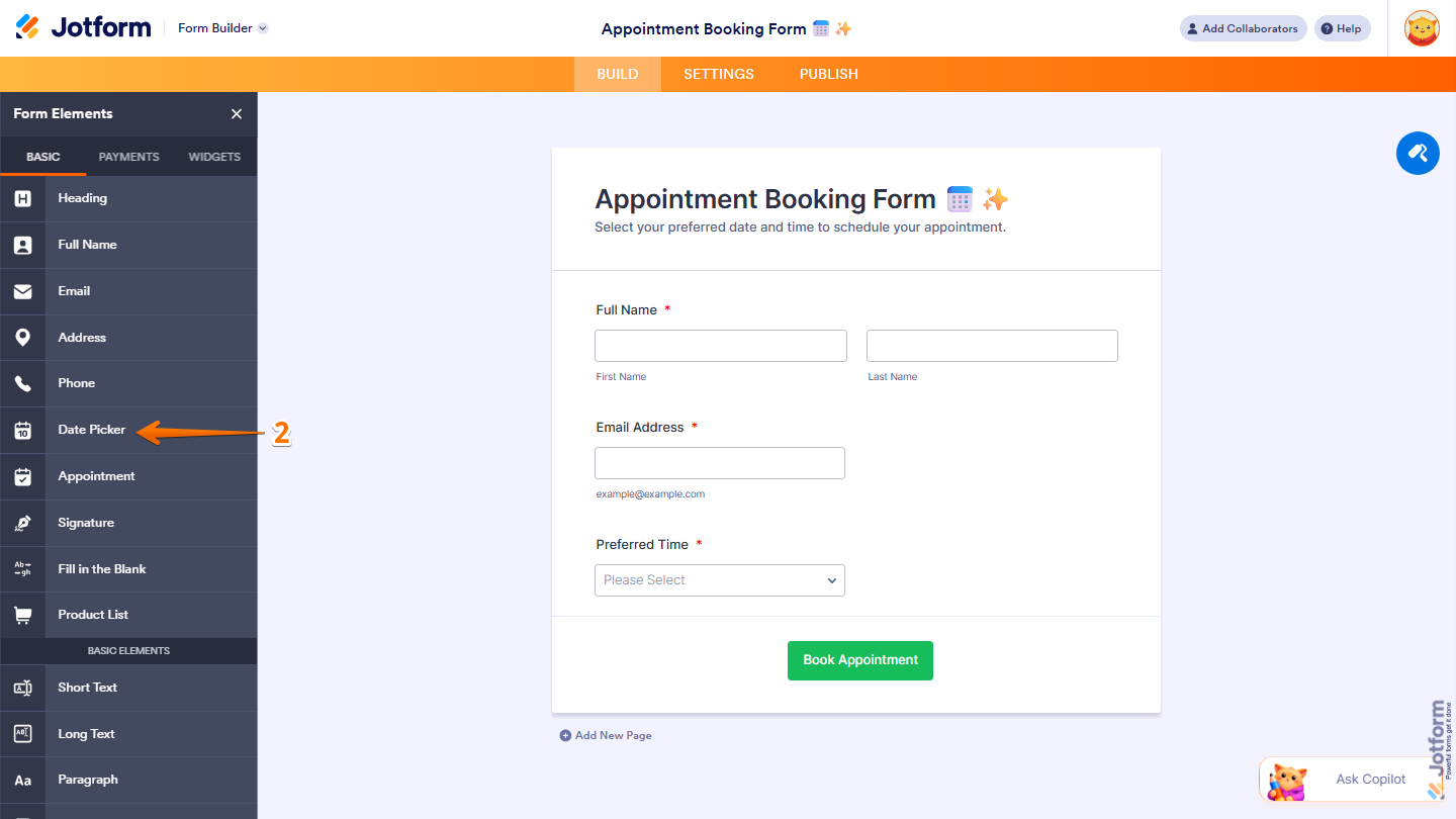
- Now, in the Form Elements menu, under the Basic tab, click on Date Picker. Or, just drag and drop it to where you want it to be on your form.
- Next, click on the Gear icon to open the Date Picker Properties menu on the right side of the page.

Now, you’ll see the following tabs where you can configure the Date Picker element:
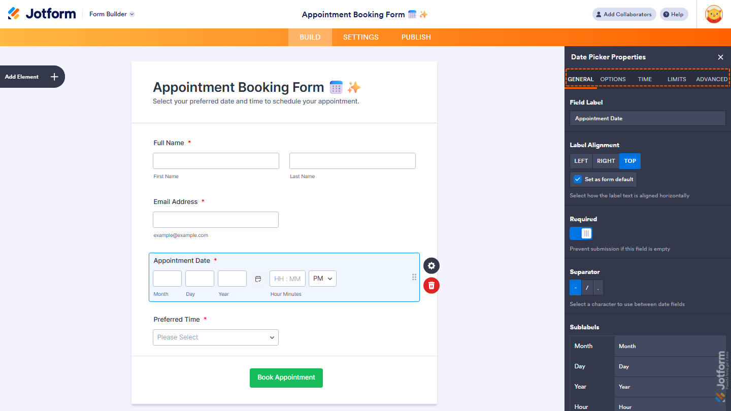
General Tab
The General tab includes the basic settings for the Date Picker element, such as the field label, alignment, and required options. You can also customize the separator and sublabel in this section. Here’s what to do:
- Under the General tab, set up these things:
- Field Label — Enter the label that will appear above the date picker field on your form.
- Label Alignment — Choose how the label is aligned. Options include Left, Right, and Top. Check Set as Form Default to apply this alignment to all fields on your form.
- Required — Toggle this on to prevent form submission if this field is left empty.
- Separator — Select a character to use between date fields. Options include –, /, and ..

- Then, scroll down to the bottom to continue and set up these things:
- Sublabel — Customize the sublabel text that appears below the date field.
- Duplicate Field — Click on Duplicate to create a copy of this field with all its saved settings.

Options Tab
The Options tab lets you control how the date is displayed and how users interact with the field. This includes setting the date format, default values, and enabling the calendar popup or Lite Mode. Here’s what to do next:
- Under the Options tab, configure these things:
- Date Format — Choose how the date is displayed. Options include MM-DD-YYYY, DD-MM-YYYY, and YYYY-MM-DD.
- Default Date — Choose whether to pre-populate the field with a date. Options include:
- None — No default date.
- Current — Pre-populates with today’s date.
- Custom — Pre-populates with a specific date you set.
- Calendar Popup — Toggle this on to show a calendar picker when users interact with the field.
- Lite Mode — Toggle this on to show a single input field instead of three separate fields for month, day, and year.
- Validate Lite Mode Date — Toggle this on to prevent form submission if an invalid date is entered in Lite Mode.

- Then, scroll down to customize the month names shown in the calendar:
- Months — Customize the display names for each month of the year shown in the calendar.

- Now, scroll down again to finish setting up these things:
- Days — Customize the display names for each day of the week shown in the calendar.
- Today — Enter replacement text for the “Today” button in the calendar.

Time tab
The Time tab allows you to include time selection along with the date. You can choose the time format and set a default time if needed. Get started like this:
- Under the Time tab, select what you want to do:
- Time Field — Toggle this on to allow users to specify a time along with the date.
- Time Format — Choose how the time is displayed. Options include 24 Hour and AM/PM.
- Default Time — Choose whether to pre-populate the field with a time. Options include:
- None — No default time.
- Current — Pre-populates with the current time.
- Custom — Pre-populates with a specific time you set.

Limits tab
The Limits tab includes options to restrict date selections. You can limit users to specific date ranges, disable certain dates, or enable age verification.
- Under the Limits tab, set things up like this:
- Age Verification — Toggle this on to prevent users under a certain age from submitting the form.
- Past & Future — Choose whether to allow users to select dates in the past, future, or both.
- Days of the Week — Choose which days of the week are available for selection. Unchecking a day will make it unavailable in the calendar.
- Start & End Date — Set a date range to allow selection only between specific dates.

- Then, scroll down to finish setting up these things:
- Disable Specific Dates — Enter specific dates to disable in the calendar. Enter each date on a new line in the format YYYY-MM-DD.
- Disable Date Ranges — Enter specific date ranges to disable in the calendar in the format YYYY-MM-DD>YYYY-MM-DD. Enter each range on a new line.

Advanced tab
The Advanced tab provides additional customization options, such as hover text, read-only settings, and field visibility. You can also access technical details like the field’s unique name and IDs.
- Under the Advanced tab, fill in these details:
- Hover Text — Add a short description that appears when a user hovers over the field.
- Read Only — Toggle this on to prevent form fillers from entering or editing the field.
- Shrink — Toggle this on to make the field smaller in size.
- Hide Field — Toggle this on to hide the field from form fillers.
- Field Details — View additional technical information about the field such as Unique Name and Field IDs.

That’s it. You’ve successfully added and set up the Date Picker widget on your form. Once you’ve configured your Date Picker element, your form is ready to collect accurate and properly formatted date inputs. You can always revisit the field settings to adjust formats, restrictions, or display options as your needs change.

Send Comment: