The Spinner element is a simple and interactive way to let users select values using up and down controls, making data entry quicker and more accurate. It’s perfect for inputs like numbers, quantities, or any field where users need to adjust values step by step.
Here are a few ways to use it:
- Collect numeric inputs like quantity, age, or number of participants.
- Use it for rating systems where users select a value within a set range.
- Add it to booking or reservation forms to let users choose the number of tickets or items.
- Use it for inventory or order forms to adjust product quantities easily.
Adding and Setting Up the Spinner Element
Whether you’re building a new form or editing an existing one, you can add and configure the Spinner element in just a few steps. This is how it’s done:
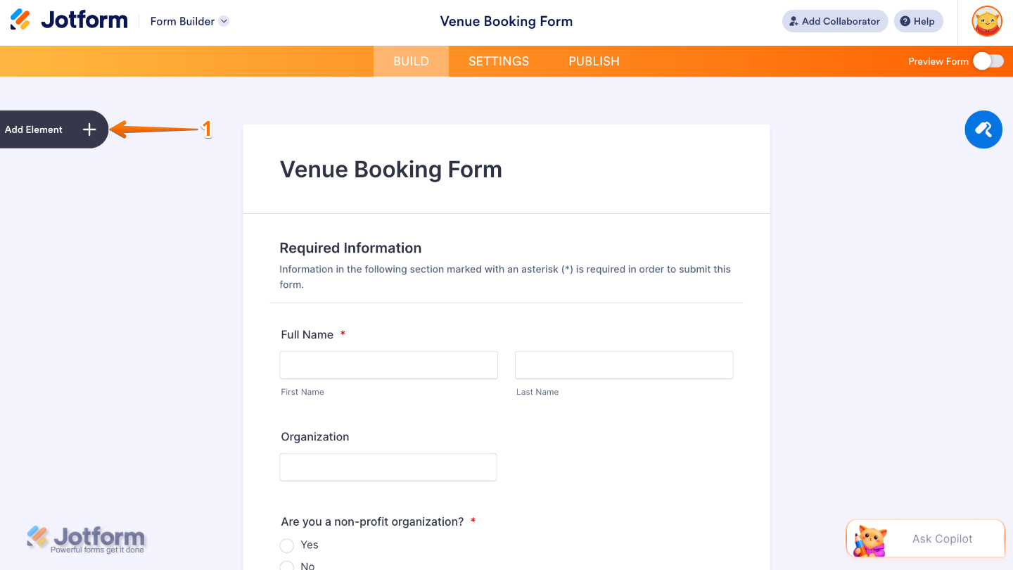
- In Form Builder, click on Add Element on the left side of the page.
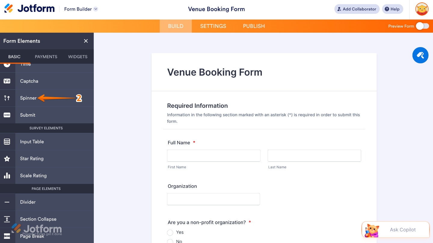
- Then, in the Form Elements menu, under the Basic tab, scroll down and then click on Spinner. Or, just drag and then drop it to where you want it to be on your form.
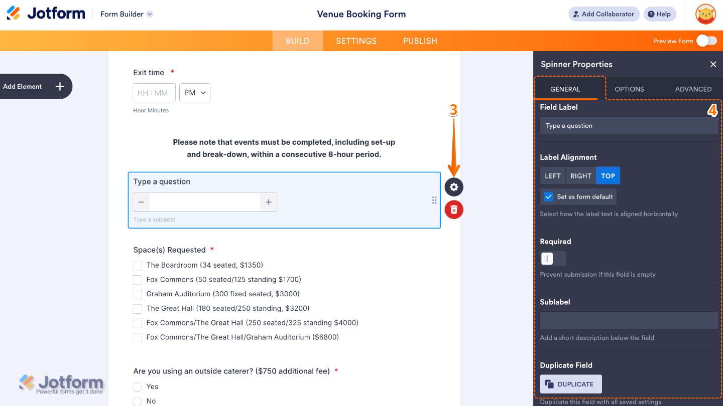
- Next, click on the Gear icon to open the Spinner Properties menu on the right side of the page.
- Then, under the General tab, set up these things:
- Field Label — Enter the main label shown above the Spinner field.
- Label Alignment — Use this to control where the label appears in relation to the field.
- Required — Toggle this on if you want to make the Spinner field mandatory to complete.
- Sublabels — Set this up to customize labels for each part of the name field.
- Duplicate Field — Click on Duplicate to create a copy of this field with all its saved settings.
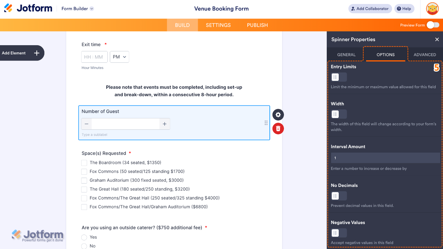
- After that, click on the Options tab and toggle on the options that you want to use:
- Entry Limits — Toggle this on to set the Minimum and Maximum range of input that users can enter.
- Width — Enable this to adjust how wide the spinner field appears on your form.
- Interval Amount — This sets the step value when users increase or decrease the number.
- No Decimals — Turn this on to ensure that only whole numbers can be entered.
- Negative Values — Use this to restrict negative number input.
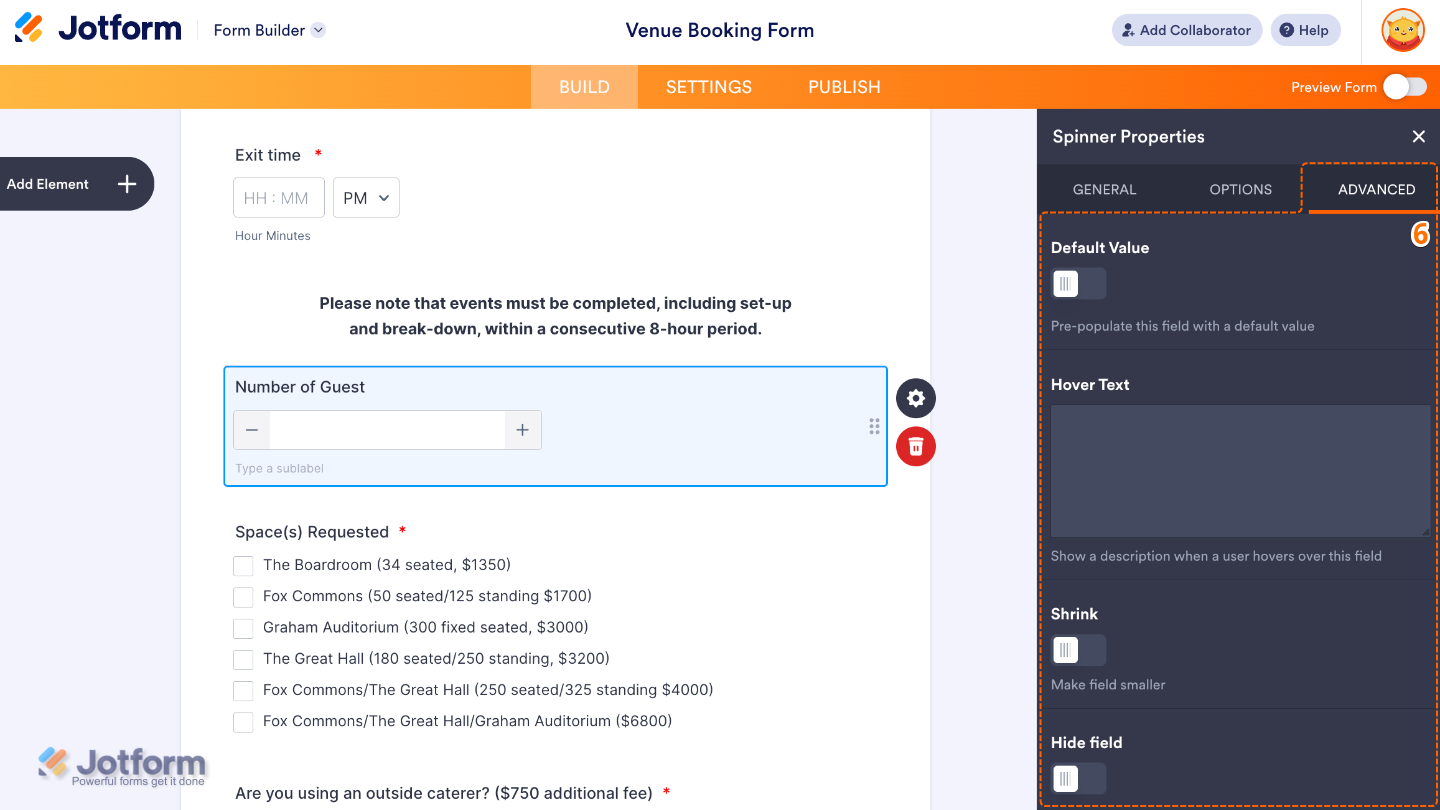
- Finally, click on the Advanced tab and continue to manage these details:
- Default Value — This will let you set a pre-filled number in the spinner field.
- Hover Text — Set this up to show help text when users hover over the field.
- Shrink — When enabled, it reduces the visual size of the field.
- Hide Field — Turn this on to completely hide the field from users.
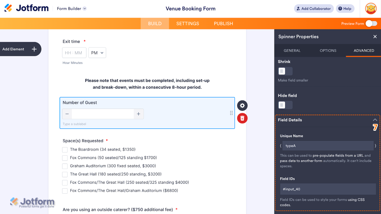
- Then, scroll down and check the Field Details, which will show you additional technical information about the field:
- Unique Name — The unique identifier for the field, which can be used to pre-populate it from a URL or pass data to another form automatically.
- Field IDs — The CSS selector for the field, which can be used to style it with custom CSS.
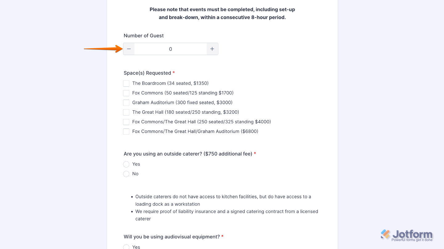
That’s it. You now have a fully set-up Spinner element that makes it easy for users to select values quickly and accurately, helping keep your form interactive and user-friendly. Want a quick preview? This demo form shows how it works.
Note
The Spinner element is currently not available in the Card form layout and can only be used in the Classic form layout.
Pro Tips
- Use the Spinner element when you want users to enter numbers quickly and accurately without typing, helping reduce input errors.
- Set a clear minimum and maximum value so users stay within the range you expect.
- Adjust the step value to control how much the number increases or decreases with each click.

Send Comment: