The Long Text element is a great way to let your users share more detailed answers, thoughts, or feedback in your forms. Whether they need to explain something, give a description, or write a longer response, this field gives them the space to do it comfortably.
Here are a few ways to use it:
- Collect detailed feedback or suggestions from users.
- Let users share comments, stories, or explanations in their own words.
- Use it for survey questions that need more thoughtful or in-depth answers.
- Gather descriptions, such as issue reports or support requests.
Adding and Setting Up the Long Text Element
Whether you’re building a new form or editing an existing one, you can add and configure the Long Text element in just a few steps. This is how it’s done:
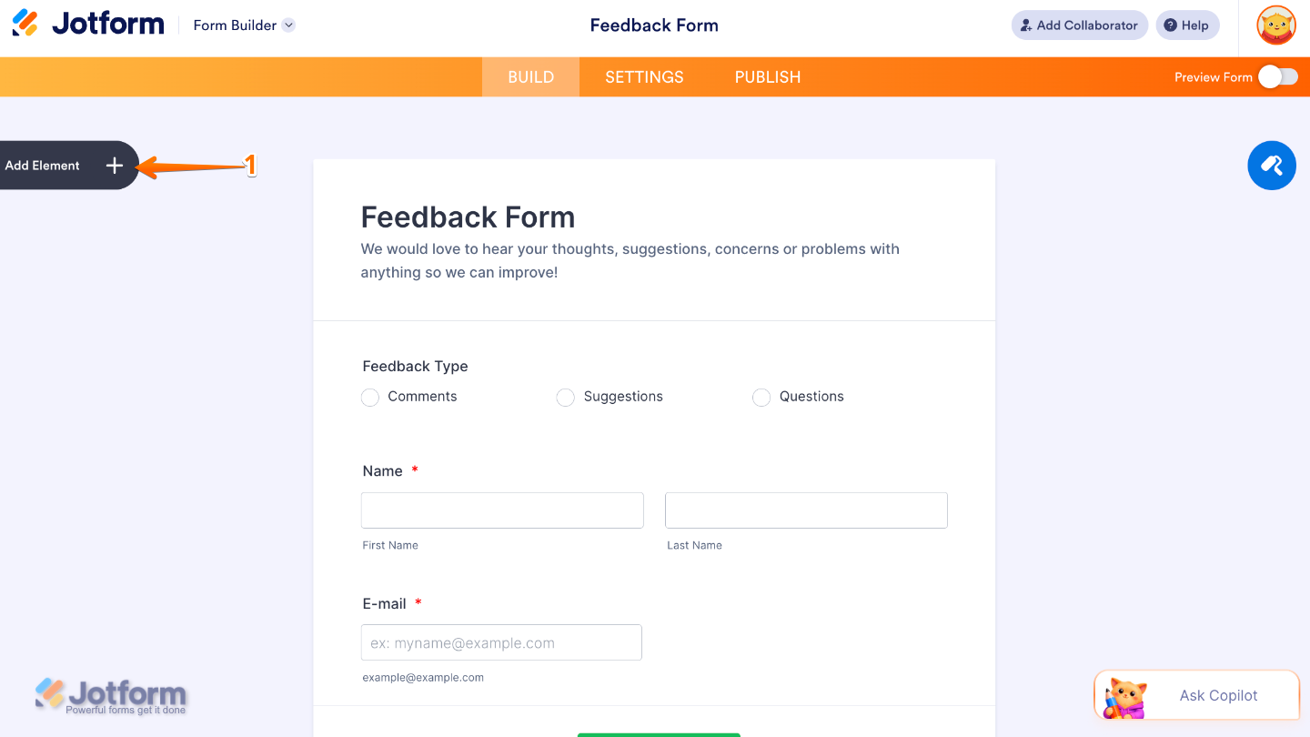
- In Form Builder, click on Add Element on the left side of the page.
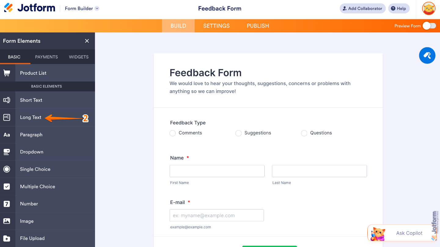
- Then, in the Form Elements menu, under the Basic tab, scroll down and then click on Long Text. Or, just drag and then drop it to where you want it to be on your form.
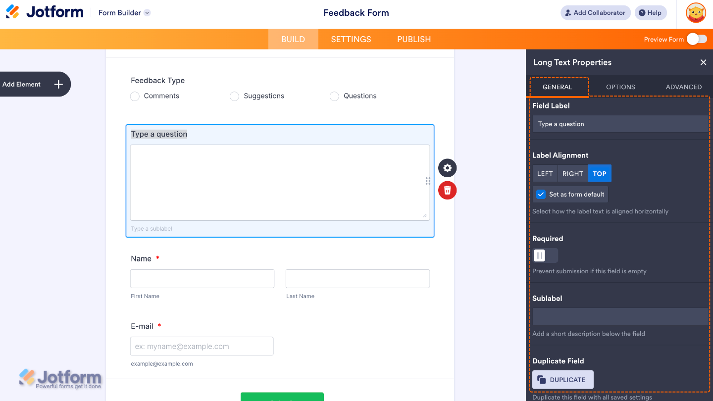
- Next, click on the Gear icon to open the Long Text Properties menu on the right side of the page.
- Then, under the General tab, set up these things:
- Field Label — Enter the main label shown above the Long Text field.
- Label Alignment — Use this to control where the label appears in relation to the field.
- Required — Toggle this on if you want to make the Long Text field mandatory to complete.
- Sublabels — Set this up to customize labels for each part of the name field.
- Duplicate Field — Click on Duplicate to create a copy of this field with all its saved settings.
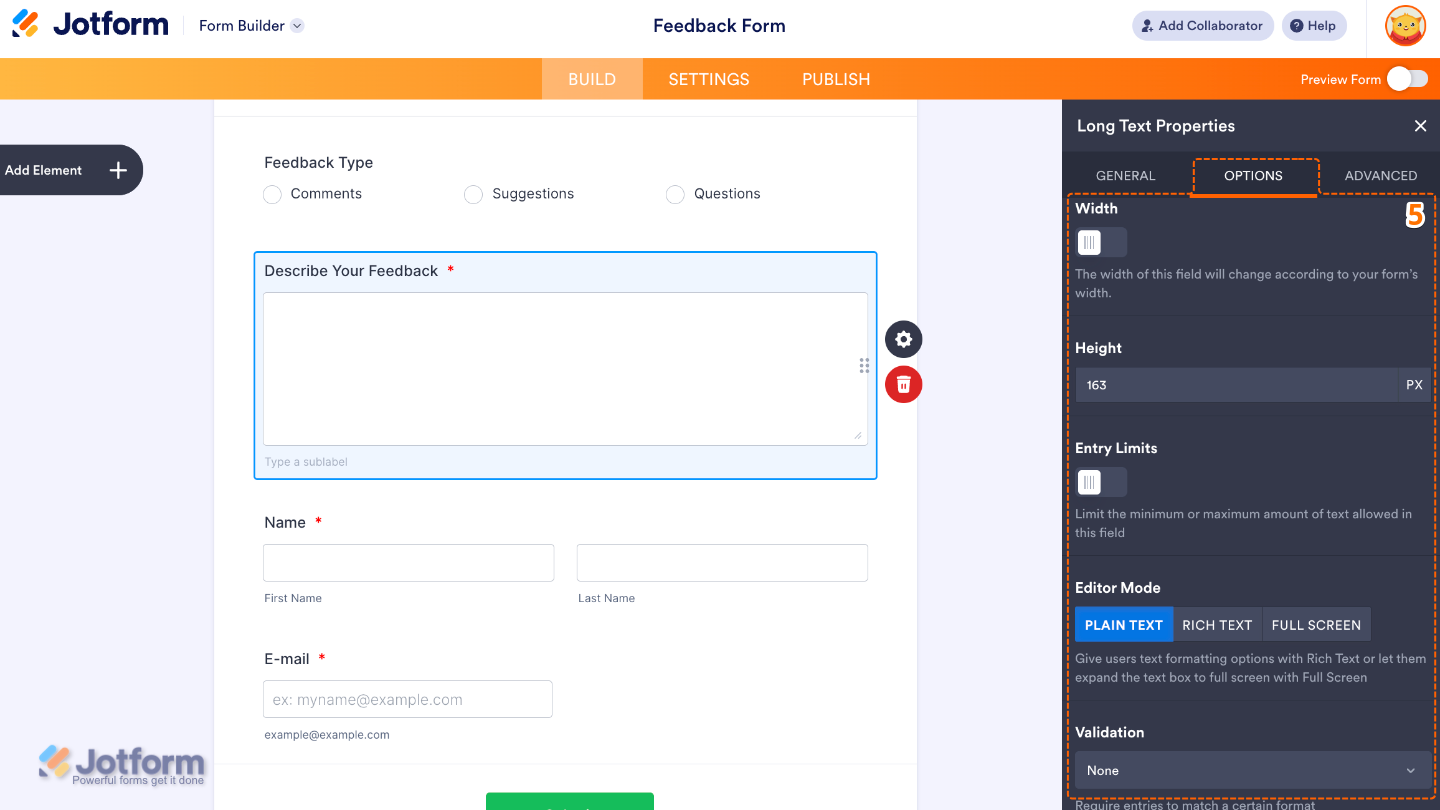
- After that, click on the Options tab and toggle on the options that you want to use:
- Width — If enabled, you have the control on how wide the input field appears on the form.
- Height — Lets you control how tall the text box appears on the form.
- Entry Limit — Toggle on to set the Minimum and Maximum number of Words or Letters users can input.
- Editor Mode — Select an option to determine how users can format their text inside the field.
- Validation — Select an option to define rules for what type of input is allowed.
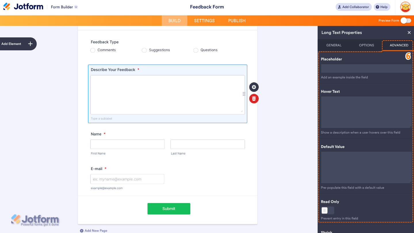
- Finally, click on the Advanced tab and continue to manage these details:
- Placeholder — Use this to display sample text inside the input field.
- Hover Text — Set this up to show help text when users hover over the field.
- Default Value — Lets you pre-fill the field with a preset value when the form loads.
- Read Only — Toggle this on to make the field non-editable.
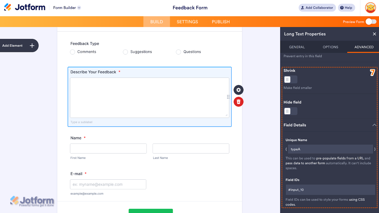
- Then, scroll down to set up these last three options:
- Shrink — When enabled, it reduces the visual size of the field.
- Hide Field — Turn this on to completely hide the field from users.
- Field Details — View additional technical information about the field:
- Unique Name — The unique identifier for the field, which can be used to pre-populate it from a URL or pass data to another form automatically.
- Field IDs — The CSS selector for the field, which can be used to style it with custom CSS.
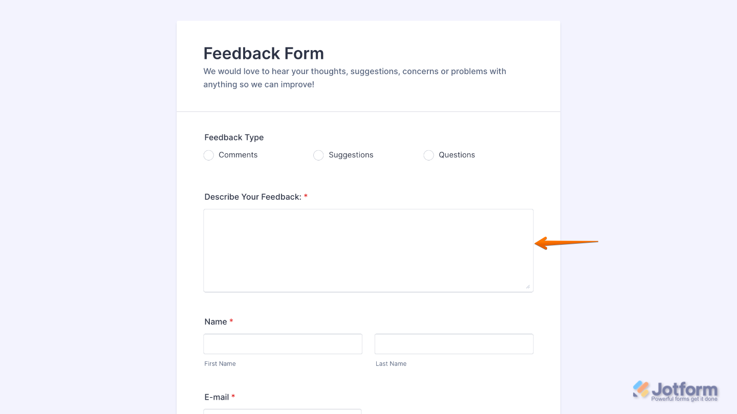
That’s it. You now have a fully set-up Long Text element that allows users to share detailed responses easily, helping you collect more meaningful and complete information through your form. Want a quick preview? This demo form shows how it works.
Note
The Long Text element is available in both Classic and Card form layouts. However, some options like Width, Height, Editor Mode, Shrink, and Hover Text are not available in the Card layout, while it includes a Description option and a Markdown Editor in the General tab instead.
Pro Tips
- Keep the Field Label clear and descriptive so users know exactly what kind of detailed response is expected.
- Use the Long Text element only when you need more detailed answers, and avoid it for short or simple inputs to keep your form efficient.
- Add a helpful Placeholder to guide users on what to write, especially for open-ended questions.
- Consider setting a Character Limit to prevent overly long responses and keep submissions easy to review.

Send Comment: