With Jotform, you can easily add images to your form to make it more branded, visual, and easier to understand. The Image element is useful for displaying logos, banners, product photos, sample images, visual instructions, or any supporting graphic that helps guide respondents through your form. It’s a simple way to make forms look more polished while giving users helpful context before they submit their responses.
Here are a few ways to use it:
- Add a logo, banner, or other visual to reinforce your brand on the form.
- Show product photos, mockups, or sample designs on order and request forms.
- Include reference images to help customers describe what they want more clearly.
- Add images to event, promotion, or announcement forms to make them more engaging.
- Use it in feedback, intake, or registration forms to give users helpful visual context.
- Display artwork, portfolio pieces, or design examples when collecting creative requests.
Note
The Image element is available in both Classic and Card Forms. You can check out our guide on When to Use Card Forms to learn more.
Adding the Image Element
Whether you’re creating a new form or updating an existing one, you can add the Image element in a few easy steps. Here’s how to do it:
- In Form Builder, click on Add Element on the left side of the page.
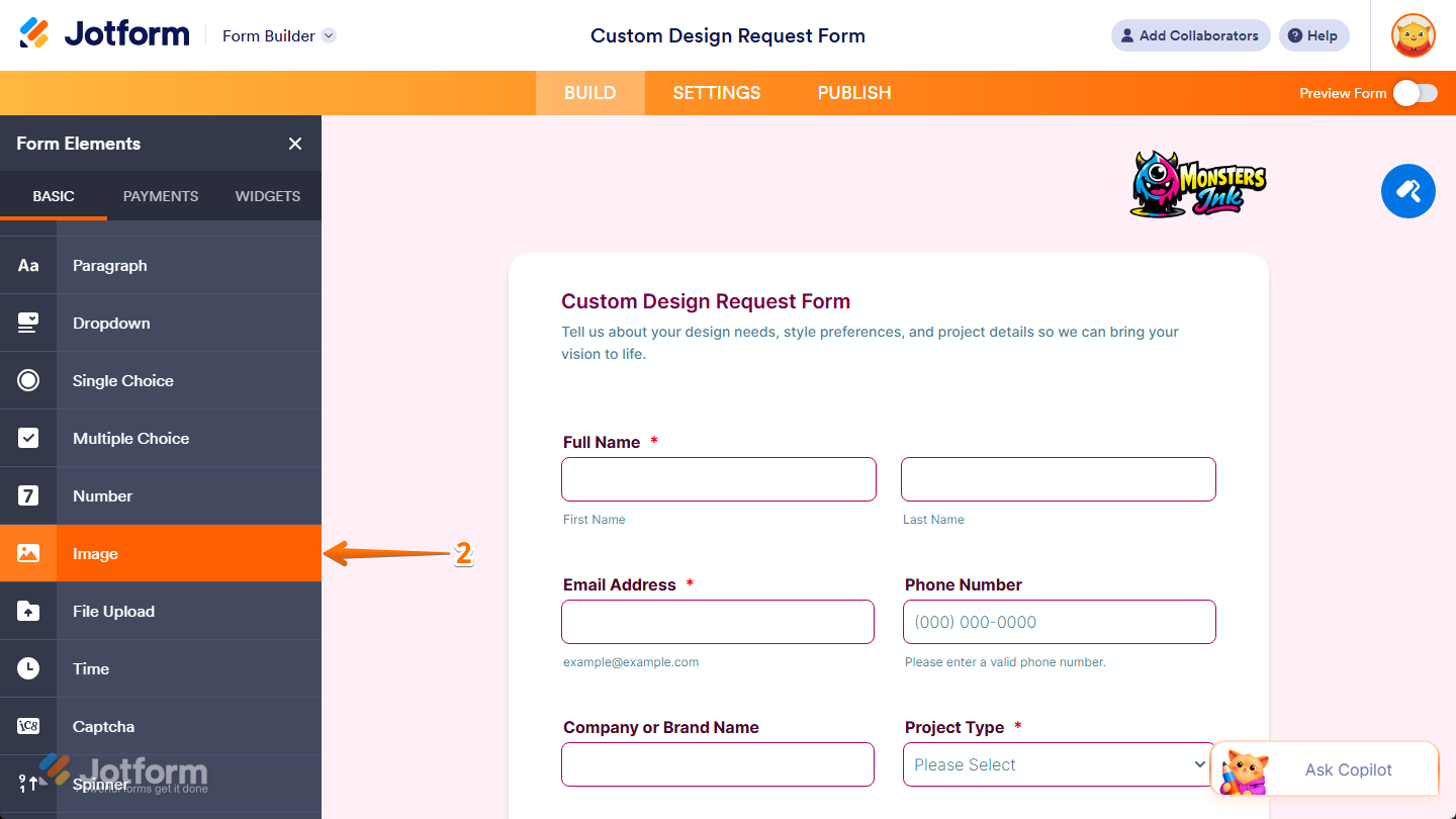
- Then, in the Form Elements menu, under the Basic tab, scroll down and then click on Image. Or, just drag and then drop it to where you want it to be on your form.
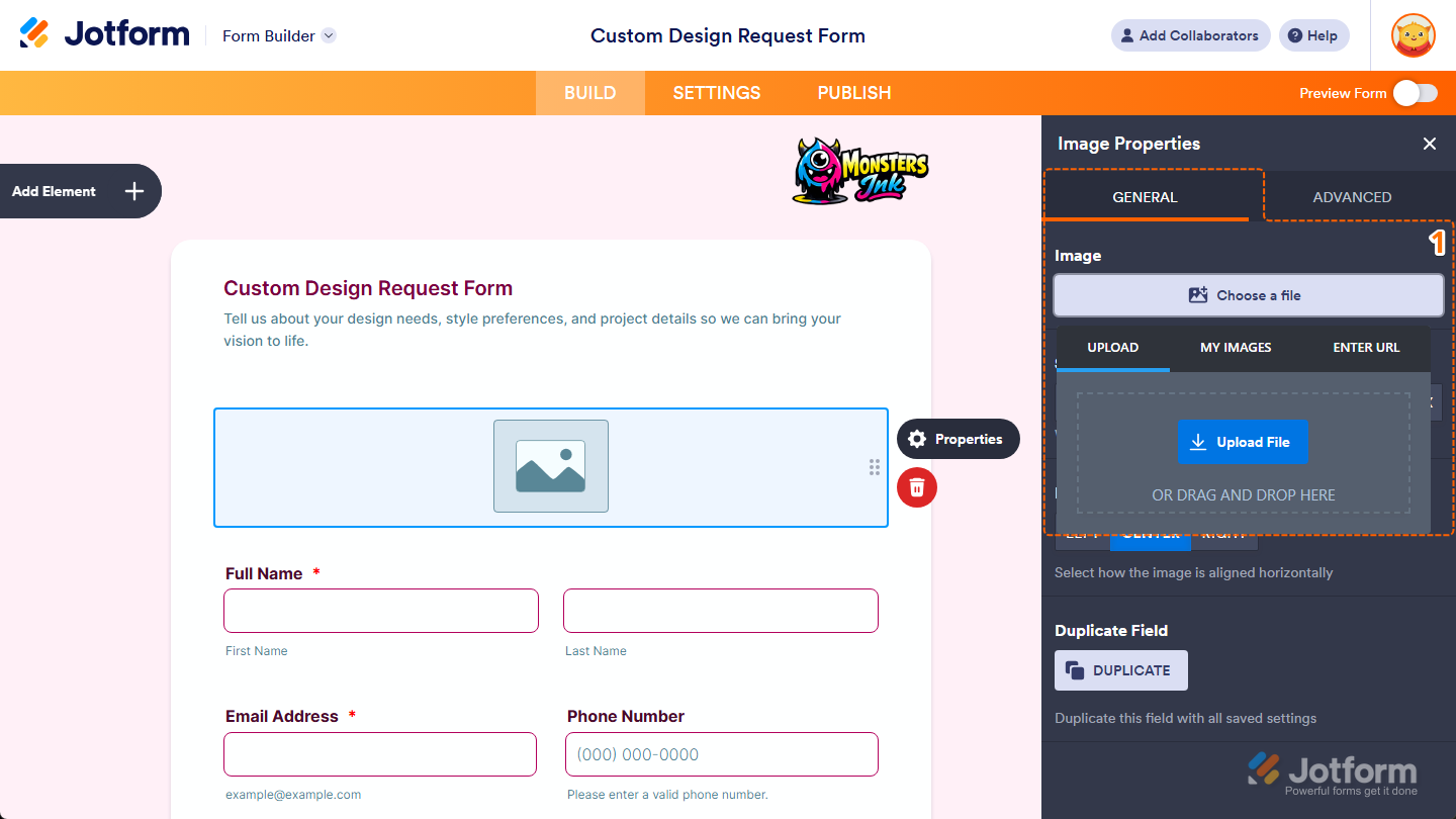
Once you’ve added the Image element to your form, the Image Properties menu opens automatically on the right side of the page, where you can adjust how it appears and works through the following tabs:

Configuring General Tab Properties
After adding the Image element, you can configure its basic properties to control how it looks on your form. Here’s how to set it up:
- In the Image Properties menu, under the General tab, click on the Choose a File button of the Image property, and in the menu that opens, go to one of the following tabs to add an image:
- Upload — Select an image directly from your device.
- My Images — Choose from images you’ve previously used and saved in your account.
- Enter URL — Paste a direct link to the image you want to use.
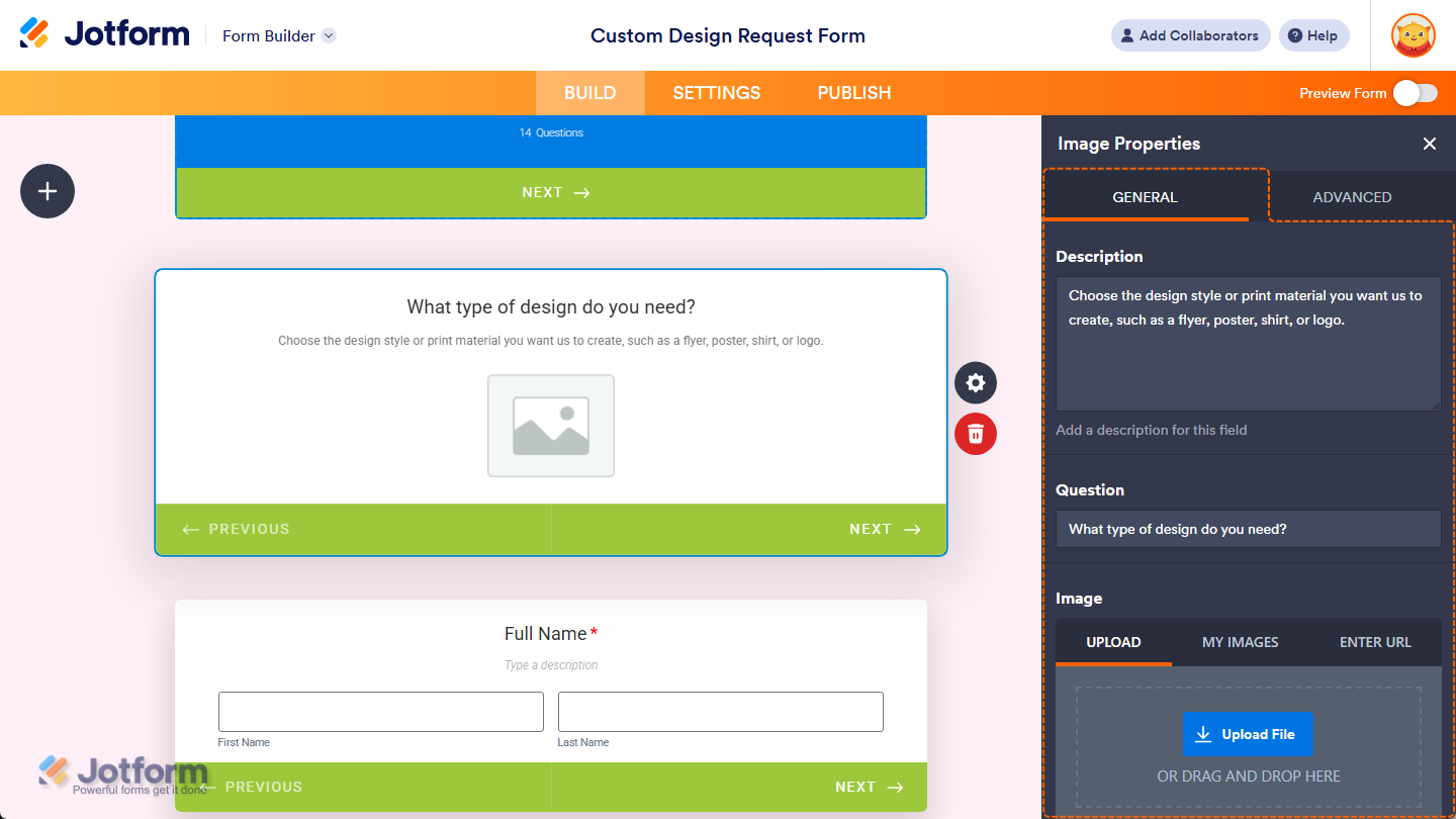
In Card Forms, the tabs for adding an image are shown by default, and you can enter text in the Description and Question properties to add context or instructions that appear above your image.
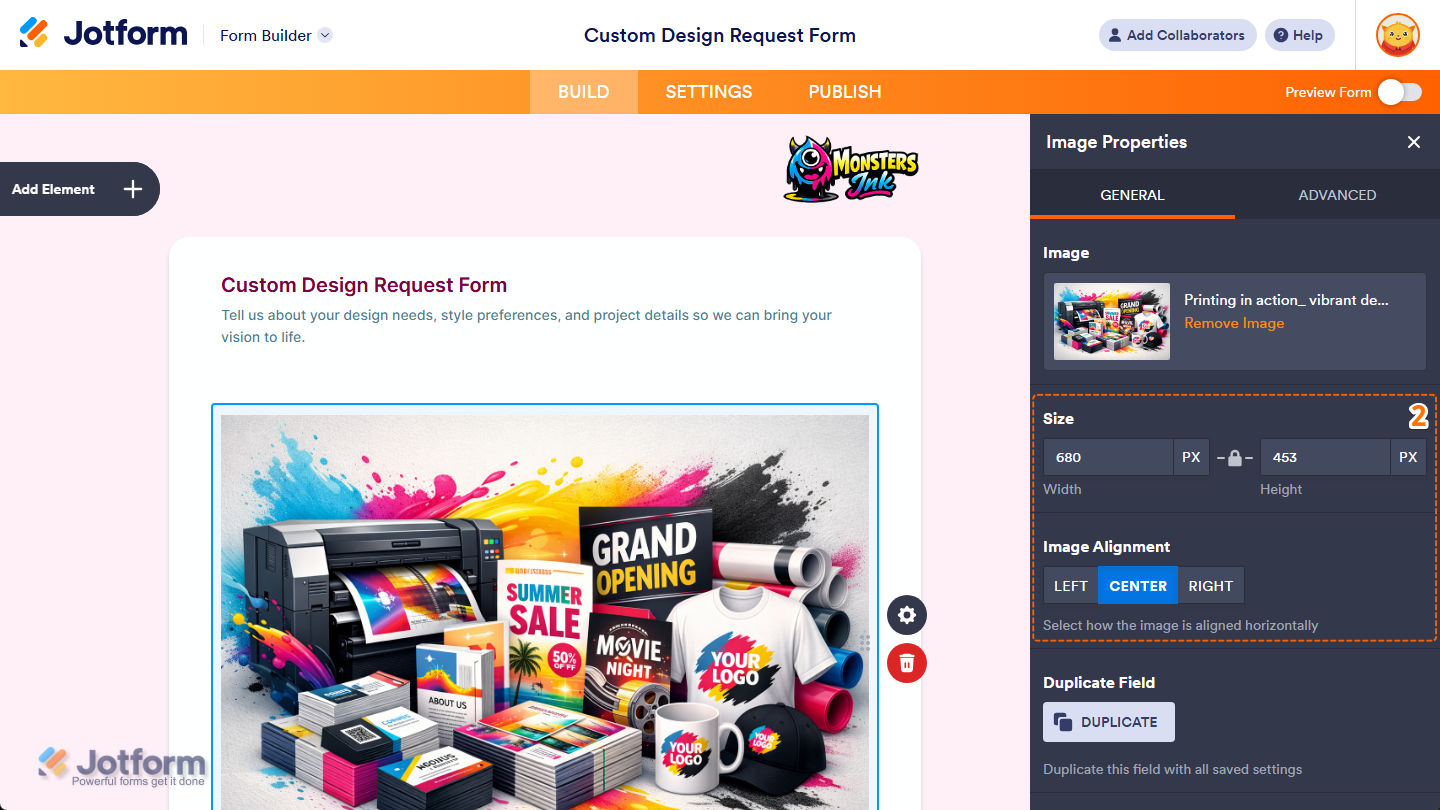
- Next, continue configuring these properties:
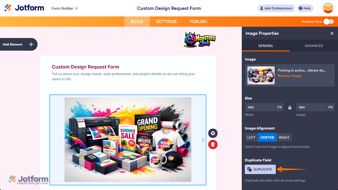
- Size — Keep your selected image’s original size or let it fit the width of your form if it’s too wide. Or, use the Width and Height input boxes if you want to manually set its size in pixels. You can also click the Padlock icon between the fields to unlock the aspect ratio and set a custom width and height separately. You’ll only find this property in Classic Forms.
- Image Alignment — Keep this set to Center to position your selected image in the middle of your Image element’s width, or select Left or Right to position it on either side.
That’s it. You’ve configured the General tab properties of the Image element on your form. If you want to create a copy of your selected image with the same setup, click on the Duplicate button at the bottom of this tab.
Customizing Advanced Tab Properties
Once you’ve added the Image element to your form, you can customize its additional properties to manage how it works with different form features. Here’s what to do next:
- In the Image Properties menu, go to the Advanced tab and you’ll see this list of properties you can customize:
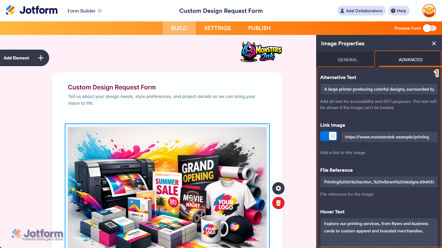
- Alternative Text — Enter alternative text if you want to describe your selected image for accessibility and SEO purposes. The text may also appear if the image can’t be loaded.
- Link Image — Toggle this on if you want to make your selected image clickable. Then, in the field that appears on the right side of it, enter the link where users should be taken when they click on the image.
- File Reference — Enter a file reference if you want to add a reference value for your selected image. This can help identify the image when working with custom setups or advanced form use.
- Hover Text — Enter the text you want to show as a short description when users hover their mouse over your selected image. You’ll only find this property in Classic Forms.
- Next, scroll down to the bottom and continue customizing these properties:
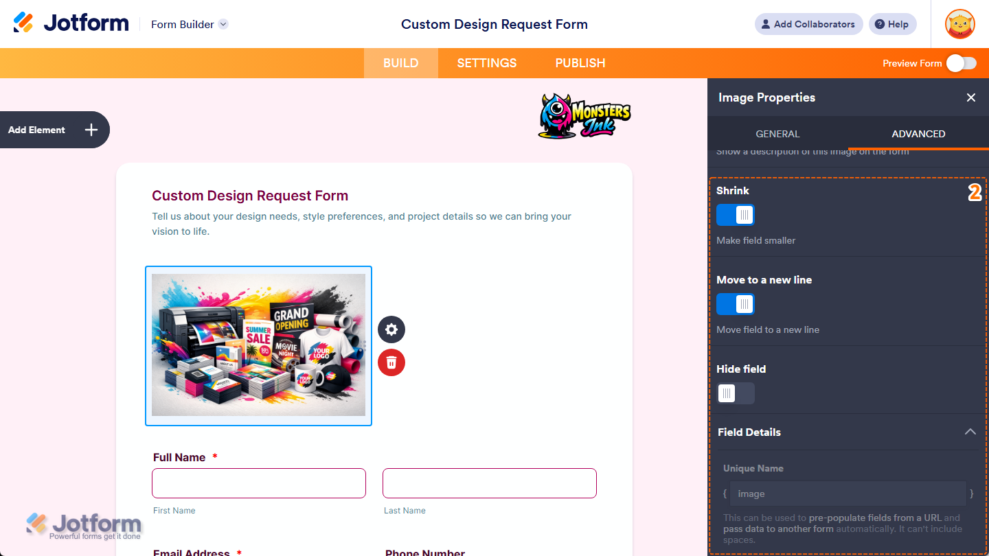
- Shrink — Toggle this on if you want to reduce your selected image’s width to half or to fit within the width of your form’s column while maintaining its aspect ratio. You can check out our guide on Setting Up Form Columns to learn more. You’ll only find this property in Classic Forms.
- Move to a New Line — You’ll only see this when the Shrink property is enabled. Toggle this on if you want to move your selected image to a new line instead of placing it next to another shrunk form element.
- Hide Field — Toggle this on if you want to hide your selected image on your form. Take a look at our guide on How to Hide Form Elements for more details.
- Field Details — Click on this section to expand it and view, copy, or update the Image element’s Unique Name.
That’s it. You’ve customized the Advanced tab properties of the Image element on your form
Replacing the Image Element Content
If the images in your Image Element become outdated, and you want to change them, that’s easy too. Here’s what to do:
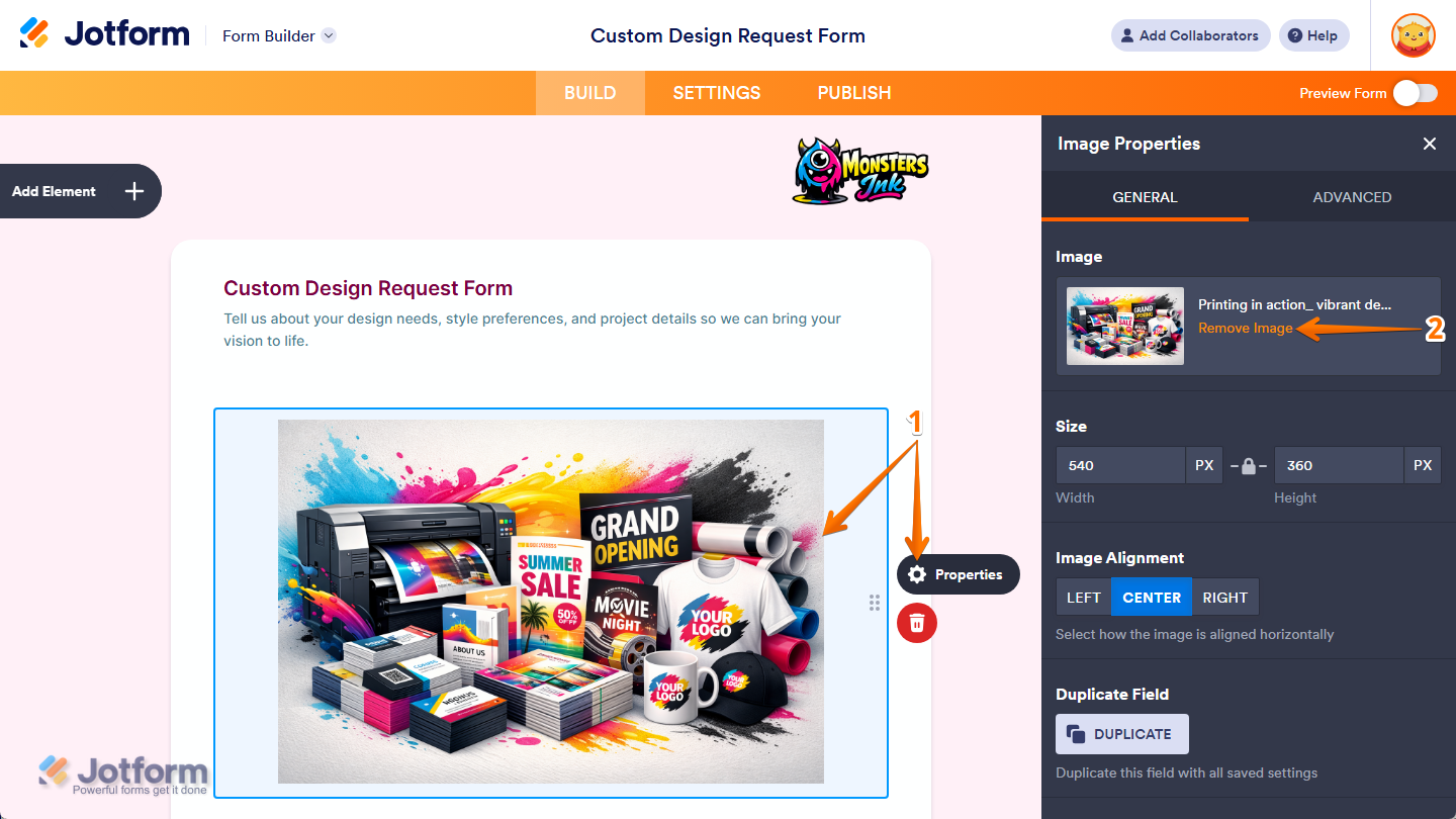
- In Form Builder, click on your Image element and then click on the Gear icon on the right side of it.
- Then, under the General tab of the Image Properties menu, click on Remove Image next to the Image Thumbnail.
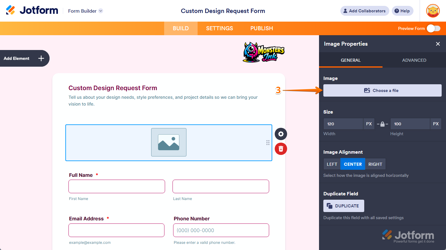
- Then, click on Choose a File to upload a new file.
Note
Any changes you make in the Image Properties window are saved automatically.

Send Comment: