Adding a Full Name field to your form is a simple way to collect complete and well-structured user information. Instead of asking for names separately, this element neatly organizes everything in one place, making it easier for both you and your users. In this guide, you’ll learn how to add and set up the Full Name element to fit your form’s needs.
Here are a few ways to use it:
- Use it for registration forms to collect complete names for events, sign-ups, or memberships.
- Add it to contact forms so you can easily identify and respond to users.
- Include it in job application forms to gather applicant details in a clear and organized way.
- Use it for order or booking forms to keep customer information accurate and consistent.
Adding and Setting Up the Full Name Element
Whether you’re building a new form or editing an existing one, you can add and configure the Full Name element in just a few steps. This is how it’s done:
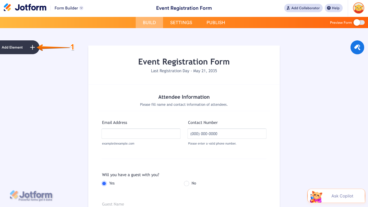
- In Form Builder, click on Add Element on the left side of the page.
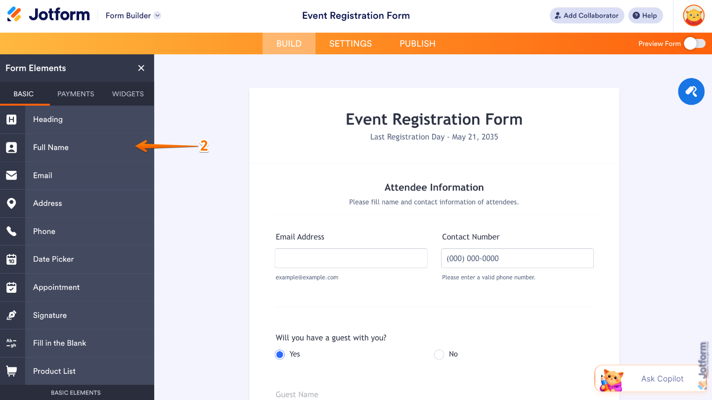
- Now, in the Form Elements menu, under the Basic tab, click on Full Name. Or, just drag and then drop it to where you want it to be on your form.
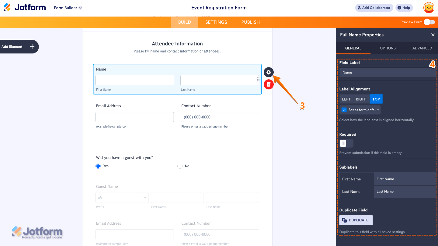
- Next, click on the Gear icon to open the Full Name Properties menu on the right side of the page.
- Then, under the General tab, set up these things:
- Field Label — Enter the main label shown above the Full Name field.
- Label Alignment — Use this to control where the label appears in relation to the field.
- Required — Toggle this on if you want to make the Full Name field mandatory to complete.
- Sublabels — Set this up to customize labels for each part of the name field.
- Duplicate Field — Click on Duplicate to create a copy of this field with all its saved settings.
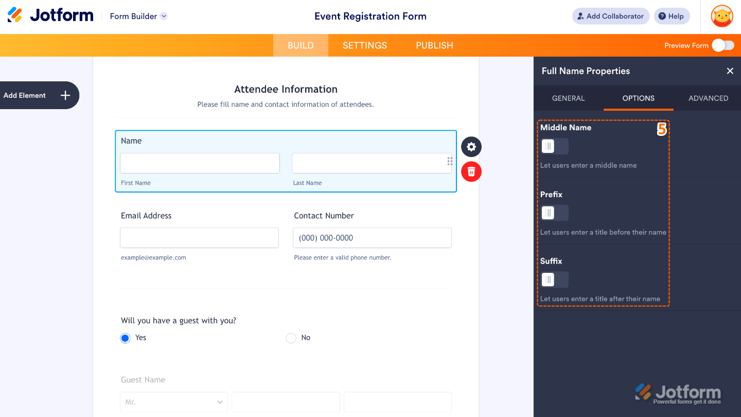
- After that, click on the Options tab and toggle on the options that you want to use:
- Middle Name — Toggle this on to add a middle name input field.
- Prefix — Enable this to add a title field before the name.
- Suffix — Turn this on to add a suffix field after the name.
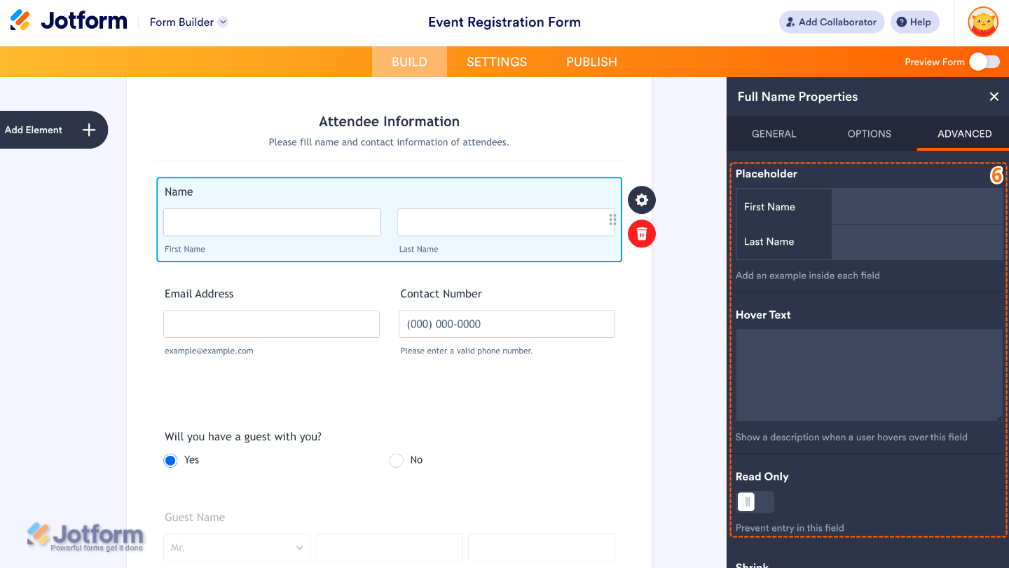
- Finally, click on the Advanced tab and continue to manage these details:
- PlaceHolder — Use this to display sample text inside the input field.
- Hover Text — Set this up to show help text when users hover over the field.
- Read Only — Toggle this on to make the field non-editable.
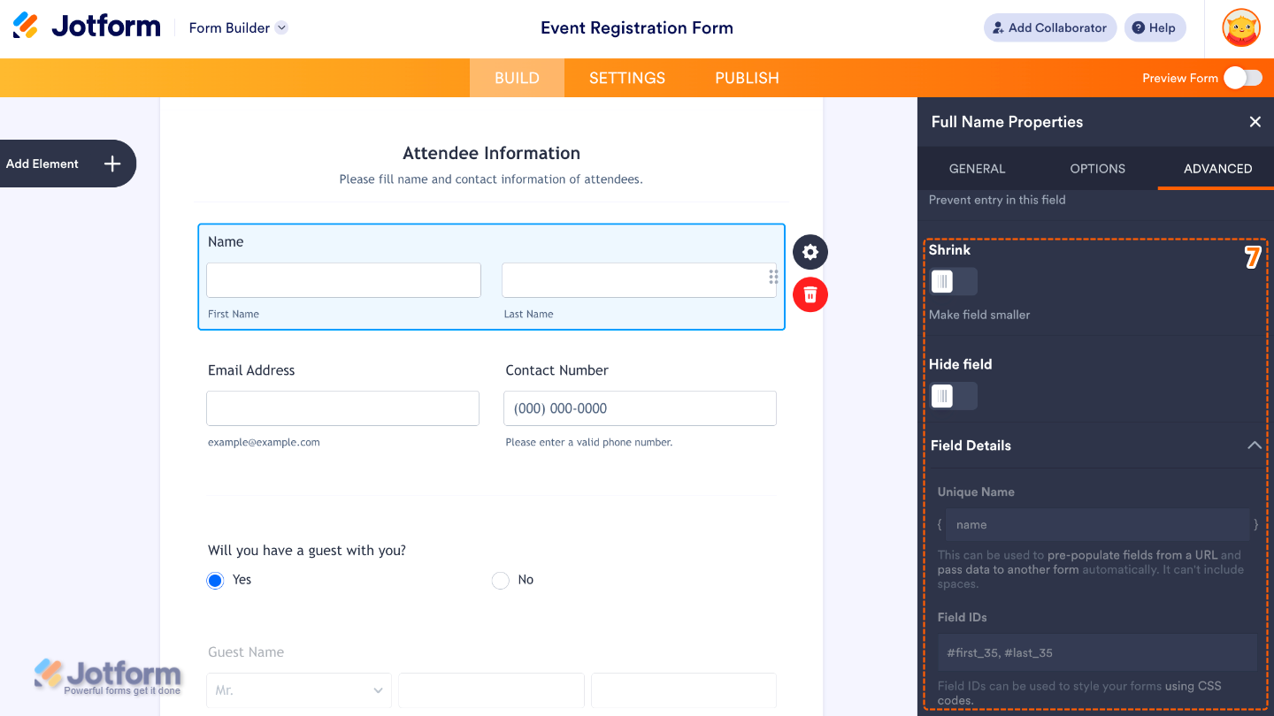
- Then, scroll down to set up these last three options:
- Shrink — When enabled, it reduces the visual size of the field.
- Hide Field — Turn this on to completely hide the field from users.
- Field Details — Field Details — View additional technical information about the field:
- Unique Name — The unique identifier for the field, which can be used to pre-populate it from a URL or pass data to another form automatically.
- Field IDs — The CSS selector for the field, which can be used to style it with custom CSS.
That’s it. You now have a properly set up Full Name element that helps you collect complete and well-structured name information, making your form easier to fill out and your responses more organized. Try it out and see what it looks like on this demo form.

Note
The Full Name element is available in both Classic and Card form layouts. However, some options like Shrink and Hover Text are not available in the Card layout, while it includes a Description option in the General tab instead.
Pro Tips
- Enable only the name fields you actually need (like Middle Name, Prefix, or Suffix) to avoid overwhelming users with unnecessary inputs.
- Use Sublabels to guide users properly, especially if your audience includes international users with different name formats.
- Turn on Required only when the full name is essential for submission to prevent incomplete form entries.
- Add Placeholder text to give users a quick example of the expected format and reduce input mistakes.

Send Comment: