Jotform’s Date Range Picker widget lets users quickly select a start and end date via an interactive calendar field, making it easier to collect accurate date ranges without manual entry. It’s ideal for booking forms, reservation requests, vacation planning, rental periods, event registrations, and other forms that require a date range selection, helping create a smoother, faster, and more user-friendly form experience.
Here are a few ways to use it:
- Schedule appointments and booking dates.
- Manage hotel and restaurant reservations.
- Process employee leave and vacation requests.
- Organize equipment and property rentals.
- Set up event registrations and attendance periods.
Pro Tip
The Date Range Picker widget is available in both Classic and Card Forms. You can check out our guide on When to Use Card Forms to learn more.
Whether you’re building a new form or editing an existing one, you can add and configure the Date Range Picker widget in just a few steps. Here’s how:
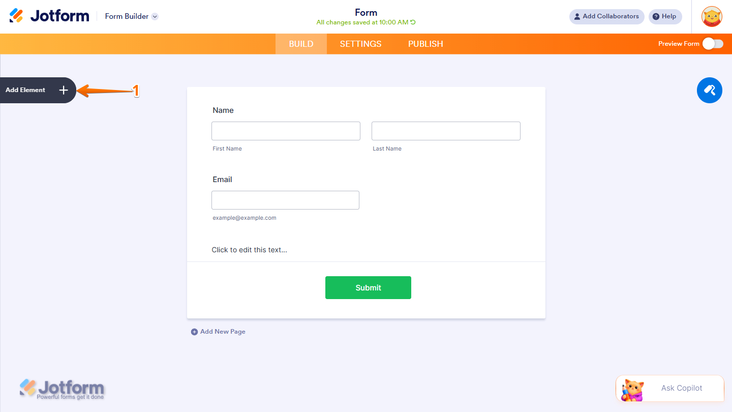
- In Form Builder, click on Add Element on the left side of the page.
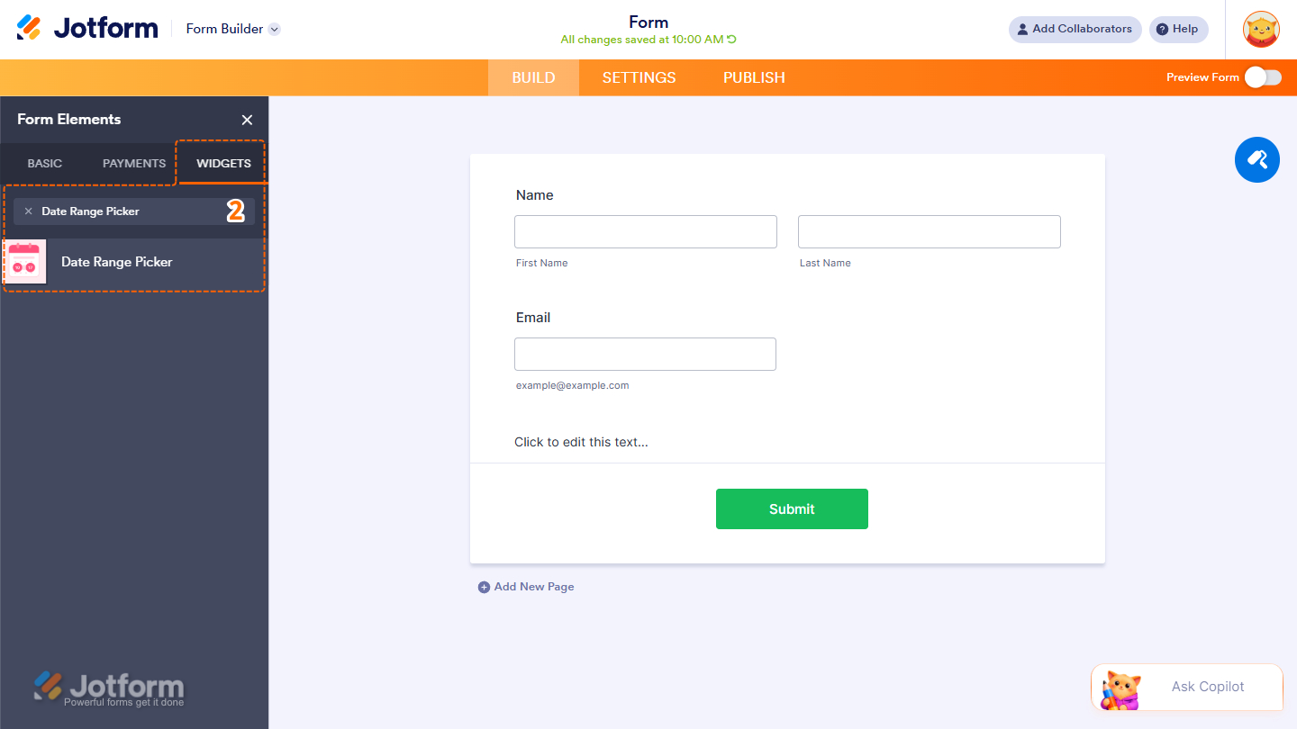
- Now, in the Form Elements menu, under the Widgets tab, search for Date Range Picker and click on it. Or drag and drop it to where you want it on your form.
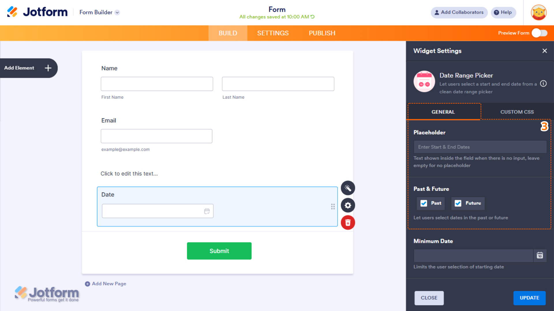
- Next, in the Widget Settings window that opens on the right side of the page, under the General tab, set up these things:
- Placeholder — The text displayed inside the field before a date range is selected. Leave this empty if you do not want to show placeholder text.
- Past & Future — Select whether users can select dates from the past, the future, or both.
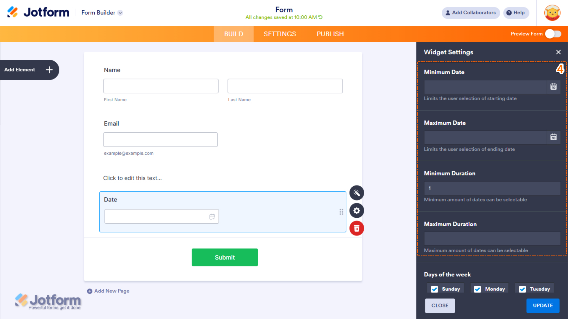
- Then, scroll down to the middle and continue to set up these settings:
- Minimum Date — Set the earliest start date users can select.
- Maximum Date — Set the latest ending date users can select.
- Minimum Duration — Define the minimum number of days allowed for the selected date range.
- Maximum Duration — Define the maximum number of days allowed for the selected date range.
- Next, scroll down and configure these things:
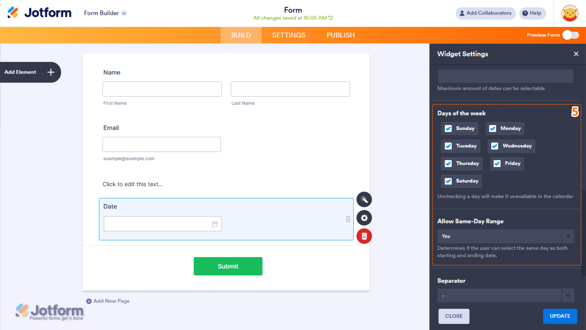
- Days of the Week — Disable specific days to prevent them from being selected in the calendar.
- Allow Same-Day Range — Select whether users can select the same date as both the start and end of the range.
- Now, scroll down to the bottom and complete these fields:
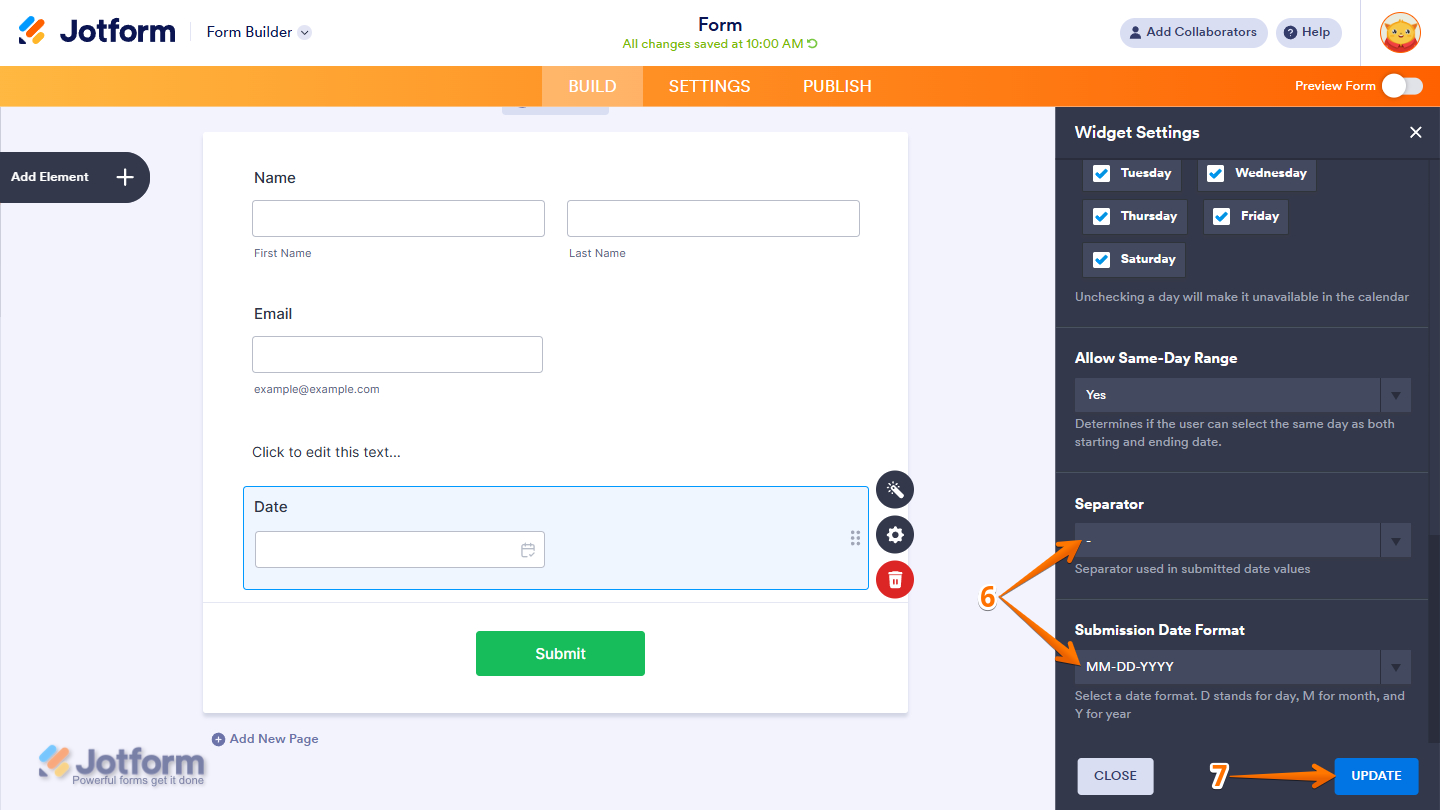
- Separator — Select the character used to separate dates in submitted values, such as a hyphen, slash, or dot.
- Submission Date Format — Select how dates are saved in submissions. D represents day, M represents month, and Y represents year.
- Once everything’s set, click on Update.
That’s it. You’ve successfully added and set up the Date Range Picker widget on your form. Curious how it works on a live form? Check out this demo.
Pro Tip
- For advanced styling of the Date Range Picker widget on a Classic Form layout, you can add your own custom CSS code under the Custom CSS tab in the Widget Settings. Our guide on How to Inject CSS Codes to Widgets walks you through everything.
- You can also configure the widget properties, like alignment, labels, size, visibility, and more, to control how it looks and behaves on your form. Check out our guide on How to Access and Configure the Question Properties of a Widget to learn more.

Send Comment: