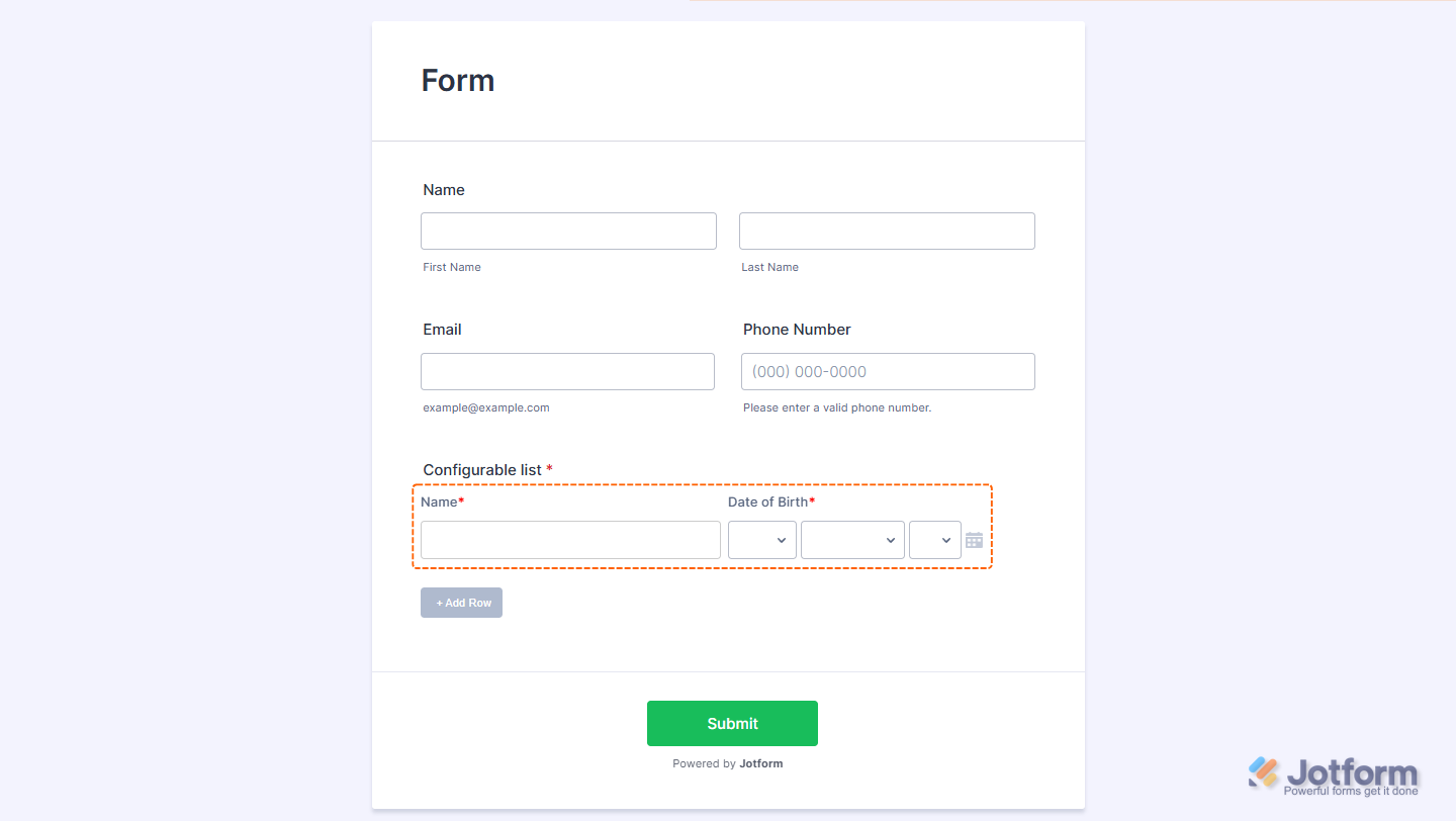
The Configurable List widget allows you to define and display a set of fields or questions that users can duplicate as needed. This is ideal for cases where a respondent needs to answer the same set of questions multiple times. For example, entering information for multiple people, items, or tasks.
Adding and Setting Up the Configurable List Widget
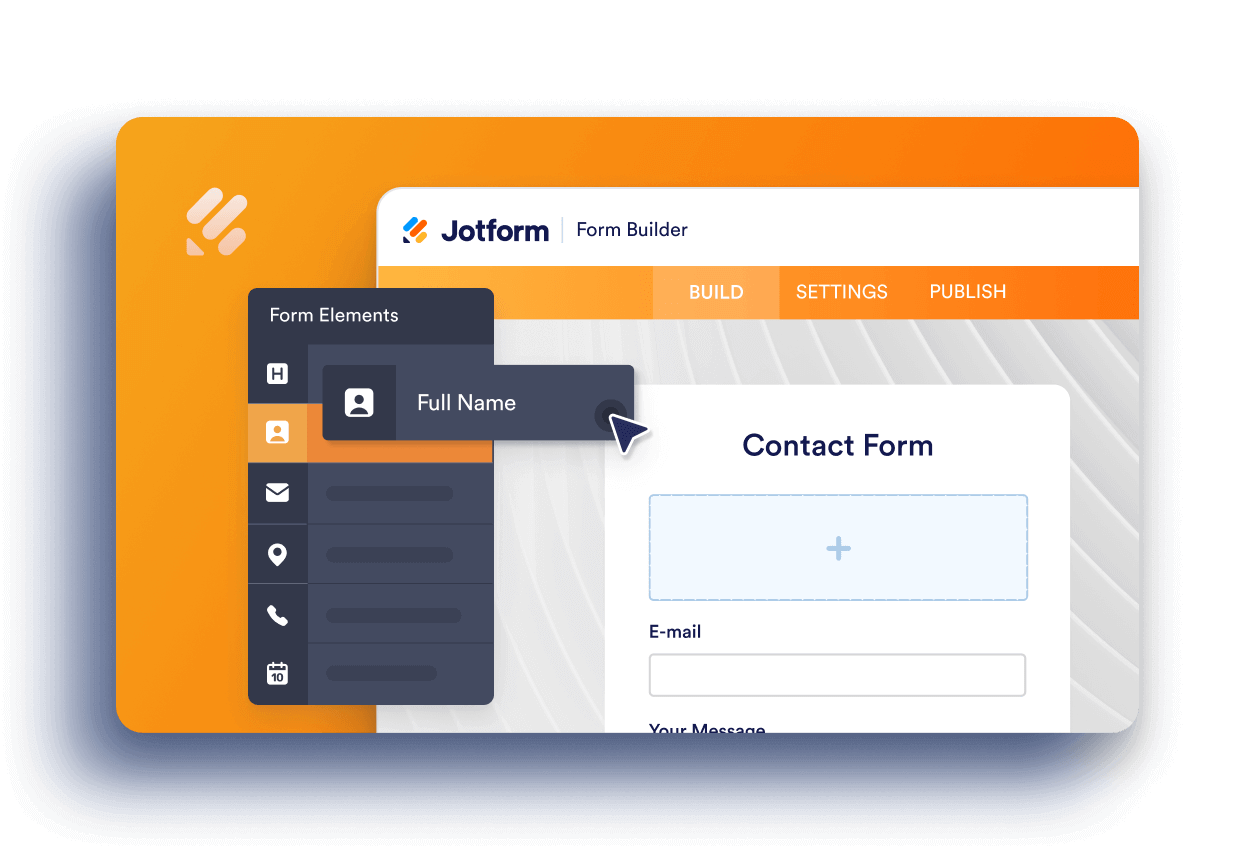
Adding the Configurable List widget to your form and setting it up is pretty simple. Here’s how to do it:
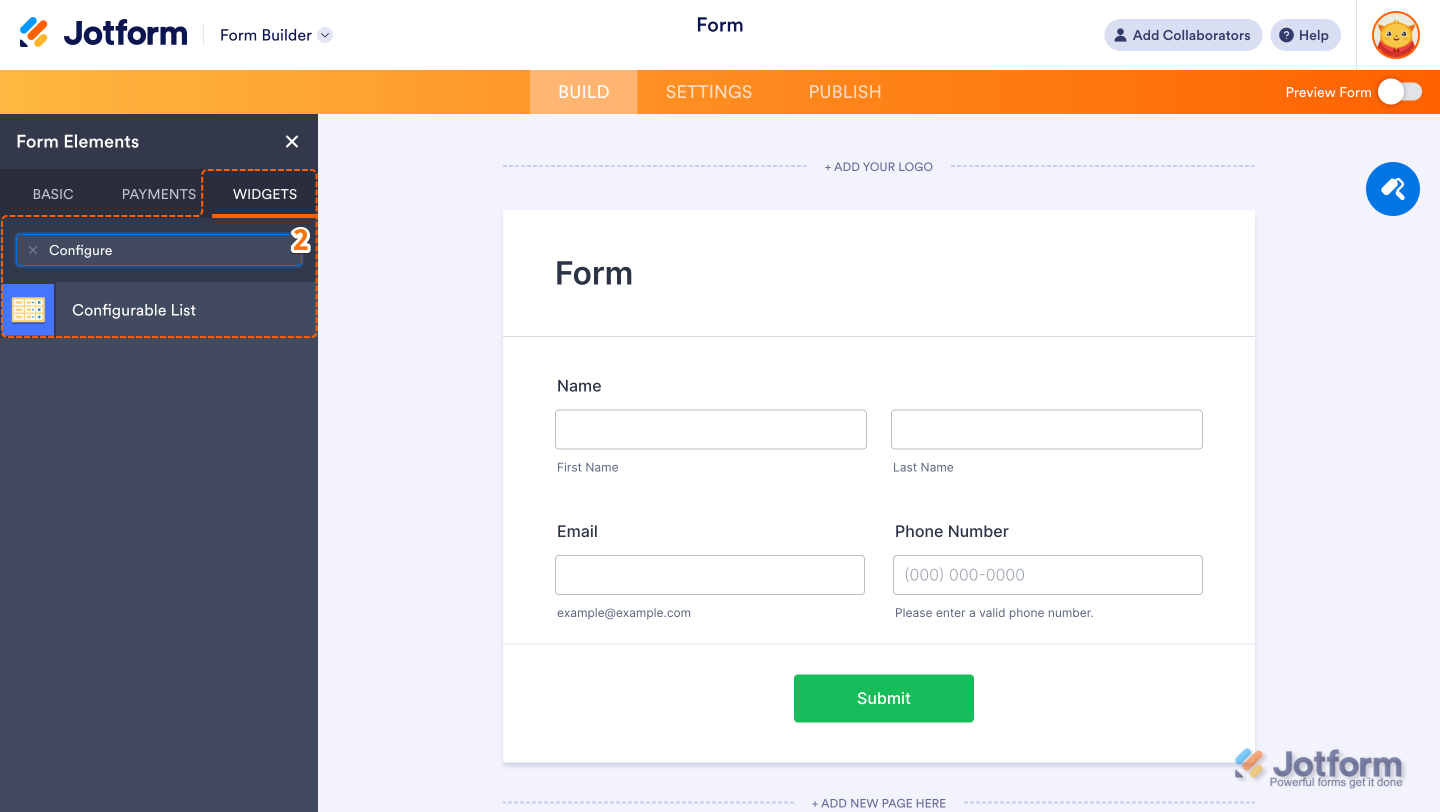
- In Form Builder, click on Add Element on the left side of the page.

- Now, in the menu on the left, under the Widgets tab, click on Configurable List widget to add it to your form.
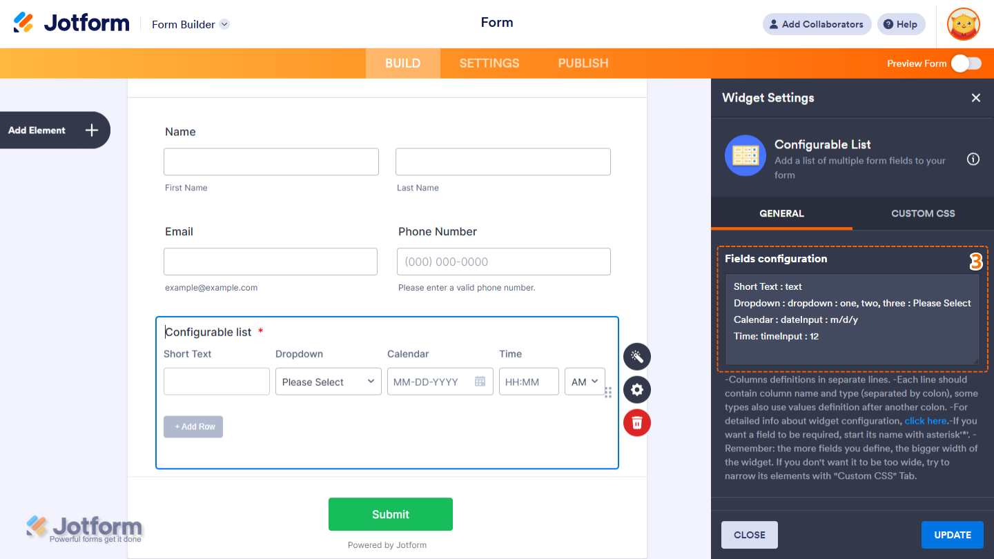
- Next, in the Widget Settings menu that opens on the right side of the page, set up the following things:
- Field Configuration — Use this area to define the fields that will appear in each row of the list using the correct syntax. Check out our guide about the Supported Field Types and Syntax for the Configurable List Widget for more details.
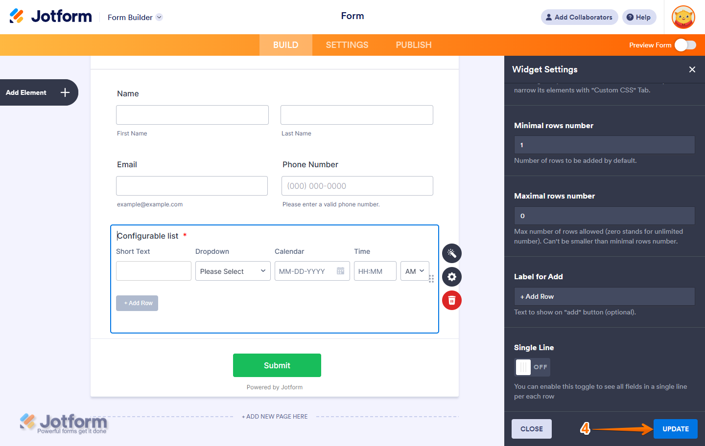
- Minimal Rows Number — This is the number of Rows to be added by Default.
- Maximal Rows Number — Use 0 to allow unlimited rows. This number must be equal to or greater than the minimal row number.
- Label for Add — Optionally customize the Text to show on Add button.
- Single Line — Toggle this On to see all fields in a single line per each row.
- Field Configuration — Use this area to define the fields that will appear in each row of the list using the correct syntax. Check out our guide about the Supported Field Types and Syntax for the Configurable List Widget for more details.

- Now, click on Update, and you’re all set.
Curious about how it works? Check out this demo form to see it in action.
Supported Field Types and Syntax for the Configurable List Widget
The Configurable List widget supports a variety of input types, allowing you to dynamically collect different kinds of information on your form. Here’s the complete list of supported field types and the syntax you can use to add them:
Note
Each field declaration must be placed on a new line for it to work correctly.
Let’s take a closer look at the syntax for each supported field type below:
Text
Use this for basic single-line responses like names or email addresses.
Syntax:
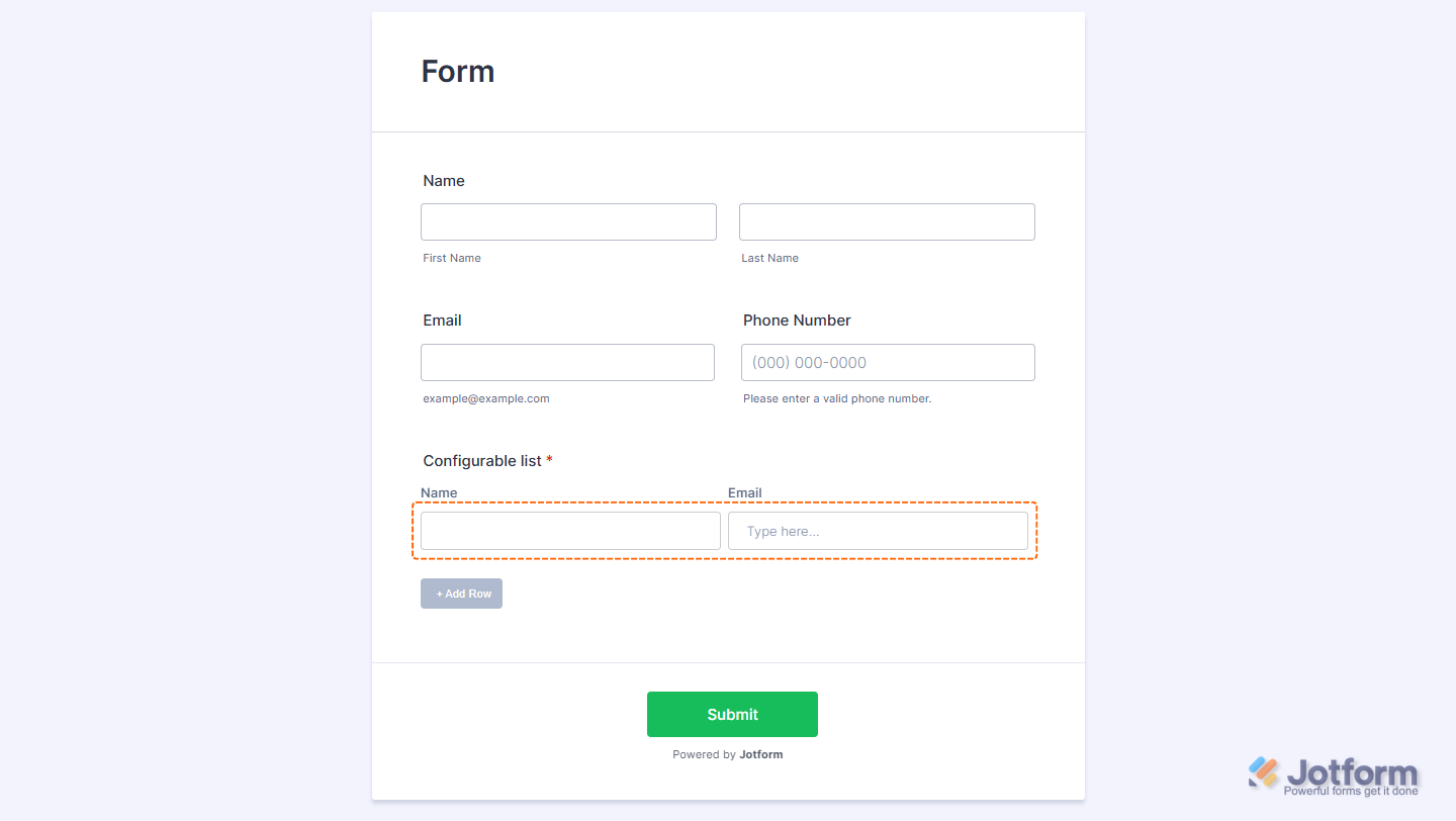
Label: text[:placeholder]Examples:
- Name: text
- Email: text: Type here…
Number
Use this to collect numeric inputs such as age, quantity, or ratings.
Syntax:
Label: number[:placeholder:step,min,max]Examples:
- Quantity: number
- Age: number: Enter your age
- Rating: number::1,1,10

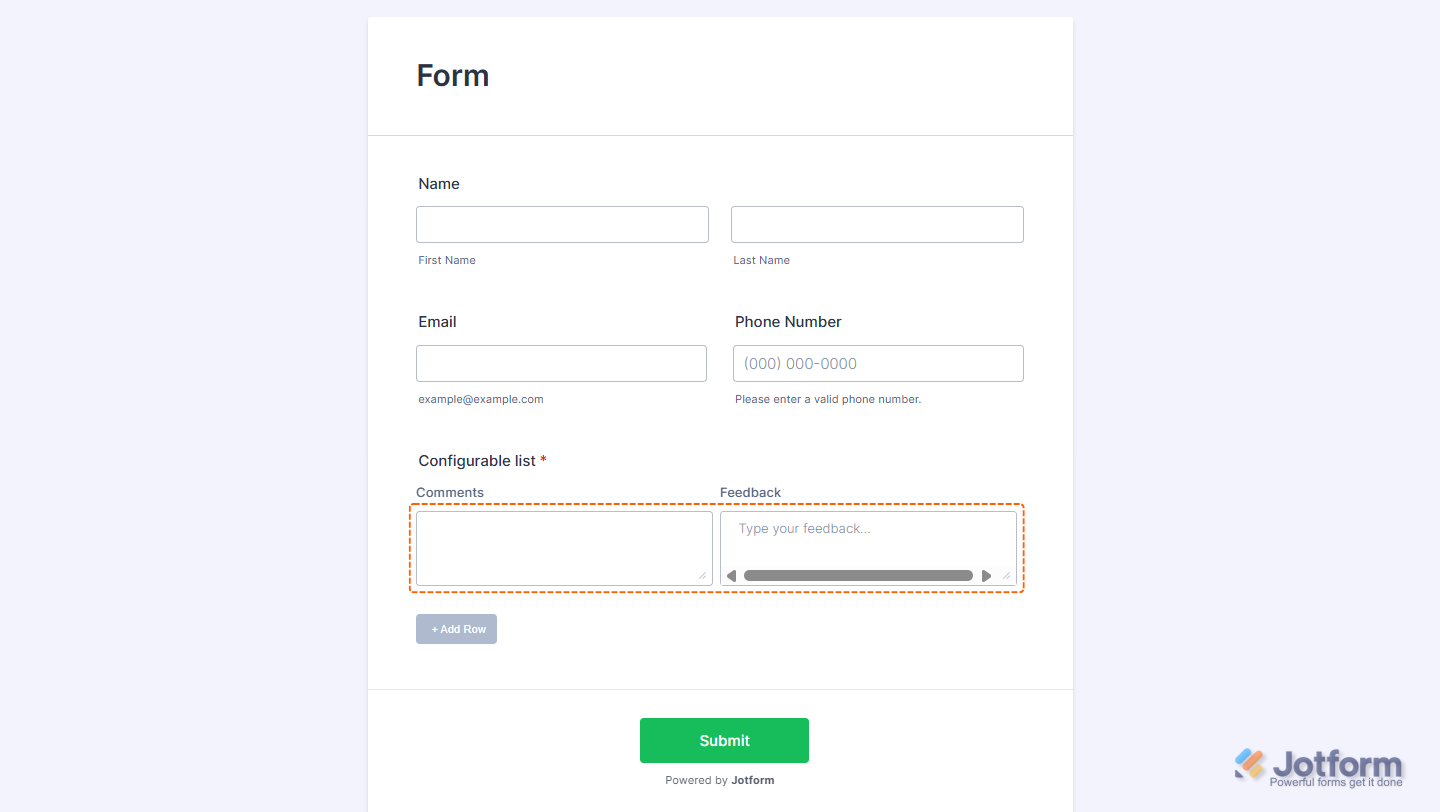
Text Area
Use this for longer responses like notes or comments.
Syntax:
Label: textarea[:placeholder]Examples:
- Comments: textarea
- Feedback: textarea: Type your feedback…
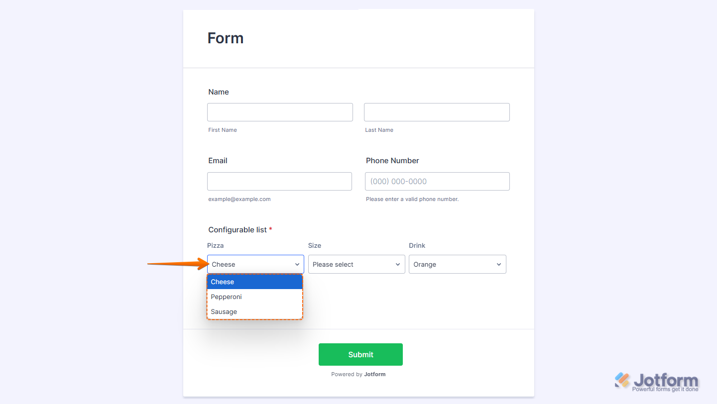
Dropdown
Use this to allow selection from a list of predefined options.
Syntax:
Label: dropdown: option1, option2, option3[:defaultOption]To have one of the options selected by default, replace the placeholder with one of the options on your list. Examples:
- Pizza: dropdown: Cheese, Pepperoni, Sausage
- Size: dropdown: Small, Medium, Large: Please select
- Drink: dropdown: Apple, Orange, Pineapple: Orange
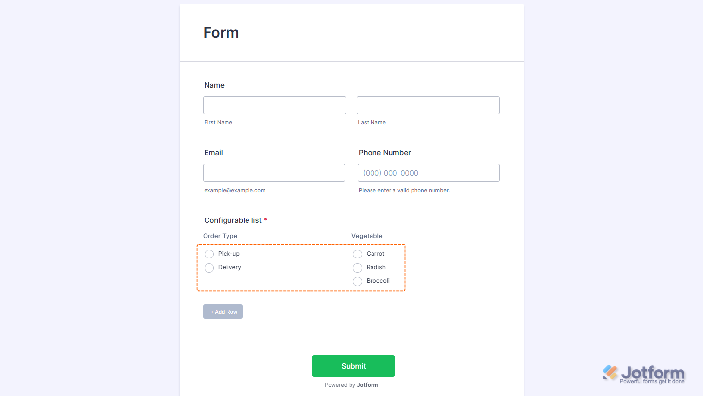
Radio Button
Use this for single-choice options displayed as radio buttons.
Syntax:
Label: radio: option1, option2, option3Examples:
- Order Type: radio: Pick-up, Delivery
- Vegetable: radio: Carrot, Radish, Broccoli
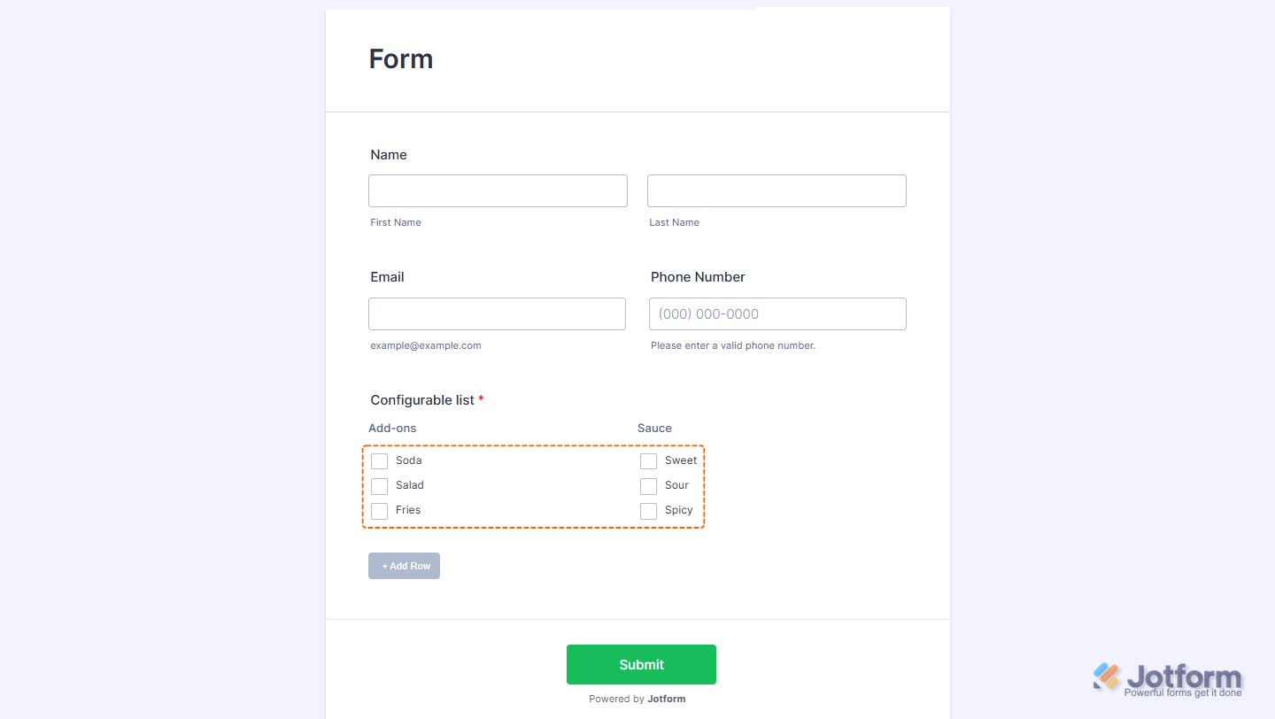
Checkbox
Use this for multiple-choice options. Users can select more than one.
Label: checkbox: option1, option2, option3Examples:
- Add-ons: checkbox: Soda, Salad, Fries
- Sauce: checkbox: Sweet, Sour, Spicy
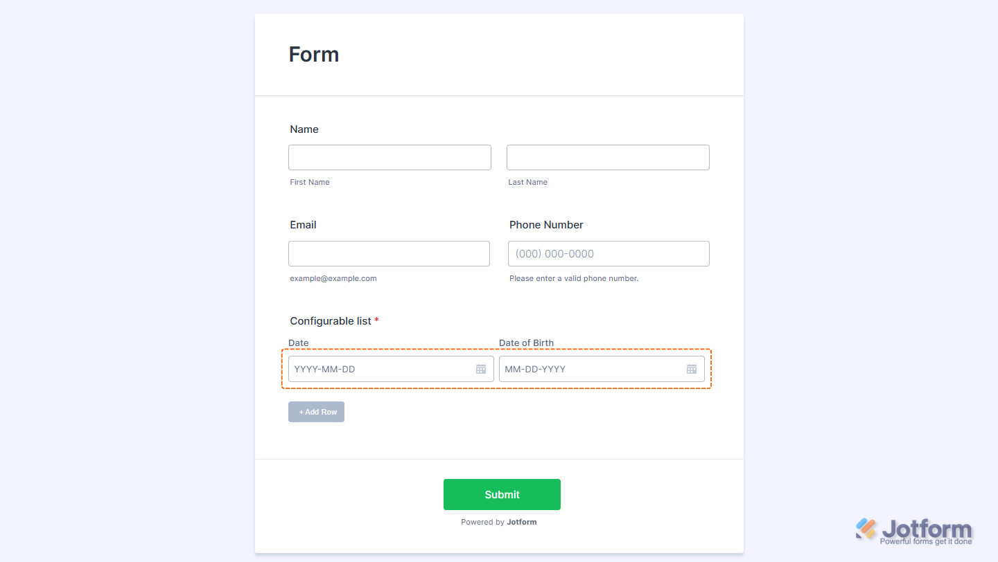
Date Input
Use this to show a calendar date picker.
Syntax:
Label: dateInput[:format]If the date format is undefined or invalid, it defaults to y/m/d. You can rearrange the format if you want it.
Examples:
- Date: dateInput
- Date of Birth: dateInput: m/d/y
Time Input
Use this to let users select a time value.
Syntax:
Label: timeInput:format[,now]- The allowed format values are 12 (with AM/PM selector) and 24. If invalid, it defaults to 12.
- To set the current time as default, append “,now” to the declaration.
Examples:
- Appointment Time: timeInput: 24
- Current Time: timeInput: 12,now

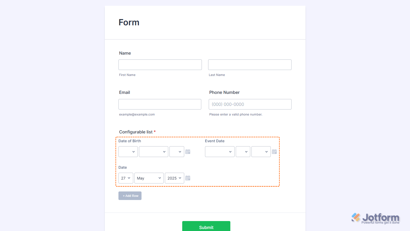
Date
Use this to display date selection in dropdown format (month/day/year).
Syntax:
Label: date[:format:range:today]- If the date format is undefined or invalid, it defaults to y/m/d. You can rearrange the format if you want it.
- The year range is formatted as start–end (e.g., 2015–2025). If you don’t set it or enter something invalid, it defaults to a range from 10 years ago through to 1 year from today.
- To set the current date as default, append “:today” to the declaration.
Examples:
- Date of Birth: date
- Event Date: date: m/d/y: 2025–2030
- Date: date: d/m/y: today
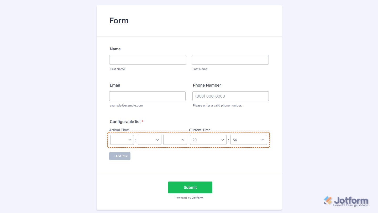
Time
Use this to show hour/minute/AM-PM dropdowns.
Syntax:
Label: time[:format,now]- The allowed format values are 12 (with AM/PM selector) and 24. If undefined or invalid, it defaults to 12.
- To set the current time as the default, append “,now” to the declaration.
Examples:
- Arrival Time: time:12
- Current Time: time:12,now
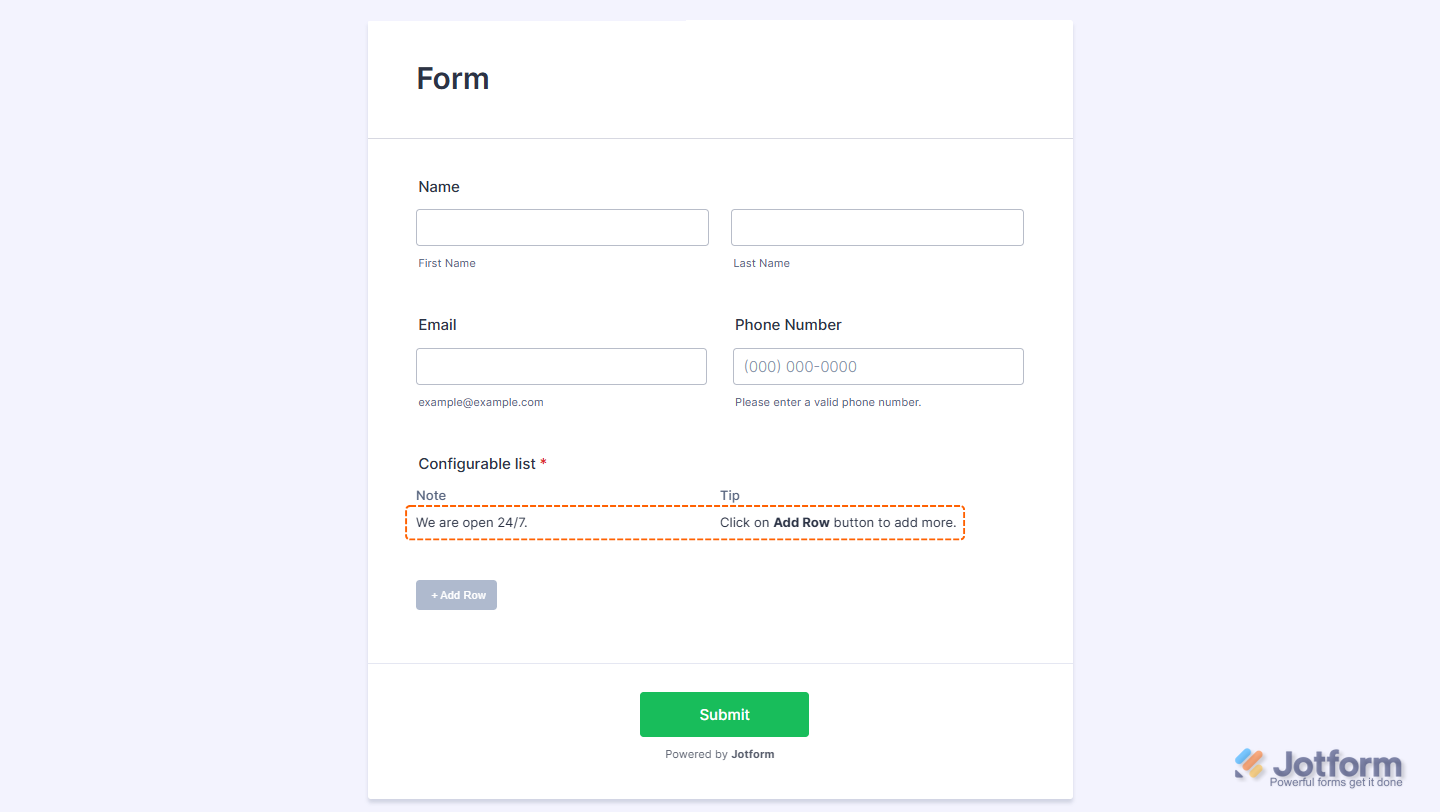
Static
Use this to add read-only notes, hints, or instructional text between fields.
Syntax:
Label: static: [text]- Supports basic HTML for formatting.
Examples:
- Note: static: We are open 24/7.
- Tip: static: Click on the <strong>Add Row</strong> button to add more.
Making Configurable List Fields Required
To make a field required, add an asterisk (*) at the beginning of its declaration. This ensures that users must fill out the field before submitting the form.
Examples:
- *Name: text
- *Date of Birth: date
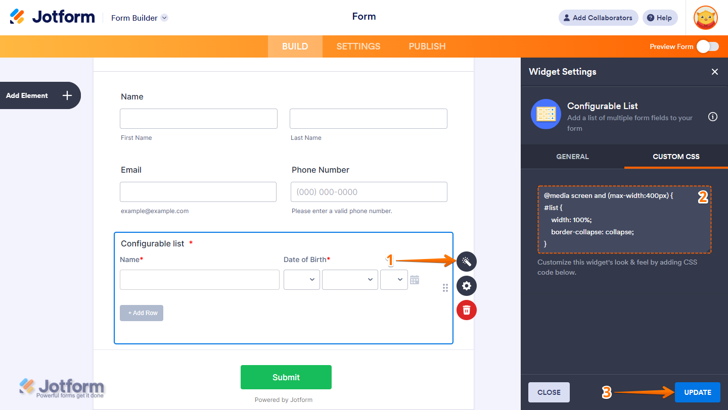
Customizing the Appearance of Your Configurable List
You can customize the appearance of your list to match your brand, product style, or corporate identity. The Configurable List widget supports custom CSS, giving you full control over its look and layout.
- In Form Builder, select your widget and on the right side of it, click on the Wand icon.
- Then, under the Custom CSS tab, paste in your CSS code.
- Now, click on Update, and you’re all set.

Send Comment:
285 Comments:
35 days ago
None of the answers to the other comments are viewable. It leads to a 404 page.
40 days ago
Is this widget compatible with URL prefilling?
46 days ago
could you make the output on google sheets to create different collum for each category? since its share same collum for all the categories.
67 days ago
Can you prefill any of these columns
69 days ago
Hola, puedo agregar la opción de subir imagen o tomar foto a la lista configurable?
71 days ago
Yes, i have some question.. How we place each input data in a Configurable List into a single column in Google Sheets ??
85 days ago
How to place each input data in a Configurable List into a single column in Google Sheets
98 days ago
Hi, it looks like your Demo Form is broken. I have an error where Configurable List never renders in my forms in Edit or in Build. I clicked your Demo Form to compare, and it also renders blank.
Your form:
Is this a new issue? Are others experiencing this?
I'm on Windows, Mozilla Firefox.
107 days ago
I dont know the name of the button so I can change the color, it looks likes its not clickable
112 days ago
Hi, is there a way to have an [email] field that will detect if email was incorrectly input? Like it is in the Basic elements of Jotform?
129 days ago
Y COMO PUEDO PONER UN VALOR POR DEFECTO
149 days ago
Bonjour Jotform,
Je suis fan du widget "liste paramétrable". Je vous demande si possible de prévoir la possibilité de définir une masque de saisie lorsqu'on choisit l'option "number". Bien à vous
156 days ago
No meu, não aparece o campo de CUSTOM CSS
160 days ago
How can I allow the element to expand beyond 1000px? It currently stops growing at that width.
168 days ago
How can I include an escape operator for commas, such that when I create a dropdown menu, I could include values that contain commas, and not separate them as options?
176 days ago
Can this be used with images? I.e. add an image to the row, or a selection of photos using take photo?
181 days ago
Can someone recommend a CSS code to change the color of the "add" button? With the default being gray, respondents think it is inaccessible (of course they don't try first).
196 days ago
When clicking on the wand, it opens "widget settings", but I only see "General", "CSS" is missing as an option. How do I find it?
213 days ago
The custom CSS is hidden for me, i need to pay this ?
216 days ago
I just want to create Diesel Generators log book daily wise start time and stop time entry n nos of generator sets can you suggest any form which integration with google sheet
237 days ago
This is absolutely great - but how do you then get to analyse that data. It shows only in one field on the report. I need to report on each set of the data collected in my report (so for eg. if a staff member undertakes 10 jobs in a day, then the report on them will show 10 lines of data under each of those subheadings within the configurable list). I can not get it to do this!
244 days ago
Hello,
Is it possible to perform calculations within this element so that the first column can be added to or subtracted from the second column, or have the result displayed in a separate column?
245 days ago
How do I make it so it's only 1 field per row? It would be amazing having simple CSS codes for simple stuff like that on this help article. Thanks!
251 days ago
How can the data from one row in this widget be separated out in the Jotform table so it's not all included in one cell?
251 days ago
Is there an upload option?