There’s no question about the value that required form fields bring. They distinguish what information on your form you’d like to have versus what information you absolutely must have. In that sense, nothing prevents people from skipping necessary questions quite like it.
However, like any good thing, it can be overused. And the last thing you want is too many required form fields and actually preventing visitors from filling out the form.
The Case for Required Form Fields
There’s really only one reason people would want to use required form fields: It keeps form visitors from omitting the information that matters most. And it works! If you’re on a sales and marketing team and you need a lead’s email address in order to reach her for further information, a required field is a necessity. The same applies to job or scholarship application forms where you need to know specific skills or qualifications, event registration forms where you need to know the attendees’ names, or surveys where you generally can’t afford incomplete data.
Some Caveats About Required Fields
However, exercise some caution when using required fields as they do run a few risks. For one, requiring some fields can indicate to your respondents that other questions aren’t important enough to answer. If you have a particularly long form, people could take shortcuts by only filling out what they need to, and you’d be left without valuable extra data points.
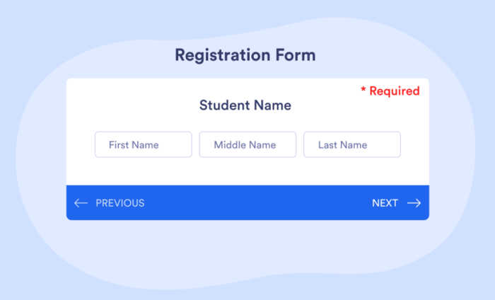
Another risk is the potential of required fields annoying form visitors and, worse, impacting completion rates. Required fields add quite a bit of visual noise to your form, whether it comes from the red asterisk next to the fields themselves, or the warnings that people get when they’ve skipped a field and try to move onto another form question.
Tips for Making Better Forms with Required Fields
Use content, instead of an asterisk, to mark a field required. The reason is simple: many people won’t understand what the asterisk even means. And if they don’t understand what it means, they may try skipping it.
Here’s a required form field as it normally appears.
Here’s an amended field that plainly states it’s required.Similarly, you can also mark which fields are optional, instead of marking which ones are required. This is something many web usability experts recommend. Jessica Enders at Formulate Information Design says, “With required fields, we want users to continue doing what they expect to do: provide answers. With optional fields, we want the user to know they have a choice they don’t normally have. Hence, we should mark optional fields.”
Jotform Required Field Design Options
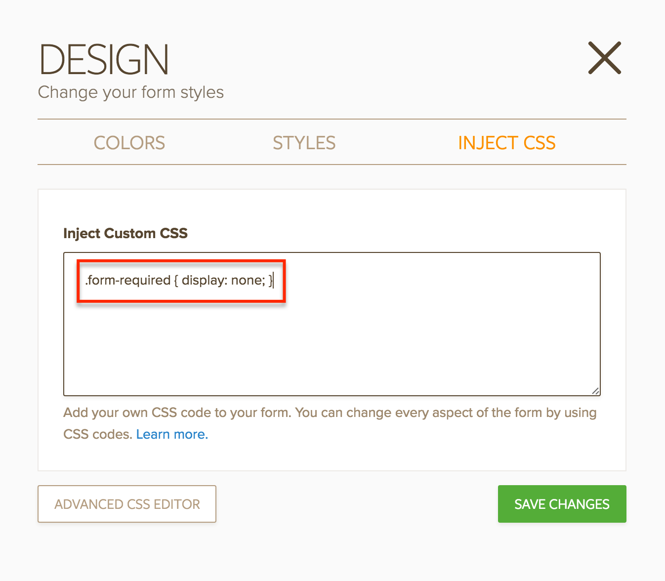
WIth Jotform, you also have an easy alternative option to make form fields required without having them marked with anything on your form. First, click on the Design option at the top of the form builder.
Find the Inject CSS option on the right side of the design panel.
Then copy and paste this code into the text provided:
.form-required { display: none; }
See example here:
Now your form’s required fields won’t appear with an asterisk, and you can include any necessary text next to the field instead!
Lastly, consider giving short instructions on your form — either at the top, subsections, or near the fields themselves — outlining the need for the required fields and how to answer them. Caroline Jarrett, Web form expert and author of Forms That Work, says, “Explain what it is, in plain language and at the start of the form fields.”
For what purpose do you use required fields on your form? How do they work for you? Let us know in the comments!


Send Comment:
4 Comments:
More than a year ago
We use (required) along with the red asterisk for web accessibility purposes, so that screen readers will inform the user that the field is required. If you only use the red asterisk screen readers won't properly inform the user that the field is required. This is at least true of the NVDA screen reader.
More than a year ago
Great suggestions. I've also discovered that if you hide pages that contain required fields, you get an error on submission. So you also need to use the enable/required field condition to unrequire fields to avoid this problem.
More than a year ago
Grande dica! Adorei! Tanks!
More than a year ago
Cant their be an option to replace the asterisk with red text instead??