In this tutorial we will be learning how to create a Magnifying glass in perspective in Adobe Illustrator. When it comes to creating semi-realistic vector illustrations the most important items are to find the easiest way to create them, make sure to create reliability and to try to keep from creating objects with too many anchor points in order to avoid an obstacle in the printing process.
In this tutorial we wont use some of the amazing Illustrator features within the 3D Effect. Using them would make the creation process much easier for sure, but on the other hand there are a few disadvantages we would like to avoid (creating numerous anchor points as previously mentioned). We will try to create a magnifying glass just with the Pen Tool (P) and a few ellipses. Some details will helps us to improve the illustration.
Let’s get down to business!
We will be creating this.
Creating the Head of the Magnifying Glass
Since we are creating a magnifying glass in perspective we will start with the ellipse. Grab the Ellipse Tool (L) and create the ellipse as it is shown in the picture below.
Grab the Selection Tool (V) and rotate this ellipse.
Duplicate (Ctrl / Cmd + C, Ctrl / Cmd + F) the ellipse and move the copy to the left.
With the Direct Selection Tool (A) select the anchor point on the right side. Hit the Delete key on the keyboard to remove it. Make sure to match end points of the curved path and the red ellipse.
Now we have to close the path. Select the Pen Tool (P) from the Tool Panel to close the path. Send the new shape behind the ellipse (Shift + Ctrl / Cmd + [).
Select the ellipse and under the Object select Path > Offset Path. Set the value for Offset to -5 pt.
Repeat the previous step and offset the smaller ellipse for another -5 pt. Grab the Selection Tool (V) and move the smallest ellipse to the left lower corner, as it shown on the picture below.
Applying a Color Gradients
Now, it is time to apply some nice color gradients. We have to simulate the look of the metal frame and the look of the magnifying glass. On the following pictures you can see the information about color gradients you can use.
As you can see, a nice color contrast has contributed to the semi-realistic look of the metal frame.
To make the illustration more authentic there is one thing we should not forget, the metal part of the framework that can be seen through the glass.
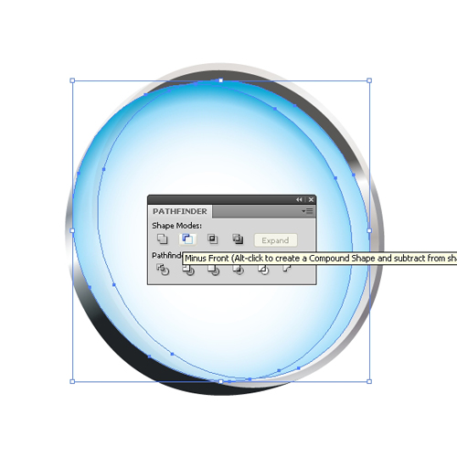
Duplicate (Ctrl / Cmd + C, Ctrl / Cmd + F) the glass twice and move one of the copies to the left. Select both ellipses and under the Pathfinder Panel hit the Minus Front button.
You should end up with the shape like this.
Apply a linear gradient as it shown on the picture below. The gradient we are using for this part is actually the same gradient we have used for the inner part of the frame. We have adjusted the colors inside the gradient by giving them a nice bluish tone.
Two highlighted edges will improve the illustration. Duplicate (Ctrl / Cmd + C, Ctrl / Cmd + F) the ellipse twice that represents the inner part of the metal frame. Move one of the copies to the left 1 pixel. Select both copies under the Pathfinder Panel hit the Minus Front button. Set the Fill color of the highlight to #FFFDE5.
We will create another highlight for the outer side of the metal frame.
Grab the Ellipse Tool (L) from the Tool Panel and create a small circle. Apply a radial white-transparent gradient.
Duplicate (Ctrl / Cmd + C, Ctrl / Cmd + F) the circle from the previous step and place it on the right part of the metal frame. It will emphasize the metal look of the frame a little bit.
Group (Ctrl / Cmd + G) all the elements.
Creating the Handle
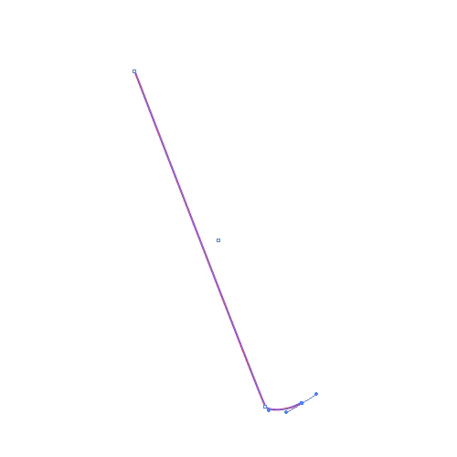
Grab the Pen Tool (P) from the Tool Panel and create the shape of the handle.
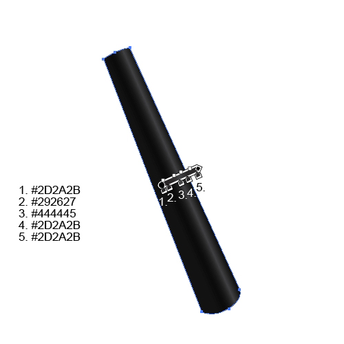
Apply the linear gradient to the handle. Just make sure to create the highlight that will follow the shape of the handle.
Select the Pen Tool (P) from the Tool Panel and create two curved paths as it’s shown on the picture below.
Select the handle and both paths and under the Pathfinder Panel hit the Divide button.
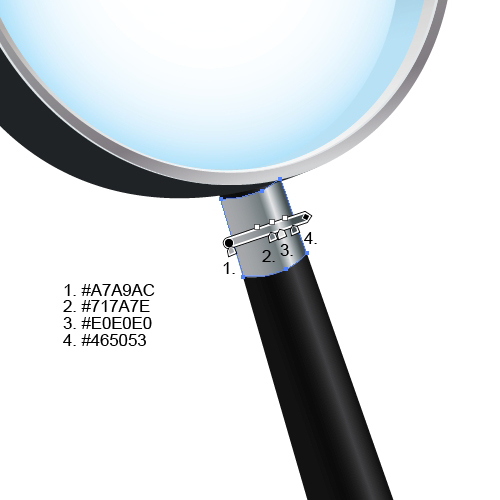
Apply the linear gradient, but make sure to create the same highlight we have created for the handle.
Use the same technique to create one more metal part of the handle.
And our magnifying glass is done. To make the illustration more interesting we will create a nice bit of additional text.
Creating Magnified Text
Let’s try to create a magnification effect. You can do it with any shape you like, but we will do it with text.
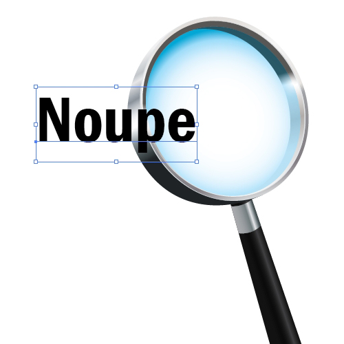
Grab the Type Tool (T) from the Tool Panel and type a word (we’ve used Noupe). You can choose any Font you like.
We will have to edit the letters a little bit. To be able to do that we have to transform them into editable shapes. Under the right click menu select Create Outlines.
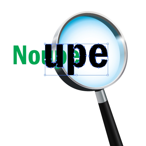
Duplicate (Ctrl / Cmd + C, Ctrl / Cmd + F) the letters and Ungroup the copy (Shift + Ctrl / Cmd + G). Remove N and O from the copied word. Change the Fill color of the original letters to green (just to be able to see what we are doing, later we will set the Fill color back to black).
Select all three black letters (u, p and e), scale them up a little bit and move them to the right.
Under the Object select Envelope Distort > Make with Warp.
The Warp Options box will pop up. Set the Style to Fisheye and the value for Bend to 25%. Hit the OK button.
If you are not quite happy with the result you have achieved, feel free to grab the Direct Selection Tool (A) and to adjust some anchor points. Under the Object select Expand. This way we will turn the letters back into an editable shape.
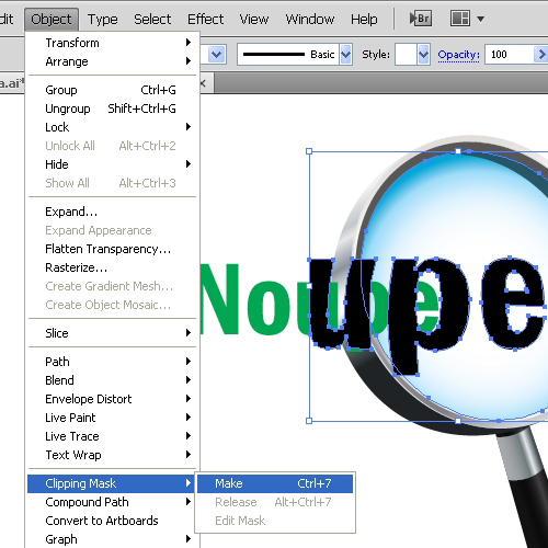
Now we have to duplicate (Ctrl / Cmd + C, Ctrl / Cmd + F) the ellipse that represents the glass. Bring it to front (Shift + Ctrl / Cmd + ]) and remove the Stroke and Fill colors. Select the ellipse and U, P, E letters and under the Object select Clipping Mask > Make.
Ungroup (Shift + Ctrl / Cmd + G) the green letters and remove the p and e letters at the end of the word. Set the Fill color for the rest of the letters to black (#000000) and send them back (Shift + Ctrl / Cmd + [).
For the end duplicate (Ctrl / Cmd + C, Ctrl / Cmd + F) the black shape of the handle, apply a nice linear gradient (#FFFFFF to # BDBDBD) and place it as it shown in the picture below.
And our magnifying glass is done!
Conclusion
This tutorial can be a nice practice for creating objects in perspective. If you are unsure how to put all the elements together, feel free to use a reference image (tracing technique can help a lot in this situation). There is one more thing I would like to encourage you about. Take your time when you are applying color gradients. Instead of using Blending Modes and transparency try to simulate a certain look by using the right combination of colors and gradients (just like we did in this tutorial with the part of the metal frame seen through the glass).
If you have any comments or questions please post them in the comments section below. Really hope you like this tutorial. Thank you for following along.
Banner Photo by Jay Wennington on Unsplash














Send Comment:
20 Comments:
More than a year ago
I'm having problem in this step:
Duplicate (Ctrl / Cmd + C, Ctrl / Cmd + F) the glass twice and move one of the copies to the left. Select both ellipses and under the Pathfinder Panel hit the Minus Front button. The Minus Front button is not giving me the same result as your picture.
Your picture preserve the blue gradient after the Minus Front, unlike mine . i'm getting the crescent shape on the right but the blue gradient is disapearing and the grey gradient under it is appearing.
What i'm doing wrong ?
More than a year ago
The pictures are breathtaking; I love the colors and everything. Must’ve been an awesome wedding!
More than a year ago
This is an amazing turorial man, is there any problem if i use this tutorial to make an icon for a school project? I mean, a non-commercial software that i am developing..
More than a year ago
Absolutely amazing tutorial....
More than a year ago
What can i say it is really fantastic . superb creation . There is important think what i saw in this tutorial that is Gradient mapping . again thanks
More than a year ago
VERY NICE STYLE PROPER USAGE OF COMMAND...THANKS FOR SHARE
More than a year ago
Fantastic Really Great Job :) Keep it Up
More than a year ago
hmm nice tutorial, i'm looking for the basic tutorial how to use all the tools in photoshop:)
More than a year ago
Excelente tutorial para principiantes
More than a year ago
Another amazing tutrorial! Can't wait to see some new stuff from you Jasmina. Keep up the good work! Thanks!
More than a year ago
Cheers, great tutorial!
More than a year ago
Thank you Olivera :-) Hvala!
More than a year ago
sjajan tutorial,hvalaaaa!!!
More than a year ago
Hi Laura,
I'm glad you like this tutorial. Thank you. Illustrator CS2 might be the problem. But, there is solution for that as well.
Make sure to apply radial gradient to the circle (white - black gradient) and under the Transparent panel for the Blend Mode select Screen. There is just one thing you have to pay attention to. Black color within the gradient have to be 100% black (C=100%, M=100%, Y=100%, K=100%). I hope you'll manage to do this.
If you still have problems with this effect just let me know :-)
More than a year ago
Thanks for the cool tutorial, very interesting. I have one problem - i can't seem to find where to create the gradient with transparency for the small highlight circles. My dialog box looks just like the one in your picture, except there's no option for opacity. I am working in CS2 -- is that the problem? thanks!!
More than a year ago
If there is something I can help you about just let me know.
More than a year ago
i'm too noob to figure out how to follow this tutorial...sux to be me lol
More than a year ago
Easy to follow. Thanks for sharing
More than a year ago
This is nice description ... easy to follow ... quite usefull
Thanks
More than a year ago
I think I might be using this. Pretty cool idea!