
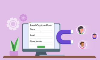
Most businesses have lead capture problems rather than web traffic problems. Teams might spend thousands on SEO, paid ads, and social campaigns, only to watch visitors leave without taking the next step. A well-designed lead capture form fixes that gap by turning anonymous traffic into prospects for your pipeline.
The trick is finding the right lead capture form for your page and audience. Timing, copy, field count, and CTA wording all influence whether someone will complete the form or sigh in frustration.
In this guide, you’ll find 10 high-converting lead generation form examples that cover some of the most popular types of forms. Our list includes:
You’ll also learn about one of the best online form builders to help you implement these lead generation forms at scale. Here’s everything you need to know.
What is a lead capture form?
A lead capture form is designed to collect visitor information. Usually, businesses seek email addresses or other basic contact information so they can follow up with potential leads. In some lead-magnet form examples, you’ll see the businesses ask for more detailed information. To give users a reason to complete the form, brands typically offer discounts, free resources, or demos.
As you explore different types of forms, you’ll see there are many different ways to approach the lead capture challenge. Form integrations can help you weave established best practices into your lead generation strategy. The trick is finding the right type of form for your business and audience.
10 lead capture form examples for improved conversion
The best lead capture forms match the offer to the visitor’s intent. Someone casually reading one of your blogs needs a different experience than a buyer comparing pricing plans. The examples below cover multiple stages of the funnel, so you can choose the right lead capture form template for each conversion opportunity.
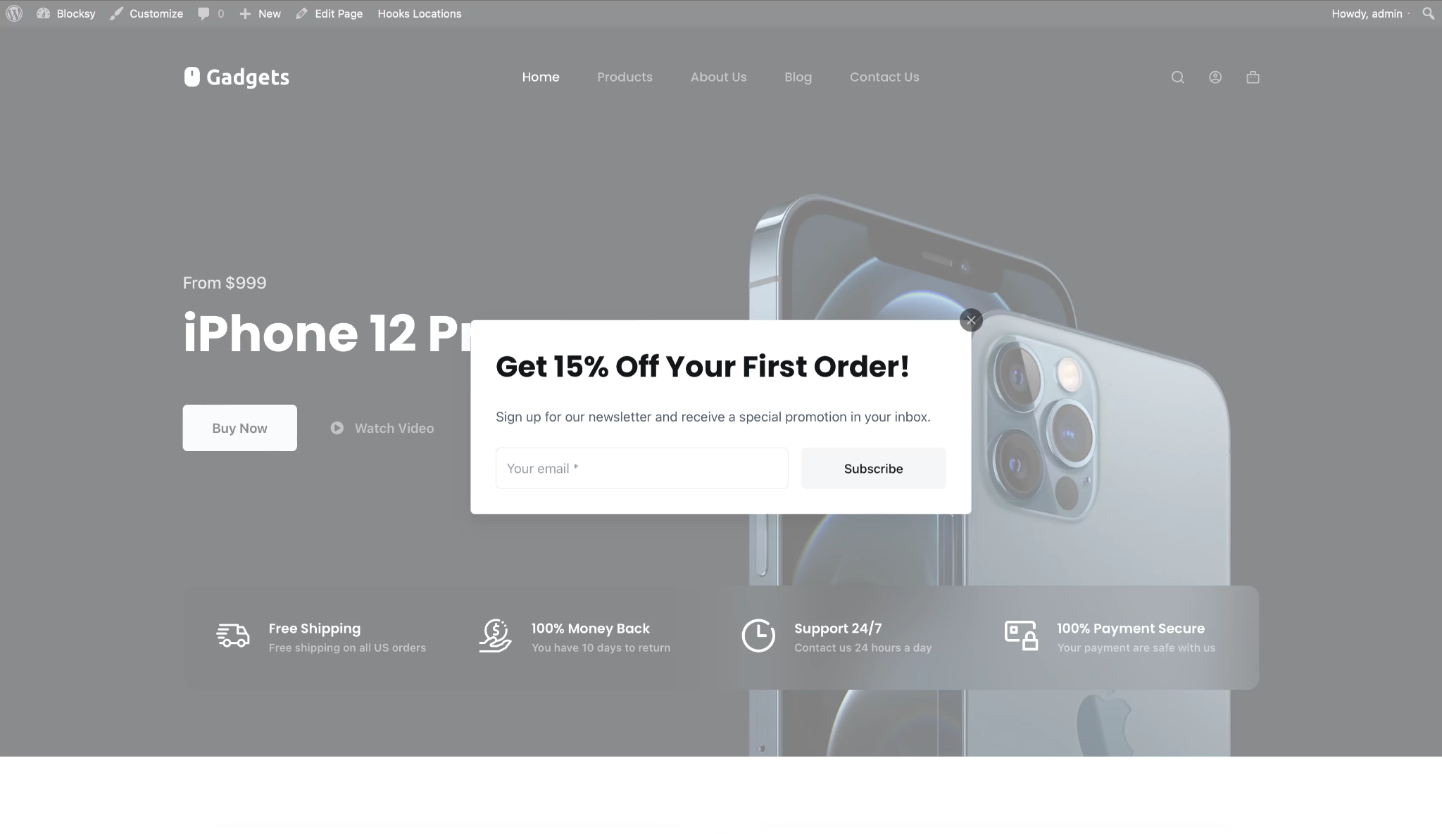
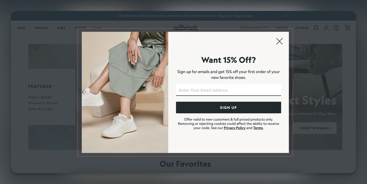
1. Popup & lightbox forms
Popup forms work because they interrupt a person’s scrolling at the right moment. When you time its presentation properly, a popup or lightbox form can outperform passive sidebar forms and static CTAs.
However, it’s smart to be cautious when using popups and lightbox forms. If you inundate site visitors with popups, they are going to get frustrated. One study examined consumers’ biggest complaints about popups. The answer was simple: “They’re everywhere.”
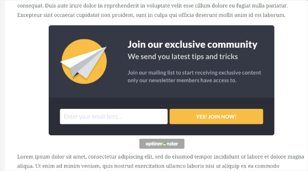
Simple newsletter popup
Set up your timed popup on a blog or media page and trigger it after a visitor has been on the page for about 10–15 seconds. The copy should include the following elements:
- Headline: Get the latest insights in your inbox.
- Subheadline: Join thousands of subscribers who receive our weekly breakdowns.
- Field: Email only
- CTA: Send me the content!
A simple newsletter popup works because it sparks curiosity without adding friction. Using a conversational headline, such as “Get in on the good stuff!,” intrigues your audience without sounding too promotional. If a few people have already signed up, you can add a subscriber count to create instant social proof.
Keep the form to a single email field so it doesn’t require too much effort from consumers. Simpler forms tend to have higher completion rates, especially if you are chasing top-of-funnel traffic.
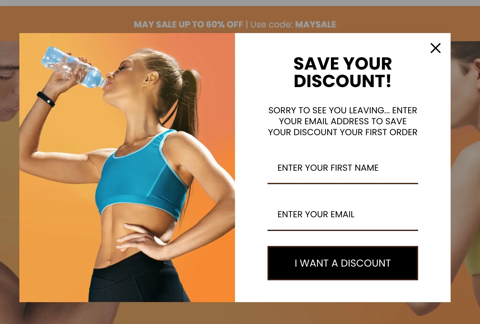
Discount/first-purchase popup
These popups are triggered on a first visit or after 30 seconds on a product page. The essential elements are
- Headline: Your first order deserves a discount.
- Subheadline: Enter your email, and we’ll send you a 15-percent-off discount code.
- Field: Email only
- Discount CTA: Claim my 15 percent off!
Giving a customer immediate value is one of the strongest conversion drivers in e-commerce lead capture. The visitor knows what they are getting in exchange for their email address and when they’ll receive it. Most consumers are intrigued by discount offers.
Using a word like “instantly” removes any hesitation about delayed delivery. A first-person CTA such as “Claim my 15 percent off” creates a stronger sense of ownership and spurs them to action. This type of popup works especially well on high-intent product and category pages.
Exit-intent popup
An exit-intent lead capture form triggers when the user’s cursor moves toward the browser’s close button. Must-have elements include
- Headline: Don’t leave yet — here’s a free gift for you.
- Subheadline: Download our free guide and put it to use today.
- Field: Email only
- CTA: Yes, send me the guide!
Exit-intent lead capture forms are effective because they target visitors at the exact moment they’re about to leave. The user has already decided to stop browsing, so the popup gives them one last chance to exchange value for contact information.
Again, keep it simple by asking for only an email address. Frame the CTA positively to subtly encourage the user to act now. You can also exchange a free resource so the visitor has a reason to stay connected to your brand, even though they aren’t ready to buy yet.
Two-step/micro-conversion popup
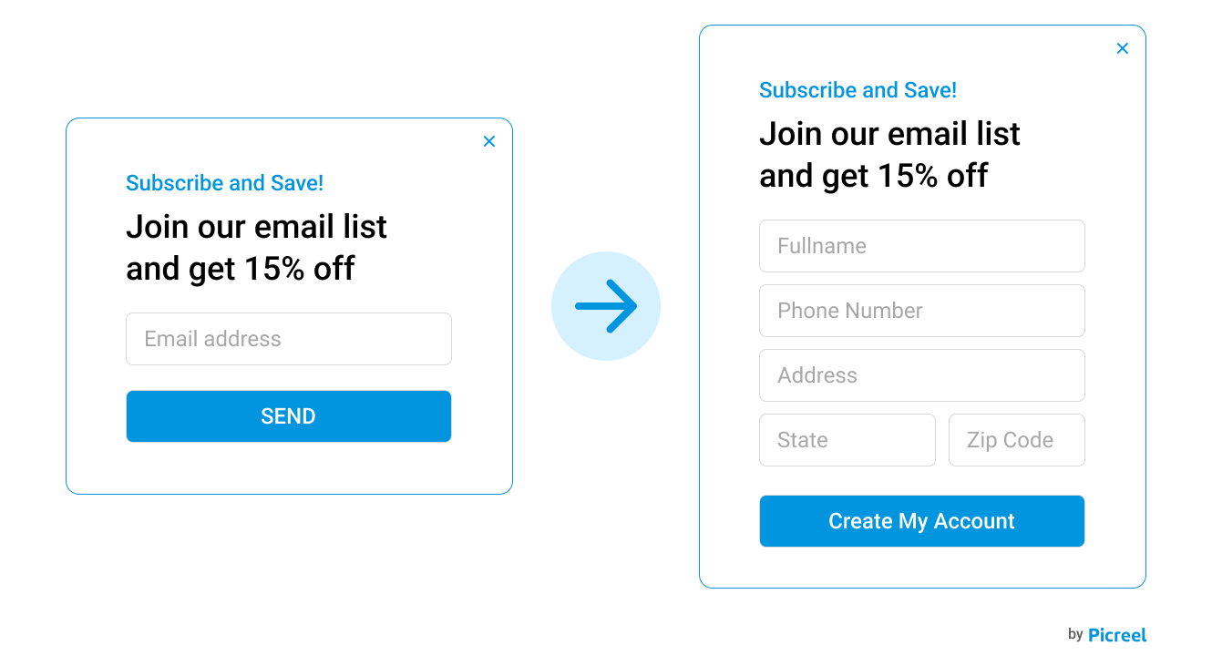
A two-step popup requires consumers to hand over more information, which is why you need to open with a simple yes/no question. Here’s how your form should flow:
- Example:
- Step 1 Button: Ready to boost your leads by 25 percent?
- Step 2 Button: Great! Where should we send your growth playbook?
- Field: Email only
- CTA: Get my playbook!
Two-step forms reduce perceived commitment. Instead of immediately asking for personal information, the form first asks the user to click yes or no as part of a small decision-making moment. Once users take that first action, they’re more likely to complete the next step because they feel somewhat committed.
People feel motivated to finish something they’ve already started. However, you can potentially derail this feeling by asking for too much on the form’s second page. To avoid this, make your first question enticing. Then keep the second frame simple, requiring only an email address and perhaps a name.
2. Landing-page & embedded forms
Landing-page and embedded forms target visitors with stronger purchasing intent. These users are actively evaluating a solution, downloading resources, or considering a purchase. Because the intent level is stronger, you can ask for more information without hurting conversion rates. Here are some common types.
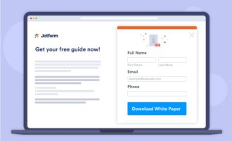
Lead-magnet/gated-content form
A lead-magnet or gated-content form can be a standalone page or an embedded form. Here’s what you need:
- Headline: The free 2026 lead generation playbook
- Subheadline: 47 pages of strategies, templates, and real campaign data you can use today
- Fields: First name, work email
- CTA: Download the playbook.
Gated-content popups are most popular among B2B brands. Offering visitors specific resources signals credibility, especially when the content is high quality. Highlight what the person will receive, such as a current-year playbook, templates, or access to valuable industry data.
Educating your audience is a vital step on the B2B purchasing journey, which can involve dozens of touchpoints. When implementing gated content, create a few different resources, including a mix of evergreen and year-specific options.
Free-trial signup
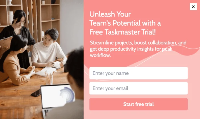
A free-trial popup should be embedded on a product or pricing page. Required elements include
- Headline: Try it free for 14 days.
- Subheadline: No credit card required. Sign up and enjoy full access.
- Field: Work email
- CTA: Start my free trial.
Free-trial forms convert best when they remove risk. Adding a line such as “No credit card required” eliminates concerns about forgetting to cancel the trial. Allowing users to sign up for a trial without providing credit card information is a great trust-building move because they can avoid complicated cancellation processes.
Keep the signup process short because visitors on pricing pages usually want immediate access. If they have to fill out a lengthy onboarding form, you’ll have a tough time keeping their interest.
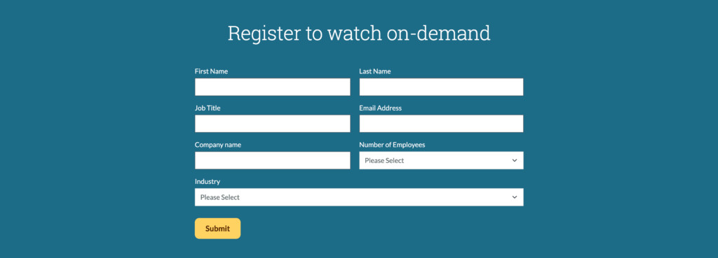
Demo request form
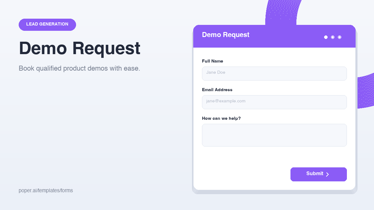
Embed demo request forms on product or solutions pages with the following elements:
- Headline: See our product in action.
- Subheadline: Schedule a 20-minute custom demo.
- Fields: First name, last name, work email, company, job title
- CTA: Book my demo.
High-intent B2B visitors are usually willing to complete longer forms if you offer enough value. The phrase “personalized demo” suggests that you will tailor the experience to their needs and pain points. If your demo is one-size-fits-all, don’t use the phrasing “personalized” because it can feel misleading.
When appealing to B2B audiences, you can (and should) request additional information, such as the name of the company and the person’s title. That way, you can learn which level of decision-maker you are interacting with. Learning the company’s name will also help you customize the demo accordingly.
A demo form is one of the most reliable B2B lead capture tools because it qualifies leads while moving them directly into your sales pipeline.
Blog content upgrade/inline form
You can embed content upgrade forms directly within or below a blog post using the following elements:
- Headline: Level up your content with our template.
- Subheadline: Download the editable version of our template and adapt it for your campaigns.
- Field: Email only
- CTA: Get the template.
Content upgrades outperform generic newsletter forms because they align directly with the reader’s existing interests. Instead of offering the user a bunch of unrelated content, the form extends the value of the article itself.
Visitors reading blog posts about tactics and strategies, for example, might be looking for shortcuts or examples they can implement immediately.
Make sure the content users sign up for delivers. If it’s just another SEO fluff piece, they could lose trust in your brand immediately. Instead, offer real insights that they can put into action.
3. Interactive & quiz forms
Interactive forms increase engagement by turning lead generation into a guided experience instead of a static request for information. These forms work particularly well for qualification, personalization, and segmented follow-up campaigns.
Lead generation quiz/assessment
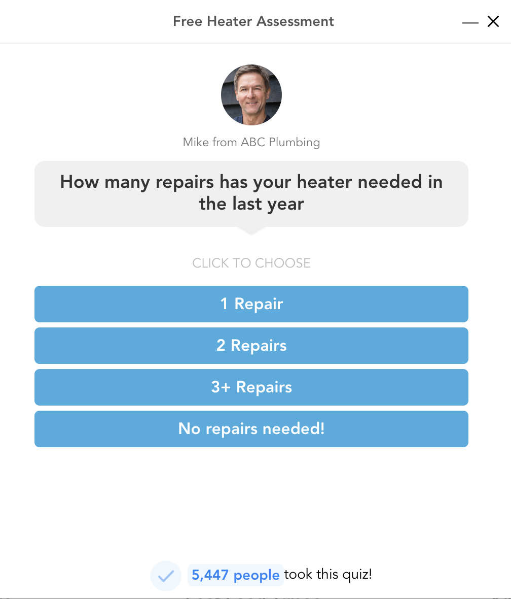
An interactive, multistep form qualifies leads while engaging them by asking relevant questions. Here’s what your quiz or assessment needs to succeed:
- Example flow:
- Opening question: What’s your biggest marketing challenge right now?
- Middle question: Include three or four qualification questions.
- Final screen: Here’s what we recommend and how to get started for free.
- Field: Email on the final screen
- CTA: See my results!
Quiz-style lead capture forms increase conversions by building investment before asking for contact information. Visitors will feel a sense of commitment after they’ve answered three or four questions and received a proposed solution. Delay the email field until the end to reduce early friction and allow your marketing team to collect qualification data for segmentation.
Quizzes can be effective for B2B brands and B2C service providers such as plumbers and HVAC technicians. Keep it short, snappy, and focused on solving the user’s problem.
Webinar/event registration form

Webinar or event registration forms are primarily meant for B2B brands. Place this type of lead capture form on a landing page or a popup promoting a live or on-demand event and include the following elements:
- Headline: Free live webinar on [topic] on [date]
- Subheadline: Join [X] professionals for a 45-minute session. Register for free today!
- Fields: First name, work email
- CTA: Reserve my seat.
Webinar registration forms combine a sense of urgency and a fear of missing out. These offers also spur users to action by offering to educate and provide exclusivity. Because the event happens at a specific time, visitors feel pressure to act now instead of postponing the decision.
End with a CTA such as “Save my seat” to imply that spots are limited. Motivated visitors will be concerned about missing out. You can also give visitors an option to post about their attendance on social media platforms with the click of a button, which can help to maximize your reach and attendance.
What makes a high-conversion lead capture form?
Even the best lead capture form templates fail if you don’t account for the basic principles of conversion. High-performing forms usually share five characteristics:
- They ask for the minimum information necessary: Every additional field you add creates friction. Unless you have to qualify your leads with deeper questions, keep forms short. Email-only forms often convert best for top-of-funnel offers.
- They match the visitor’s intent: A first-time blog reader shouldn’t see the same form as someone comparing pricing plans. Align your offer with the visitor’s current step in the funnel.
- They communicate immediate value: Strong forms explain what the user gets in exchange for their information and effort. Forms that provide a specific outcome, such as a 15 percent discount, outperform forms that make vague promises.
- They reduce perceived risk: Phrases such as “No credit card required” or “Unsubscribe anytime” lower a person’s hesitation and build trust.
- They use strong CTA copy: Generic buttons underperform compared with action-oriented CTAs. For instance, a B2B lead capture form might end with “See the strategies industry leaders are using to win more business in 2026.”
If you need more tips, check out our guide on how to improve lead capture forms.
Build your lead capture form with Jotform for better results
Thanks to Jotform, you don’t need a developer to implement these lead capture form examples. Jotform lead generation form templates make it easy to create a wide range of forms to collect consumer data and set the stage for later follow-up.
Jotform currently offers 20,000-plus form templates, including hundreds of lead capture form templates. Once you choose a template, our AI form builder creates lead capture documents via a simple chat. You can create popups, multistep forms, and conditional logic for quiz-style lead capture.
Jotform also offers CRM integrations with top platforms such as Salesforce, ActiveCampaign, and HubSpot. Once a consumer inputs data into your form, it will flow directly into your pipeline. You can also embed your form directly on any web page (no developer needed), and any updates you make in the form builder will automatically reflect in the embedded version.
With Jotform, you’ll enjoy 150-plus native integrations, along with customizable thank-you pages and CTA copy. Jotform Mobile Forms makes it easy to connect with audiences who are on the go, and our lead generation tools set you up for growth. Try Jotform for free today!
This article is for marketers, growth managers, and demand generation teams who want to capture more leads from their existing traffic and are looking for real-world examples with actionable copy frameworks they can adapt immediately.


Send Comment: