
What if one field on your form was costing you $12 million a year in lost sales? Well, that’s what Expedia found out after it removed an optional “Company” field from its booking process. Similarly, inline validation, which lets users know straightaway if they’ve made an error, can boost your conversion rate by 22 percent.
In form optimization, even tiny tweaks like these can drive huge payoffs. Similarly, if forms are failing to convert, it could be because of small and fixable design issues.
Let’s look at how to optimize forms to improve form conversion rate and reduce form abandonment. Here are five key form optimization techniques; think of them as the five pillars of a good form:
- Structure your form so users don’t have to think.
- Cut anything unnecessary.
- Choose the right input for every question.
- Stop using “Submit”; you can do better.
- Build for mobile; test before you launch.
Jotform is one of the best online form builders and has all these features baked in.

Migrate existing forms instantly
There’s no need to rebuild your online forms from scratch. Instead, migrate existing forms and submission data into your Jotform account in one click — so you can collect data without skipping a beat.
Your form can not be migrated.
Please ensure that your form URL is correct and that your form is set to “public” before attempting to migrate it again.
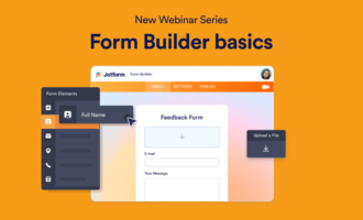
1. Structure your form so users don’t have to think
How your form looks determines whether users even start. A cluttered, confusing layout will send them away before they even type their name. Start with a successful form structure and everything else is much easier.
Use a single column; don’t make eyes zigzag
Multi-column layouts break the natural reading flow. A bad form design that forces people to switch between left and right can cause users to skip fields, lose their place, or exit without filling in a single field, especially on mobile.
A single column is the safe default. Your user starts at the top and finishes at the bottom, and it’s obvious if they’ve skipped a field.
This isn’t to say multicolumn fields never work. Two columns work best when you have two closely related short fields(e.g., first name/last name, city/state) and splitting them would feel even weirder. But if you’re in doubt, go with a single column.
Order fields from easiest to hardest
One easy way to optimize your forms is to start with low-effort fields with easy answers before asking for more sensitive or complex information, or things that users will have to look up, search for, or think about. Get users to fill in their name and email address before moving on to fields such as payment details, optional extra packages, or their partner’s phone number.
This might sound simple, but it’s based on real psychology. Once someone starts filling in a form, they’re much less likely to stop. That’s because users think “I’ve spent five minutes on it so I might as well finish,” a bit of psychology called the sunk cost fallacy, or they think “I should finish the things I start because that’s the responsible thing to do.”
Whatever your user’s internal motivations, start simple and then get more complicated.
Break long forms into steps; don’t show everything at once
If your form has more than five or six fields, break it into steps. You can split a form into sections on a single page or, even better, over multiple pages. This way, your user is never staring at a long and intimidating form with a hundred checkboxes to wade through.
Multistep forms with a progress bar can be particularly effective and consistently outperform single-page forms. The progress bar boosts motivation to reach the finish line.
Jotform has a multistep feature in its drag-and-drop editor that handles all of this for you, including autogenerating the progress bar.
2. Cut anything unnecessary
Every extra field, every unnecessary step, and every CAPTCHA is a reason to abandon. If you’re ruthless with your form, your users will have far less reason to bounce.
Ask only for what you absolutely need
The Expedia case study bears repeating: The company removed a single optional field and increased revenue by $12 million a year. That’s a high price to pay to find out if someone booking a hotel works for Microsoft or McDonald’s.
If you can’t clearly explain why you need a piece of information, don’t ask for it. “It might be useful later” isn’t a good enough reason to make a form longer than necessary. Most forms need only three to five fields. For lead generation, for example, it’s enough in most cases to ask for a person’s name, email address, and contact number, and the product they’re interested in
Let autofill and smart defaults do the typing
Every field already filled in for your user is one fewer reason for them to abandon. Enable browser autofilling so it can insert the information you already have; if someone’s logged in, you don’t need to ask for their email address again. Use smart defaults, such as autoselecting the most popular option or using IP address to set the country field.
Pro Tip
For addresses, use Google Maps autocomplete. It saves your user from having to fill in four or five fields.
Remove CAPTCHA; it’s costing you conversions
Everybody hates CAPTCHAs, and there’s data to prove it. One study found that having a CAPTCHA on your form can decrease conversions by up to 40 percent.
There are better modern spam protection alternatives, such as honeypot fields (hidden inputs only bots fill in), invisible reCAPTCHA, and built-in spam filters. Jotform’s filters catch spam without asking users to click on traffic lights or bikes.
If you’re still using a traditional CAPTCHA, swapping it out is the single highest-impact, lowest-effort change you can make today. Consider it a top online form best practice.
3. Choose the right input for every question
The wrong input type forces your user to expend unnecessary effort. Don’t give them a text box when a dropdown would do or a dropdown where radio buttons would be clearer. These small mismatches add up fast.
Match the input type to the question; don’t default to text boxes
Text boxes seem like the most useful choice, but they require the most cognitive effort from users. Instead of choosing an option, they have to think about what to type. Use them only when you need free-text answers, such as name or email address.
For everything else, match the input type to the question:
- If users should pick one of two to five options, use radio buttons. All the choices are visible at a glance.
- If users should pick multiple items, use checkboxes. They’re easy and logical.
- If users need to select from six or more options, use dropdowns. They keep the form compact while preserving choice.
- For simple number inputs, use steppers or sliders. Use common sense, though; you wouldn’t use a stepper for a phone number.
- For dates, always use a date picker.
- For yes/no answers, use a toggle or single checkbox.
Tell users what’s wrong before they hit Submit
Inline validation, a feature that will let users know straightaway if they enter an incorrect or impossible value, can increase conversions by 22 percent and results in 22 percent fewer errors, a 31 percent increase in satisfaction, and a 42 percent increase in completion speed.
These error messages should be helpful. Telling users their proposed password is invalid is annoying, but telling them it needs to be a minimum of eight characters or include a special symbol is helpful information.
Set the right keyboard for mobile users
Smartphones have different keyboards for different input fields. If you set the input field to “tel” or “email,” your users will get the right keyboard: either a number pad or a full keyboard with an easy-to-find @ symbol. While this might sound small, it’s a real point of friction. Typing a phone number on a QWERTY keyboard is painful.
Good news: Jotform handles this automatically for all field types.
4. Stop using “Submit”; you can do better
ContentVerve ran a test in which it changed a button from “Start your free 30-day trial” to “Start my free 30-day trial.” They changed one word and got a 90 percent boost in click-through rate. These small copy tweaks can have outsize results.
Replace “Submit” with a button that tells users what they’re getting
“Submit” is meaningless. It doesn’t tell users what happens next or what they get for completing your form. It’s a relic from the early days of web design.
Action-oriented calls to action (CTAs) consistently outperform a generic “Submit” button. “Get my free guide,” “Create my account,” and “Send my request” are all concrete promises of what’s going to happen next. The button is the last thing a user reads before committing, so make it feel like it’s worth clicking.
Put labels before fields, not inside them
Placeholder text inside fields (for example, a light gray “Enter your email”) disappears the moment a user clicks on it. If they get distracted for a second, they can’t see what they’re meant to enter.
Instead, use top-aligned, always-visible labels. They’re easier to scan and work great on mobile. Placeholders look clean in mockups but fail in practice. They can work as a supplementary hint if you like, but they should not be the only label.
Add microcopy that removes hesitation
Users often have specific objections at specific points. They worry about spam when they enter their email address, getting overcharged when they enter their credit card, or wasting their time when they see a long form.
Small, well-placed copy can reassure your user:
- Have “we’ll never spam you” next to an email field.
- Try “takes less than two minutes” on a signup form.
- “No credit card required” is helpful on a free trial form.
You can also use trust signals such as security badges, compliance badges, and SSL indicators to reassure users that you can be trusted with sensitive data.
5. Build for mobile; test before you launch
A form that looks great on desktop but breaks on smartphones and tablets loses a huge portion of your users before any optimizations even begin to matter. You can tweak the CTA all you want, but if it doesn’t appear on a phone screen because it’s wrongly sized, it won’t work.
Design for thumbs first, mice second
Over half of web traffic is mobile.. Form fields, buttons, and tap targets need to be large enough to comfortably use on a small screen. Reduce the need to zoom in and the chance a user might accidentally tap the wrong field.
This is another area where Jotform makes life simple: Its forms are mobile-responsive by default. No extra work needed.
Don’t let a slow form script tank your conversion rate
Slow-loading forms are a silent conversion killer. Heavy scripts, unoptimized embeds, and third-party trackers can all increase the time it takes for your form to load and make your users more likely to abandon, especially on mobile networks.
The fixes require some technical knowledge, but they’re worth doing. Load scripts asynchronously so they don’t block page rendering, minimize third-party dependencies, and test your form’s load time with Google’s PageSpeed tool and with a real mobile connection, not your office Wi-Fi.
Alternatively, you can use a tool such as Jotform, which does all of this work for you. A mobile-friendly form can massively increase form submissions.
Test before you assume: Use the five-second rule
Anyone who looks at your form should know what it’s for and why they should fill it out within five seconds. If they don’t, it’s too complex.
You can test this. Show your form to a friend or colleague for a few seconds and then ask them what it’s for. If they can’t tell you, make it clearer. It’s the cheapest, fastest usability test you can do.
Optimize your forms without writing a single line of code
Optimizing your forms doesn’t have to be a complicated process. Jotform can handle every aspect of it natively:
- Multistep forms and single-column layouts make it easy to structure your forms.
- When it comes to cutting anything unnecessary, Jotform’s conditional logic and spam filters are key.
- With 30-plus field types, Jotform has the right input for every question.
- You can customize any button or field to turn a “Submit” into a real CTA, add labels, and include helpful microcopy.
- Every Jotform form is mobile-responsive. Any form you create is built for mobile.
All of this is easy to do with Jotform’s drag-and-drop editor. The Mountain West Conference switched from another form builder to Jotform and saved 50 percent in admin time. It also saw improvements in work processes and data organization.
“Mountain West previously used another form builder, but employees weren’t able to get timely and organized data with it,” says Mountain West Chief Financial Officer Gary Walenga. “After some searching, [we] switched to Jotform. Since then, the conference has seen dual improvements in both its work processes and in Jotform.”
So if you want to optimize your forms and improve your conversion rate, the best thing to do is check out Jotform today. It’s one of the best form builders, and you can try it for free. Jotform provides form optimization the easy way.
FAQs about form optimization
Basic visual design principles and user experience best practices apply to forms. . Use consistent branding, with on-brand colors and typography; allow ample whitespace; and default to a clean single-column layout. Or just use Jotform. It has more than 1,000 themes and an easy-to-use custom theme builder.
Stick to the five pillars of good forms:
- Structure your form so it’s easy for users to fill in.
- Aggressively cut any unnecessary fields.
- Choose the right input for every question.
- Include CTAs, labels, and microcopy to guide users through your form.
- Build for mobile devices, which make up half of all web traffic.
An effective form is one that collects the right data with the least friction. Know what data you need and ask only the questions that get you that data, nothing more. Make questions clear, specific, and actionable. Be clear with users what you need, why you need it, and what will happen at every step.
The simplest form is the one with the fewest fields and the most answers prefilled. Cut unnecessary questions, allow browser autofill, validate answers inline, use the right input types, and clearly label everything so users understand what’s expected. Also, use modern spam prevention techniques instead of CAPTCHAs.
This article is for marketers, UX designers, and product managers who build lead gen, signup, or checkout forms and want to reduce abandonment, increase completion rates, and get more out of the traffic they already have.


Send Comment: