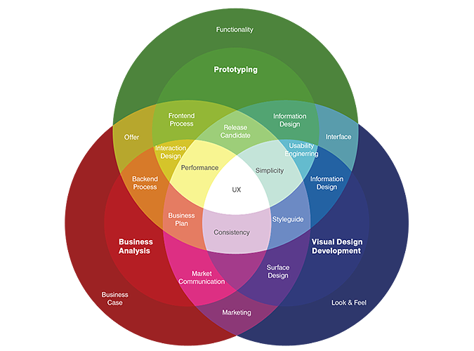
The UX diagram below is the clearest one I’ve ever seen on the web. The overlapping cases give the whole UX design idea.
Image Source: http://www.studioaum.in
Even a product which has a great functionality may not satisfy user expectations. Here are the most important points to pay attention to while designing the User Experience:
UX is not UI
“Some people think design means how it looks but of course, if you dig deeper, it’s really how it works.” Steve Jobs
UI and UX are blurry concepts even for some designers. Many people think UX is sketching and wire framing interfaces. However, UX design is the life cycle of the product. Basically, UI defines the overall design, look and feel of the product and plays a significant role on first impressions. UX defines the interaction models, tasks, flows and creates communication scenarios with users. Users’ happiness mostly depends on the UX design.
As a metaphor we can say that UX design is the “inner beauty” and UI design is the “gloss.” If your product has gloss but languish on the inside, your users will notice in a hurry.
Designers should give equal importance to every step in the UX designing process.
Consistency in Design Experience
Successful user experience depends on consistency which I discuss in my previous post Consistency & the User Experience?
Users Have the Power
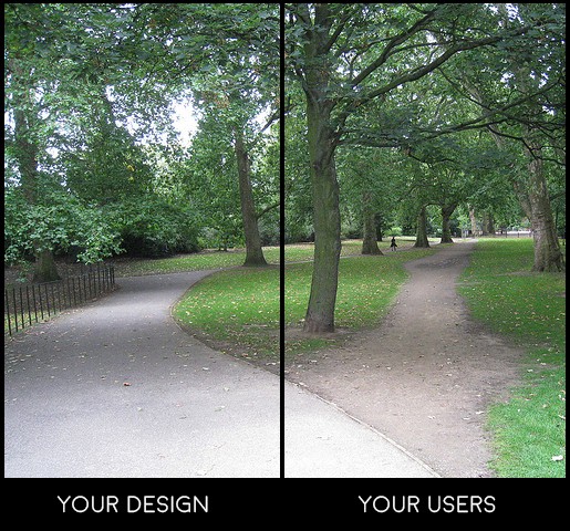
A big mistake nearly every designer makes: they assume their users perceive their product like they do. But they do not! Users will not always use your product the way you imagined they would. They will find their own ways. Users need to feel in control, rather than feeling controlled by your product. Being controlled or constrained by your product makes them uncomfortable. Collect clear and objective data from your users and design according to it. Otherwise, it will be inevitably lead them carving their own path.
Information & Navigation Structure
Information & navigation structure should be predictable and useful. Information structure is one of the most critical UX steps. When the information structure is illogical or changes between different mediums, it confuses users.
Logical structure lets users know where they are and how to go back. You need to identify your product’s features according to “the most important — the less important.” This thinking process will help you establish a strong information hierarchy.
GitHub’s Old Navigation Structures
GitHub’s New Navigation Structure
Notice the new navigation structure of GitHub. The hierarchy is great and elements on the page have a key purpose, which makes the lives of its users easier.
Meaningful Error Messages
Even error messages have a significant role on users’ happiness. If your users don’t work in the web industry, they probably don’t know what “502 Gateway something, something…” means.
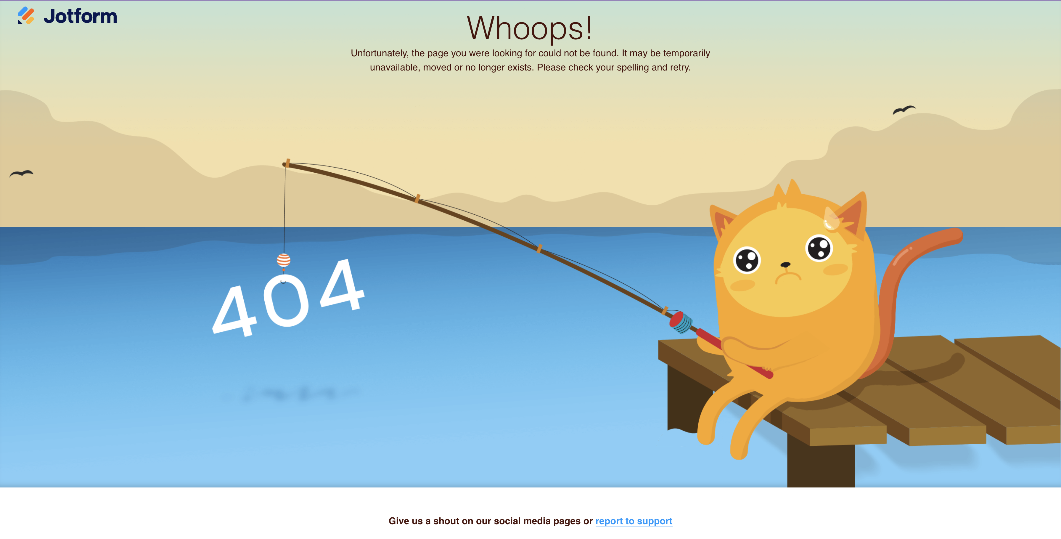
Here is another and way to present error messages which helps you to ease your users and distract them with fun. One of the best examples is Jotform’s “404 page not found” error page which is consistent with our branding and acknowledges an issue in a humorous way.
Other impressive examples are:
MailChimp
Befriend Your Users
User experience is not only about the usage of the product, it also includes communicating with users. I love it when I receive e-mail from a product which starts with my name “Hi Ecem, Great News”. I know it is mostly automatic but still it catches me. It feels like I am important to them as an individual user.
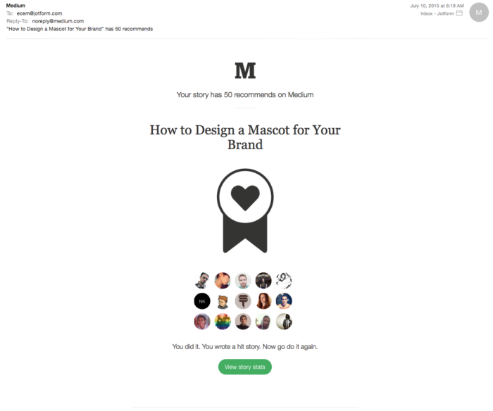
Medium uses a great method that motivates their users; they deliver only good news to writers. And I think it raises the success of Medium.
Support Team
Even the best products couldn’t be prepared for every problem users might come across. A support team using various mediums including social media, email, online chat, and an online forum are a great solution.
At Jotform we have a 24/7 Support Team for our users. In addition to our Support Team members, everyone does user support. It is beneficial for our team’s productivity and development processes, and also gives a better user experience for our users. Tips to Supporters: How to be successful in the Jotform Support Team.
Do not Implement Every UX “Myth” to Your Product
There are thousands of user testing results on the web. Don’t assume all of them will fit with your product. Do not forget that you know your users more. (At least you should!) User tests for other products may or may not be relevant to your own users.
- Myth #1 You can not design a new experience: I’m not saying to develop something that seems like came from another planet, however, do not solely stick with current experiences. Dare to develop using new interactions. For example, in 2007 Steve Jobs announced Apple’s “new” iPhone touchscreen “multi-finger gestures.” (FingerWorks, a gesture recognition company, produced a line of multi-touch products in 1998. The company was acquired by Apple in 2005.) Before 2007 if you would ask someone about “pinch-zoom” the answer would be “What zoom?” Nowadays it’s familiar and feels natural to whole world.
Image Source : Mantas Bačiuška
- Myth #2 If it works for another brand, it will work for you: Maybe it will work, but it often ends up in disaster! Copying another brand’s decisions is very dangerous and the wrong strategy. Another brand’s context fits with the web site or products they made. It will not always work in a different context. Different contexts need different designs.
- Myth #3 Do not make users scroll: Facebook, Twitter and Tumblr are my favorite myth busters for the “don’t scroll” myth. The success of these products depends on the continuous content they serve. Scrolling is also useful for regular web pages and evolved to the new scroll experience such as the parallax effect.
‘’User experience is people caring about people.’’ Corby Lebson, Former President of UXPA / UXistanbul Conference 2015











Send Comment:
1 Comments:
More than a year ago
UI UX designer is crucial to just about everything. It renders the latest technology accessible to the masses, makes our favourite apps and websites a pleasure to use, and determines which brands and products we return to over and over again. To put it simply, design matters.