In web development, there are many factors that can optimize work processes. It’s not just the final result that counts, but also the amount of time that is put into the development of a website or a reusable template. Good PSD grids are still indispensable when it comes to designing a website and making your work flow more efficient. Thus, today, we’ll show you a couple of free Bootstrap PSD grids for your next project.
Efficient webdesign is essential nowadays. There’s a lot of competition on the market, and nobody can afford to put more time into the development of websites than necessary. That’s why front-end frameworks, like Bootstrap for example, have established themselves.
The mobile-first approach, the support of preprocessors, predefined HTML components, and jQuery plugins in conjunction with frequent updates are the reason for the Bootstrap framework’s popularity. Did you know that already two percent of all websites are created using Bootstrap? On WordPress.org, it seems as if there were no themes that don’t use a Bootstrap foundation lately.
So why shouldn’t you use the framework as well, and develop a solid prototype with the following grids?
Pro Tip
Sign up for a free Jotform account to create powerful online forms in minutes — with no coding required.
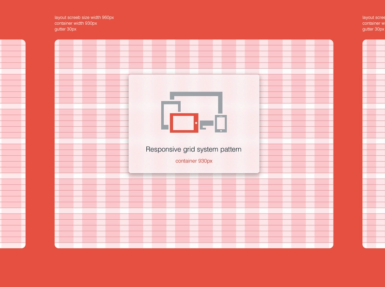
1 – Bootstrap Responsive Grid by Michael Henning
This package allows you to develop website layouts for desktop, tablet, and smartphone layouts in Photoshop. It is compatible to Bootstrap 3.
2 – Free 12 Column Bootstrap v3.0.0 Grid Pattern PSD
Bootstrap aficionados will appreciate this freebie by Himanshu Softtech. The 12-column grid helps you develop a Bootstrap 3 website.
3 – Free Bootstrap 3 PSD Grid System
The Free Bootstrap 3 PSD Grid System is an extendable, and updated version of its predecessor. This grid is also perfectly suitable for the development of mobile-first websites and saves you valuable time.
4 – 4 Responsive Grid System PSDs
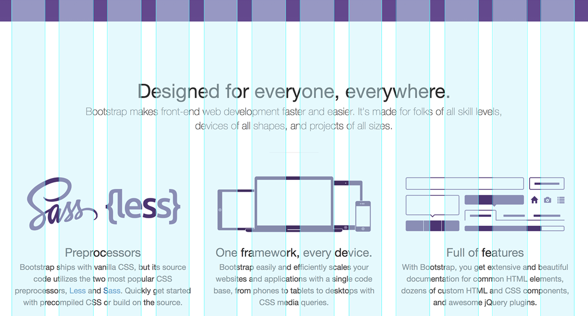
5 – Bootstrap 3 Responsive Grid PSD Template
The Bootstrap 3 Responsive Grid PSD Template has a total width of 1170 pixels, and comes with 12 columns, exactly meeting the Bootstrap 3 requirements. The author has considered all proportions and sizes, so that you are able to use these grids as the basis for any project.
6 – Free Printable Bootstrap Wireframe Template
Accompanying digital solutions, there is paperbased media for the prototyping of Bootstrap websites as well. This freebie could prove to be a good tool when it comes to quickly sketching your ideas on paper. It also lets you visualize versions for the desktop and the mobile designs.
7 – Bootstrap 3 PSD
Bootstrap 3 PSD comes with useful features like Retina solution, well-structured layers, and an excellently documented PSD file. Fully editable, it helps developers working out website designs based on the Bootstrap 3 framework.
8 – Responsive Bootstrap Grids
Responsive Bootstrap Grids doesn’t need redundant extras. The clean, minimalistic appearance doesn’t distract you from your work. Use this grid to quickly design the layout and the interface without much effort.
9 – Bootstrap 3 Grid PSD (Retina-Ready)
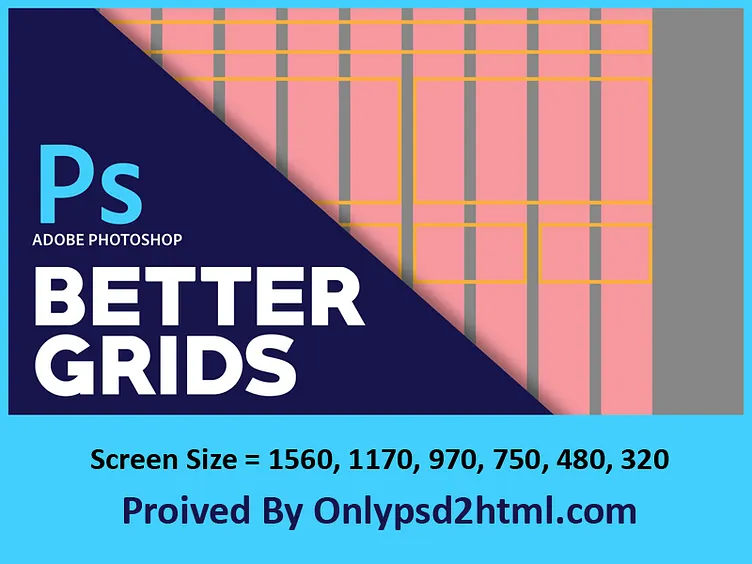
A free PSD built on the standard 12-column Bootstrap 3 grid. It includes templates for 1170, 970, and 750 breakpoints plus 480 and 320 mobile sizes, all with the default 30px gutter, and ships with retina versions for high-DPI comps.
10 – Bootstrap 3.0 Responsive Grid System PSD
The author used Bootstrap 3 to develop a couple of projects and created this responsive grid template for that purpose. He recommends using GuideGuide for Photoshop if you want to create your own grids.
Conclusion
In order to really make work processes more efficient, you should start working with Bootstrap at a very early stage of development. Concept drafts should be made with a clean grid, following the framework’s rules. The key to success is a fitting PSD grid system. When everything in the layout process is aligned for the use of Bootstrap, the front-end development will be a lot faster.
(dpe)









Send Comment:
1 Comments:
More than a year ago
Should I use the web grid for designing responsive content for retina iPad in landscape position? The retina display are wider than a desktop screen sometimes if I consider a full screen content...