-
 artsincolumbus
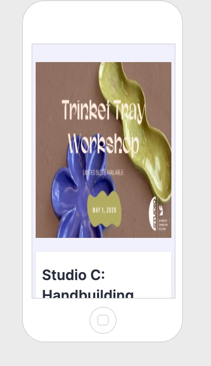
Our form "Studio C: Handbuilding Workshop–Trinket Tray" the image displays correctly on desktop but appears squished on mobile, distorting the proportions.
Can you help us fix this so the image maintains its aspect ratio across devices? Please let us know if there are recommended settings or specs.

-
 Kevin JotForm Support
Hi artsincolumbus,
Thanks for reaching out to Jotform Support.
You can easily set the logo to be mobile responsive by Injecting CSS Codes into your form. Let me walk you through it:
1. First, copy this code:
img.form-page-cover-image {

  width: 100%;

  height: 100%;


}
2. In Form Builder, click on the Paint Roller icon on the right side of the page to open Form Designer.
3. Now, in the Form Designer menu, click on the Styles tab, scroll down and paste the code into the Inject CSS Code box. That’s it. The code is automatically saved.
Your Reply
Something Went Wrong
An error occurred while generating the AI response. Please try again!