-
 Soifer
Hi-
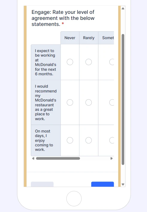
I'm trying to make it so that the tables in this survey form don't require scrolling to view all options when viewing on a mobile phone device. I asked Podo and he said he fixed it, but he didn't. I also did some googling and tried changing the end tag on the code for the first table, but that didn't work either.
Emily
 Page URL: https://form.jotform.com/260815574726161
 -
 Rehan Support Team Lead
Hi Emily,
Thanks for reaching out to Jotform Support. We need to remove the padding of the headers in the input table to get the required result. Let me show you how:
1. First, copy this code:
@media screen and (max-width: 560px){

.form-matrix-headers {

  padding: 0px;

}

}
2. In Form Builder, click on the Paint Roller icon on the right side of the page to open Form Designer.
3. Now, in the Form Designer menu, click on the Styles tab, scroll down, and paste the code into the Inject CSS Code box. That’s it. The code is automatically saved.
Here is the result in a cloned form.
That’s it. Let us know if you have any other questions.
-
SoiferHi-
I pasted that in at the bottom but I think I messed something up. Could you please send me the whole CSS Inject code so I can just delete what's there and add the correct code? Thank you though, the cloned version you sent was what I'm looking for.
Emily?
________________________________
... -
 Ronald JotForm Support
Hi Soifer,
Here's the whole CSS code that you can use:
.form-all {

  border-radius: 12px;

  box-shadow: 0 0 32px rgba(42, 42, 42, 0.16);

}


.form-header-group.header-small {

  padding: 0 !important;

  border-radius: 6px 6px 0 0;

  margin: 0 -38px;

}


.form-header-group.header-small h3 {

  text-transform: uppercase;

  font-size: 34px;

  font-weight: 600;

  padding-left: 48px;

  color: #2c3345;

}


.form-header-group.header-small .form-subHeader {

  color: #2c3345;

  font-weight: 300;

  padding-left: 48px;

}


.form-header-group.hasImage.header-small {

  flex-direction: row !important;

}


.header-logo img {

  vertical-align: bottom;

}


@media screen and (max-width: 560px) {

  .form-header-group.header-small h3 {

    font-size: 24px;

    line-height: 28px;

    padding-left: 20px;

  }


  .form-header-group.header-small .form-subHeader {

    font-size: 14px;

    padding-left: 20px;

  }

}


@media screen and (max-width: 560px) {

  #id_20 .form-matrix-table,

  .form-line .form-matrix-table {

    table-layout: auto !important;

  }


  #id_20 .form-matrix-table th:first-child,

  .form-line .form-matrix-table th:first-child {

    width: 45% !important;

  }


  #id_20 .form-matrix-table th:not(:first-child),

  .form-line .form-matrix-table th:not(:first-child) {

    width: 11% !important;

    min-width: 44px;

  }


  #id_20 .form-matrix-table th,

  #id_20 .form-matrix-table td,

  #id_20 .form-matrix-table label,

  #id_20 .form-matrix-table span,

  .form-line .form-matrix-table th,

  .form-line .form-matrix-table td,

  .form-line .form-matrix-table label,

  .form-line .form-matrix-table span {

    font-size: 10px !important;

    line-height: 1.1 !important;

    white-space: normal !important;

  }

}


@media screen and (max-width: 420px) {

  #id_20 .form-matrix-table th:first-child,

  .form-line .form-matrix-table th:first-child {

    width: 50% !important;

  }


  #id_20 .form-matrix-table th:not(:first-child),

  .form-line .form-matrix-table th:not(:first-child) {

    width: 10% !important;

    min-width: 40px;

  }


  #id_20 .form-matrix-table th,

  #id_20 .form-matrix-table td,

  #id_20 .form-matrix-table label,

  #id_20 .form-matrix-table span,

  .form-line .form-matrix-table th,

  .form-line .form-matrix-table td,

  .form-line .form-matrix-table label,

  .form-line .form-matrix-table span {

    font-size: 9px !important;

  }

}


@media screen and (max-width: 380px) {

  .form-header-group.header-small h3 {

    font-size: 16px;

    line-height: 20px;

    padding-right: 6px;

  }


  .form-header-group.header-small .form-subHeader {

    font-size: 11px;

  }

}


@media screen and (max-width: 768px) {

  .form-header-group.header-small,

  .form-header-group.hasImage.header-small {

    margin: 0 -14px;

  }

}


@media screen and (max-width: 480px),

screen and (max-device-width: 767px) and (orientation: portrait),

screen and (max-device-width: 415px) and (orientation: landscape) {

}


ul.form-section.page-section,

ul.form-section.page-section > li,

.form-input-wide,

.form-matrix-table {

  width: 100% !important;

  max-width: 100% !important;

}


.form-matrix-table th {

  width: unset !important;

}


@media screen and (max-width: 480px) {

  .form-matrix-table th,

  .form-matrix-table td,

  .form-matrix-table label,

  .form-matrix-table span {

    font-size: 12px;

    line-height: 1.2;

  }


  .form-matrix-table th,

  .form-matrix-table td {

    padding: 6px 4px;

    white-space: normal;

  }

}


@media screen and (max-width: 560px) {

  #id_20 .form-matrix-table,

  .form-line .form-matrix-table {

    table-layout: fixed;

  }


  #id_20 .form-matrix-table th,

  #id_20 .form-matrix-table td,

  .form-line .form-matrix-table th,

  .form-line .form-matrix-table td {

    padding: 4px 3px;

    font-size: 11px;

    line-height: 1.15;

    white-space: normal;

    word-break: break-word;

  }


  #id_20 .form-matrix-table label,

  #id_20 .form-matrix-table span,

  .form-line .form-matrix-table label,

  .form-line .form-matrix-table span {

    font-size: 11px;

    line-height: 1.15;

  }


  #id_20 .form-matrix-table th:first-child,

  .form-line .form-matrix-table th:first-child {

    width: 40%;

  }


  #id_20 .form-matrix-table th:not(:first-child),

  .form-line .form-matrix-table th:not(:first-child) {

    width: 12%;

  }

}


@media screen and (max-width: 560px) {

  .form-matrix-headers {

    padding: 0px;

  }

}
Give it a try and let us know how it goes.
-
SoiferThat worked, thank you! Can you help me with a couple of analytics/reports questions or do I need to go somewhere else for that?
Emily
________________________________
... -
 Brandon
Hi Emily,
Glad that solution worked out for you! If you want to ask questions about a different topic, you can create a new thread to ask those in via the same method you used to make this one. The team would be happy to answer your questions there.