-
 almalang
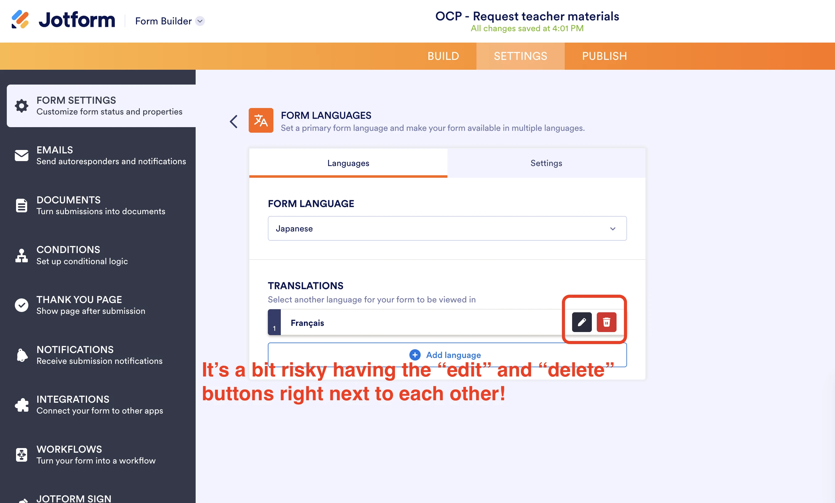
Hi team, I noticed that the Edit and Delete buttons in the Translation settings are positioned right next to each other. It feels quite risky, as it’s very easy to accidentally hit Delete when you mean to click Edit.
Would it be possible to add some space between them or move the Delete button to prevent accidental clicks? Thanks for looking into this!
Kind regards,
Mariko
-
 Podo: Support Specialist
Hi Mariko,
Thanks for reaching out to Jotform Support. I'm an AI assistant here to assist you.
Regarding your suggestion about the Edit and Delete buttons in the Translation settings being too close and the risk of accidental deletion, there is no specific information available about adjusting the spacing or repositioning these buttons in the current Jotform interface.
Your feedback is valuable, and such UI improvements are typically considered by the development team to enhance user experience and prevent accidental actions.
Let us know if you have any other questions.
-
 Chris_L JotForm Support
Hi Mariko,
While the feature you're looking for isn't available at Jotform right now, we've gone ahead and escalated your request to our developers. Exactly when or if it's developed depends on their workload, how viable it is, and how many other users also request it. If there are any updates, we’ll circle back to this thread and let you know.
Thanks for your patience and understanding, we appreciate it.

Your Reply
Something Went Wrong
An error occurred while generating the AI response. Please try again!