We’re thrilled to announce Jotform Mobile Forms, a reimagined take on mobile data collection. We didn’t want to make an app just to review submission information; we wanted to create a mobile platform with robust forms that work anywhere.
And we’re happy to say, we nailed it.
It would be a mistake to simply call Jotform Mobile Forms the app version of Jotform, because it’s more than that. It’s a whole new product designed to break free from the limitations on when and where you can collect the data that matters to your organization.
Jotform Mobile Forms was an undertaking over a year in the making. Our user research and product teams took a deep dive into learning what our users wanted to see.
So let’s get started with profiles of the users and industries that will enjoy Jotform Mobile Forms as well as some tips on how they can make the most of this new product.
Psst: We’re on Product Hunt. Don’t forget to check us out.
Our research
In the process of building Jotform Mobile Forms, our user research team interviewed a number of beta users to learn how they were incorporating mobile forms into their workflow. What they discovered is a diverse collection of organizations using mobile forms in entirely different ways but bound by a single need: to collect data anywhere.
Below are a few examples of how early beta users have been using the new app:
- A residential roofing company collects safety reports from workers in the field using Jotform Mobile Forms. Employees fill in the reports on their own devices.
- An elite amateur soccer team collects applications and electronic signatures through their mobile tryout request forms.
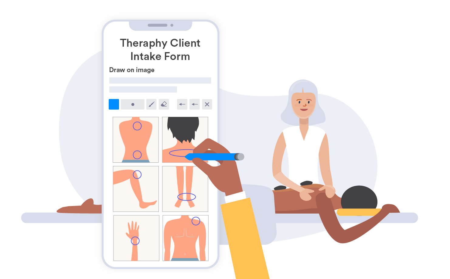
- A massage therapist submits photos and acquires patient signatures using mobile forms. The photos help them evaluate patient posture changes over time.
- A pet sitting company decides which teammate should do an in-house visit by using the map feature in Jotform Mobile Forms to see who lives closest to the pet owner.
- An outdoor adventure meetup club uses Jotform Mobile Forms to get people to quickly fill out liability waiver forms, even outside with no internet access.
We’ve built features in our new app to accommodate several different types of user profiles:
- Users who want others to fill out a form from a single device
- Users who fill out their own forms away from their desk
- Users who want others to fill out their forms remotely
Although Jotform Mobile Forms was born out of a desire to improve our old app, conversations with people who used our product prompted us to rethink our approach.
We realized very quickly that mobile data-collection needs often varied based on the type of work that a person did. We also found that gaps in the mobile data-collection market was prompting people to either use multiple solutions or some manual processes to get work done.
At the end of the day, we had to reimagine the way people thought about mobile forms and collected the information they needed.
“Once we looked at the mobile data-collection market and tried to find ways to expand what we had, that’s when Jotform Mobile Forms became a great product.”
—Aytekin Tank, CEO of Jotform
Jotform Mobile Forms gives people the flexibility to access, collect, share, and manage data on their own terms, regardless of where or how they work.
Users who want others to fill out a form from a single device
After talking to Jotform users and conducting market research, we realized our new product needed a feature that allowed a mobile device to act as a public survey station. We found that this was a particularly helpful tool for event organizers fetching on-site information from participants, retailers gathering in-store feedback from customers, or exhibitors collecting leads at conventions and trade shows, just to name a few.
The solution we developed for the mobile app was kiosk mode, which enables a form to take up the entire screen on a mobile device and refresh automatically every time someone submits a form.
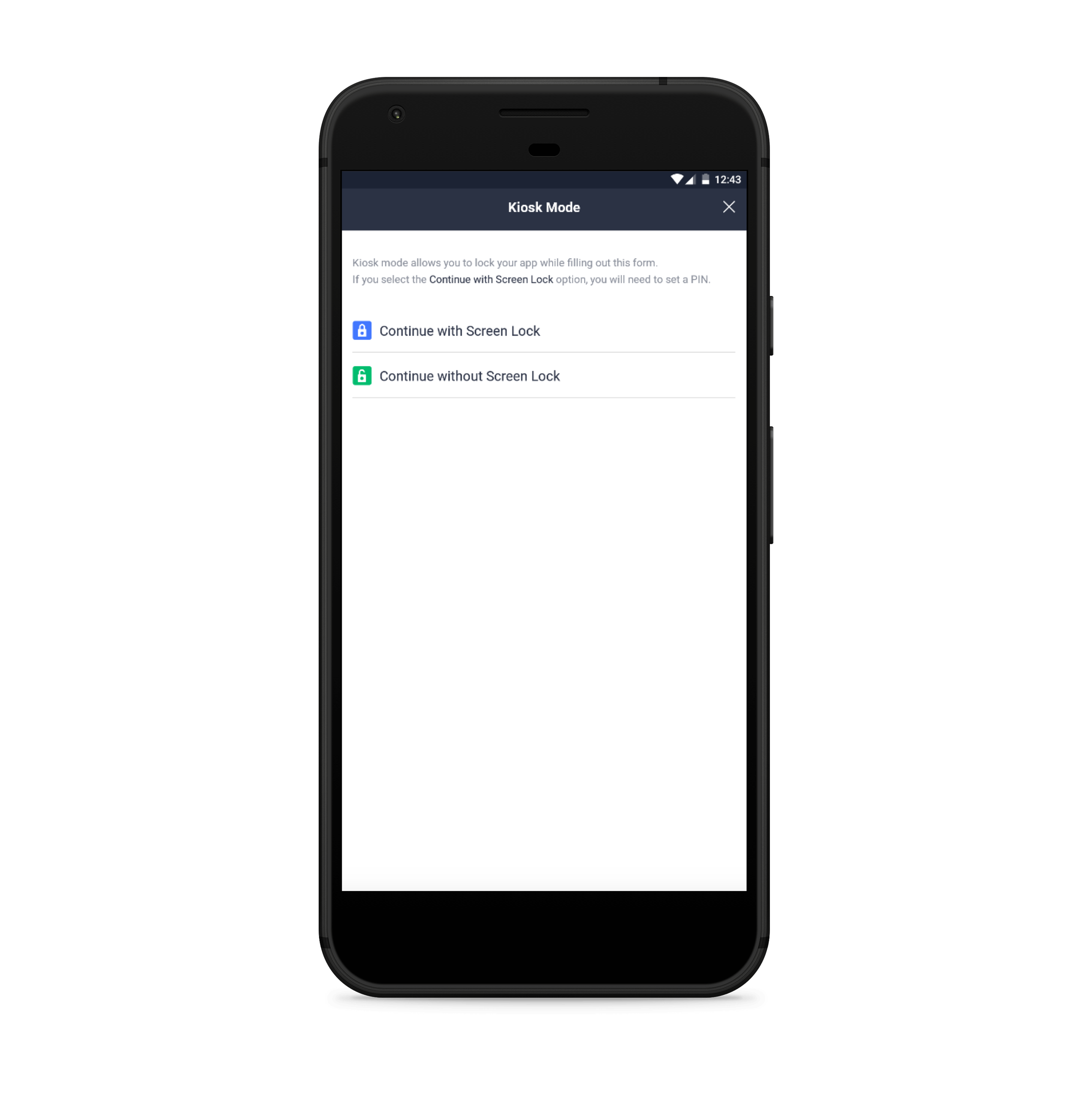
We even went a step further by adding a screen lock feature to kiosk mode, based on feedback from Jotform users who were worried about form responders trying to close kiosk mode and access individual forms or submitted information in the app.
Users who fill out their own forms away from their desk
Even though our trusty Form Builder has been incorporated into the new app, conversations with Jotform users revealed that some people preferred to build their forms on a desktop before filling them out remotely on a mobile device.
In some cases, Jotform users found it was easier to create long, detailed forms or customize the design and layout of their forms with CSS code on a desktop. Meanwhile, other users felt more comfortable building their forms on a desktop instead of a mobile device.
The good news is that any form built on a desktop, as well as any linked integrations, will look the same and work without a hitch on the Jotform Mobile Forms app. Jotform users can even edit a form or any submitted information on their mobile devices. Any changes they make are saved and synced automatically in their account.
Users who want others to fill out their forms remotely
We may have developed Jotform Mobile Forms with remote work in mind, but we also created it so that people could build and share forms with contractors, coworkers, or other team members to fill out.
This decision was based on extensive feedback from Jotform users, who wanted to share forms with other team members without granting them full or restricted account access.
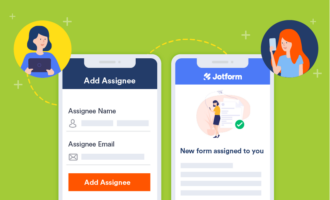
We designed a workflow that enables Jotform users to create a form and assign it to colleagues even if they don’t have a Jotform account. These colleagues, in turn, receive restricted access to a form so they can access it, complete it, and only manage information that they submit.
Jotform users, meanwhile, can receive notifications about when a team member submits a form and can manage that information on their end.
Some beta app users, usability testers, and interviewees made some “game changing” comments about the new app. We were surprised and excited about their job titles and industries:
- Safety inspectors (inspection forms)
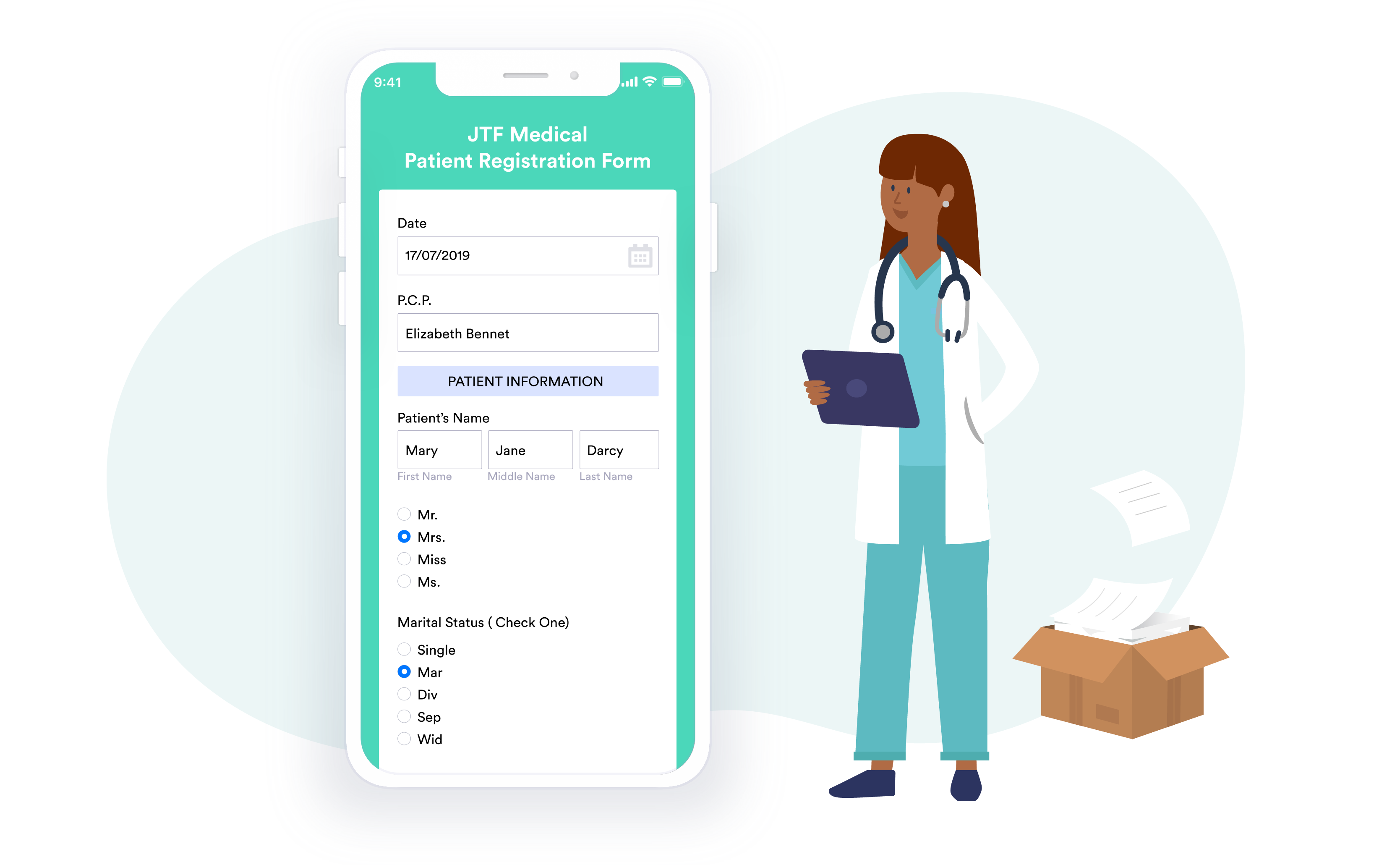
- Healthcare (patient intake, medical history forms)
- Contractors (project checklist forms)
- Property managers (inspection forms)
- Security and campus staff (incident reporting)
- Trade show marketers (list signup and lead forms)
- Oil, gas, and utility workers (rig inspection checklist forms)
- Sports leagues (waiver forms)
- Government and municipal service workers (work request forms, inspection forms)
- Pollsters (survey forms)
Notice something in common? Many of these workers aren’t tied to a desk and need to access data and fill out forms from a wide variety of locations where they may have limited to no internet access. Jotform Mobile Forms ensures that field workers stay connected to the information that they need, regardless of the mobile device they use or whether they have access to the internet.
Field workers
There was a time when it was more efficient and convenient to get important tasks done at a desk, in an office, and on a desktop or laptop. But changing job demands and shifting perceptions about how work is done have led more people to work remotely. This gradual shift toward remote work has been fueled by new apps that allow people to work on the go with popular mobile devices like smartphones and tablets.
With all of this in mind, we created Jotform Mobile Forms specifically for remote workers who need to tackle action items while they’re out and about. Jotform’s new app serves as an end-to-end solution that enables people to build and share forms as well as manage, organize, and edit any incoming information. It’s the mobile data-collection tool that field workers need.
Here are a few examples of how real-life companies and remote workers can use Jotform Mobile Forms:
Pet sitters
As a budding cat sitting business, Molly the Cat Lady and Friends relies on Jotform to manage the reservation process for nearly 400 existing clients.
The small Minneapolis-area business also uses the Jotform mobile app to get notifications when someone fills out a reservation form. This process allows John Hansen, a key business partner, to make decisions quickly based on that information, such as assigning visits for specific cats on certain days.
But after experiencing a nearly 300-percent surge in customer growth over the past three years, Hansen wants to nail down a solution that can not only capture, retain, and share information but also automate some data analysis processes.
Jotform Mobile Forms will enable Hansen to create a seamless data-collection workflow and collect the information he needs from colleagues who work remotely.
Hansen could, for instance, use the mobile app to assign a form to workers prior to a visit. The workers, in turn, would receive an email prompting them to download the mobile app and giving them access to view the form, fill it out, and manage the information that they submit.
Workers could also use built-in special form fields, or widgets, to take a photo of a cat that they’re visiting, record a voice memo, pinpoint where a form was filled out, and draw an e-signature that confirms a visit took place.
Once a form is filled out and submitted, Hansen would get an instant push notification, view the submission in the app, and even share it with a client so they know a visit took place.
Jotform Mobile Forms will also allow Hansen to share necessary information with cat sitters without giving them restricted access to his account. This can be particularly helpful for seasonal or short-term workers, such as young adults who work during their school breaks.
“We don’t want to put them through a tremendous amount of software training to communicate what’s important to them, and we don’t want to administer security and the keys to the kingdom, so to speak, to ensure they’re permitted to see this and not this.”
—John Hansen, business partner at Molly the Cat Lady and Friends
Nongovernmental organizations
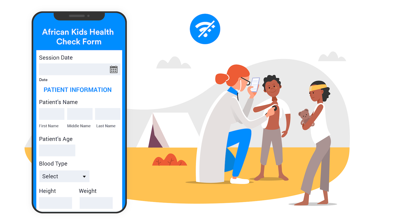
A humanitarian organization in Turkey primarily uses Jotform on tablets to collect medical information from refugees. The problem, however, is that doctors must be able to look up submitted information while out in the field and in areas where there’s little to no internet connection or cell service.
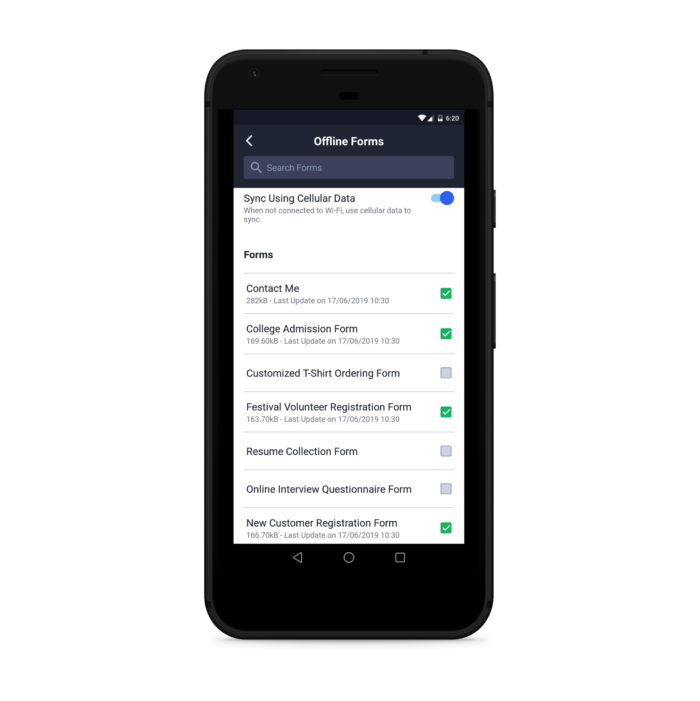
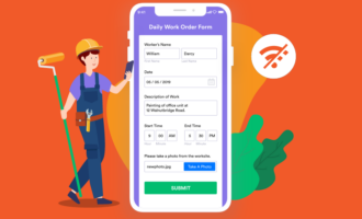
Jotform Mobile Forms allows field workers to access, view, fill out, and submit forms on any mobile device of their choice, even when they can’t find a stable internet connection. The best part is that field workers don’t need to worry about losing any information, since data submitted offline is saved on a device and synced as soon as an internet connection is available.
Field workers can even use built-in form widgets to share a broad range of important information, such as voice recordings, photos, or geolocation data, and submit it offline. This is important for the humanitarian organization, since it must track when and where patients are seen over time.
Since doctors often see a lot of patients and organize this data by name, Jotform Mobile Forms allows humanitarian field workers to sort through their forms and submissions even they’re not connected to the internet. That means doctors can spend less time searching for information and more time with the patients who need their help.
Safety inspectors
A risk management company uses Jotform to produce a wide range of forms — from checklists to emergency evacuation procedures — for clients based in Australia and the United Kingdom. The ability to pull up, fill out, and submit forms offline through a mobile app is particularly important for the company, since many clients must complete forms when there is little to no cell phone reception or internet access.
One client, for instance, is a local government in the Australian state of Victoria that covers more than 2,000 square miles. Since the area is so vast and remote, it’s common for government workers to travel about 124 to 186 miles (200 to 300 kilometers) from where they’re based. Smartphones can be more of a burden than a benefit in these areas, since there’s virtually no cell reception or internet access.
The company currently creates forms and shares them with clients to fill out. Once clients complete and submit forms, automated notifications are sent to specific people, based on their answers to certain questions. Submitted form information is also saved to a cloud-based file storage solution, such as Dropbox or Google Drive, for archiving purposes.
The offline feature in Jotform Mobile Forms will allow the risk management company’s clients to access and fill out forms, as well as view any submitted information, even when they’re in remote locations with no internet access. Remote workers don’t have to worry about losing submitted information, since that data is saved on a mobile device and sent once a Wi-Fi connection has been re-established. There’s even an option for remote workers to send submitted form information as soon as a mobile phone signal is available.
As an added benefit, forms and any submitted information can be sorted while a user accesses Jotform Mobile Forms in offline mode. This allows people to pull up the information and mobile data-collection tools that they need in a pinch.
The behind-the-scenes story of Jotform Mobile Forms
Background
When Jotform was founded in 2006 only 3.8 percent of Americans owned a smartphone, compared to 77 percent today. Think about that for a moment.
That was a full year before the release of the iPhone and three years before anyone saw an iPad.
As you can imagine, businesses collected information differently back then.
No one designed online forms to be filled out on mobile devices, much less created them or shared them on the go. They didn’t need to. Paper forms still reigned, and pen and clipboard sales soared.
But work has evolved with the rise of mobile adoption — not only how people work but where they work. And so too has Jotform.
The building process
Over the past four years, we noticed that the old app was getting a lot of feedback — some good but most requests for improvements. Our users wanted better features and more functionality.
Jotform Mobile Forms started as a small project — the plan was to use our user feedback to make a simple UI improvement and add a few new features. We soon found out that the old app wasn’t doing enough, and we needed to start from scratch. Users wanted an offline feature, the ability to assign forms to others, and much more.
Developing our app was tricky because we were building it for both iOS and Android operating systems. We had to constantly think about differences in devices, accessibility, and system updates. We used React Native (a program for building native apps) since we’d used React for other projects, which helped us a lot.
The core of our product development was based around our users — we wanted to give them a better experience by enabling them to work anywhere, speed up their workflow, and easily collaborate.
Before we started on Jotform Mobile Forms, we looked through all of the user feedback from our old app and sent out hundreds of user tests. Even after the tests were sent out, we continued to ask for feedback so we could continuously improve what we were building.
It took us a little over a year to get the app up to par. Our process was so consumed with what users wanted that the current UI is far different than the one we started with.
Even after we launch Jotform Mobile Forms, user feedback will play a big part in making updates and adding new features to the app.
Why did we decide to revamp the mobile app?
To enhance the features. Over the past four years, the old app got a lot of feedback. At the beginning of the year, the user research team began conducting interviews. Users told us that they needed offline capability and the ability to assign forms (a lot of people use Jotform with sub-users).
What began as a small project became a complete reimagining of mobile forms.
What’s the process of designing something like this?
It’s complicated because you have to think about developing a product for iOS and Android. There are lots of things you don’t necessarily think about, such as accessibility problems. We constantly had to consider different devices and make updates each time an operating system was updated.
We started this project by looking at users’ needs. The current UI is far different than the one we started with. We sent hundreds of user tests to find ways to improve the app.
Seeing the app come to life was exciting. It’s awesome to open the app and see it working.
How did we integrate user feedback into the final product?
Before we started, we looked through the user feedback from our old app. We then created our minimum viable product (MVP), which contains that feedback. Next, we alpha tested with our close community and then created an open beta group with the help of the data team. Now we have almost 5,000 beta users, and they’re sending lots of feedback. A support team member joined our team for the month before the launch to help us reply to feedback.
In 2018 more than 4 million unique visitors used their mobile phones to access the Jotform website. Users needed to access their forms on the go, and we weren’t making it easy for them.
Now we’ve gone from under serving several types of workers to giving these users the ability to completely manage the flow of information coming into their business, no matter what type of device they use.
Top features
After months of brainstorming, developing, debugging, testing, refining, revisiting, and fixing various parts of the new mobile app, we are finally ready to show you the fruits of our labor.
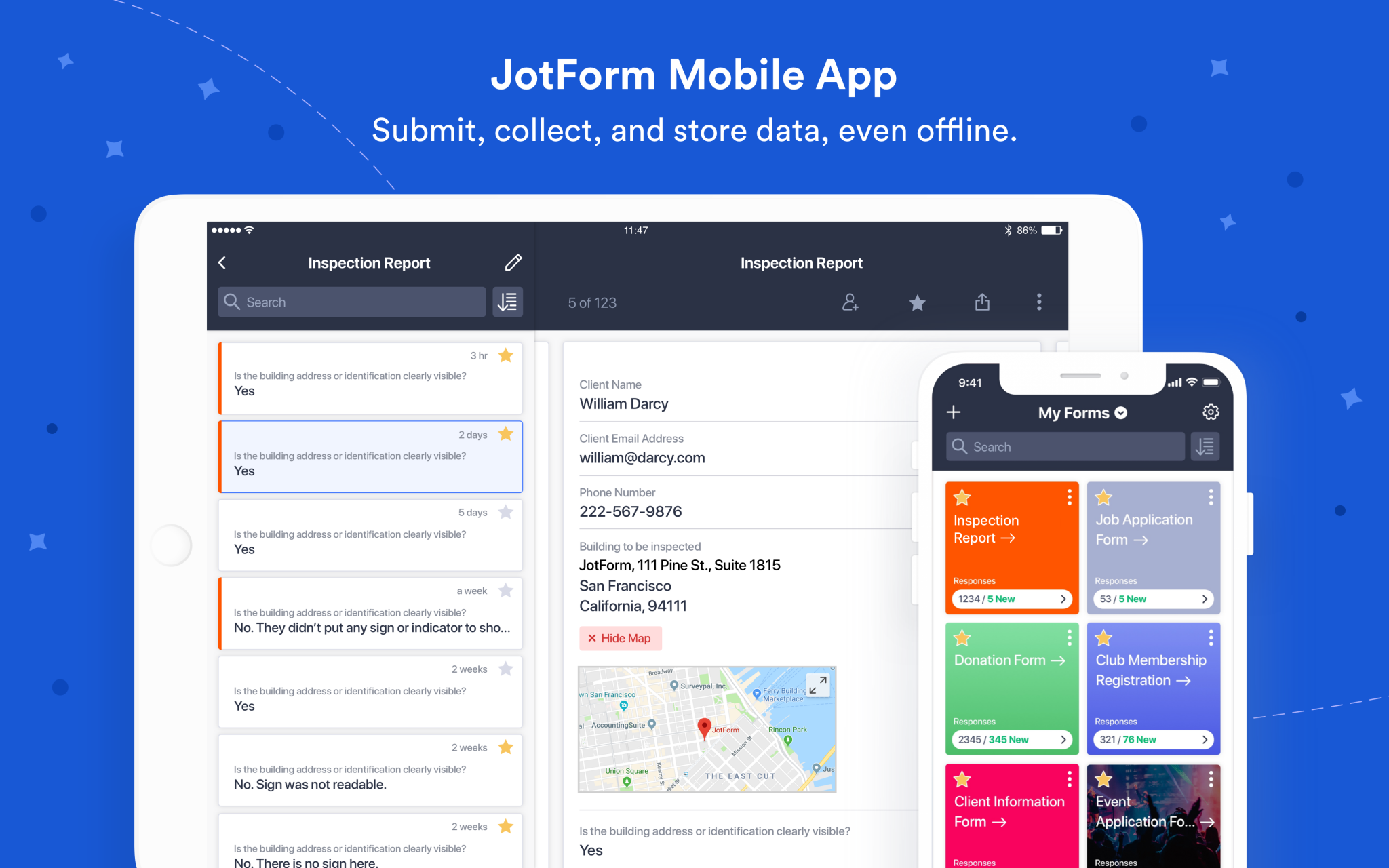
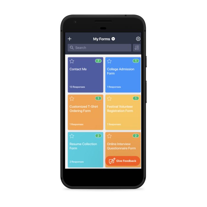
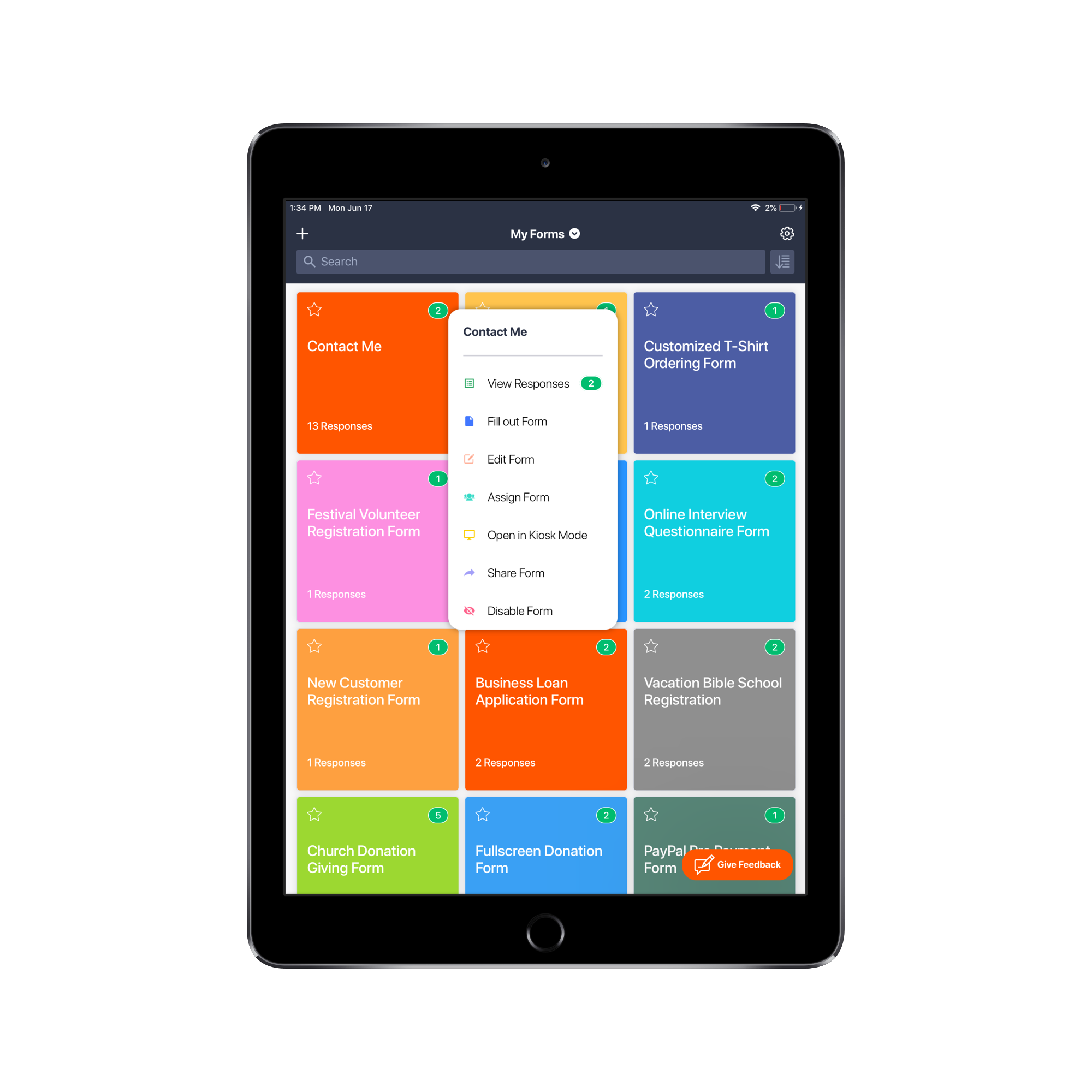
This all starts with the new and improved My Forms dashboard, which displays form selections as cards.
Each form on the scrollable dashboard gives you the option to view any form you want with the tap of your finger. And the search bar at the top makes locating the form you need easy, particularly if you have lots of forms. The forms in your My Forms dashboard show either the color or image you use on your form’s background, making it easier to spot what you’re looking for and adding a splash of color when you’re scrolling.
Offline forms
The real standout feature of this workflow is the offline capability. Even if you’re in a remote location, far away from cell service or an internet connection, you can access any of your forms and fill them out on the spot. When you’re reconnected to internet or cell service, your data will automatically sync with your Jotform account.
This immediately replaces paper forms and the related workflows, where workers in the field needed to record data by hand (think inspection forms or collecting samples).
Offline forms were one of the most requested features over the past few years. Jotform Mobile Forms makes your forms accessible anywhere you are.
We created a fun video for this feature that sums it up in less than a minute.
Enable offline forms from the Settings tab at the top of the screen, and then select the forms you’d like to use offline.
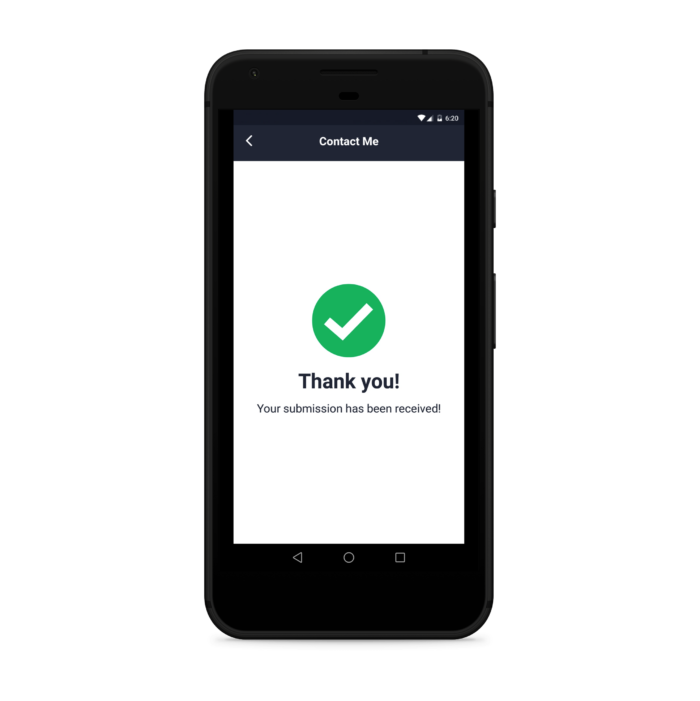
After submitting an offline form, you’ll be redirected to a modified “thank you” page that lets you know that the data is saved and will be submitted to your account the moment you’re back online.
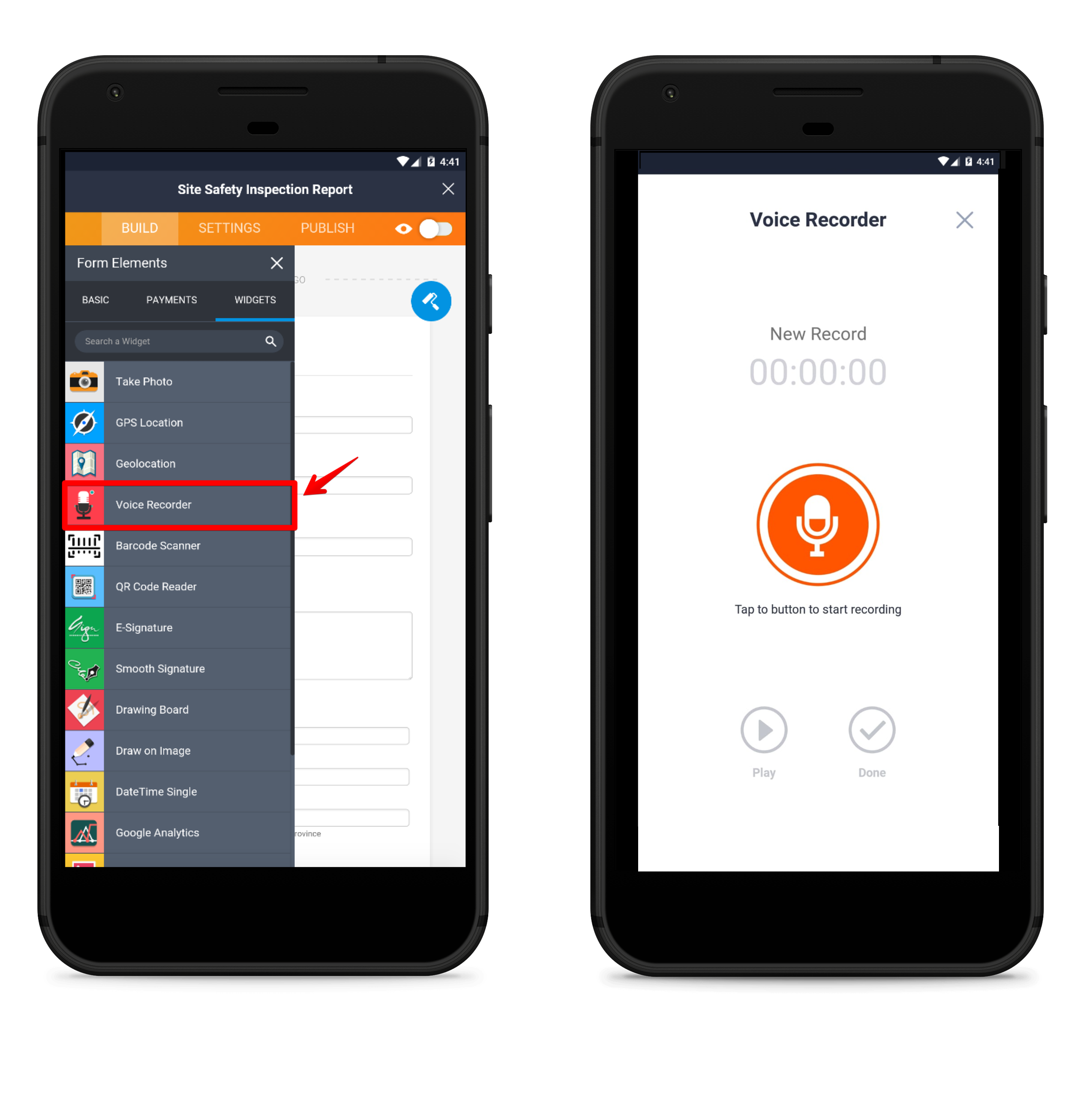
Voice Recorder widget
Our Voice Recorder widget is a powerful tool. From any device, someone can record audio as a form submission. A remote worker can record themselves describing a problem they’re encountering for their inspection form. Often it’s easier to explain something by talking than by typing up a description, especially if you’re using a small touch-screen keyboard.
Geolocation widget
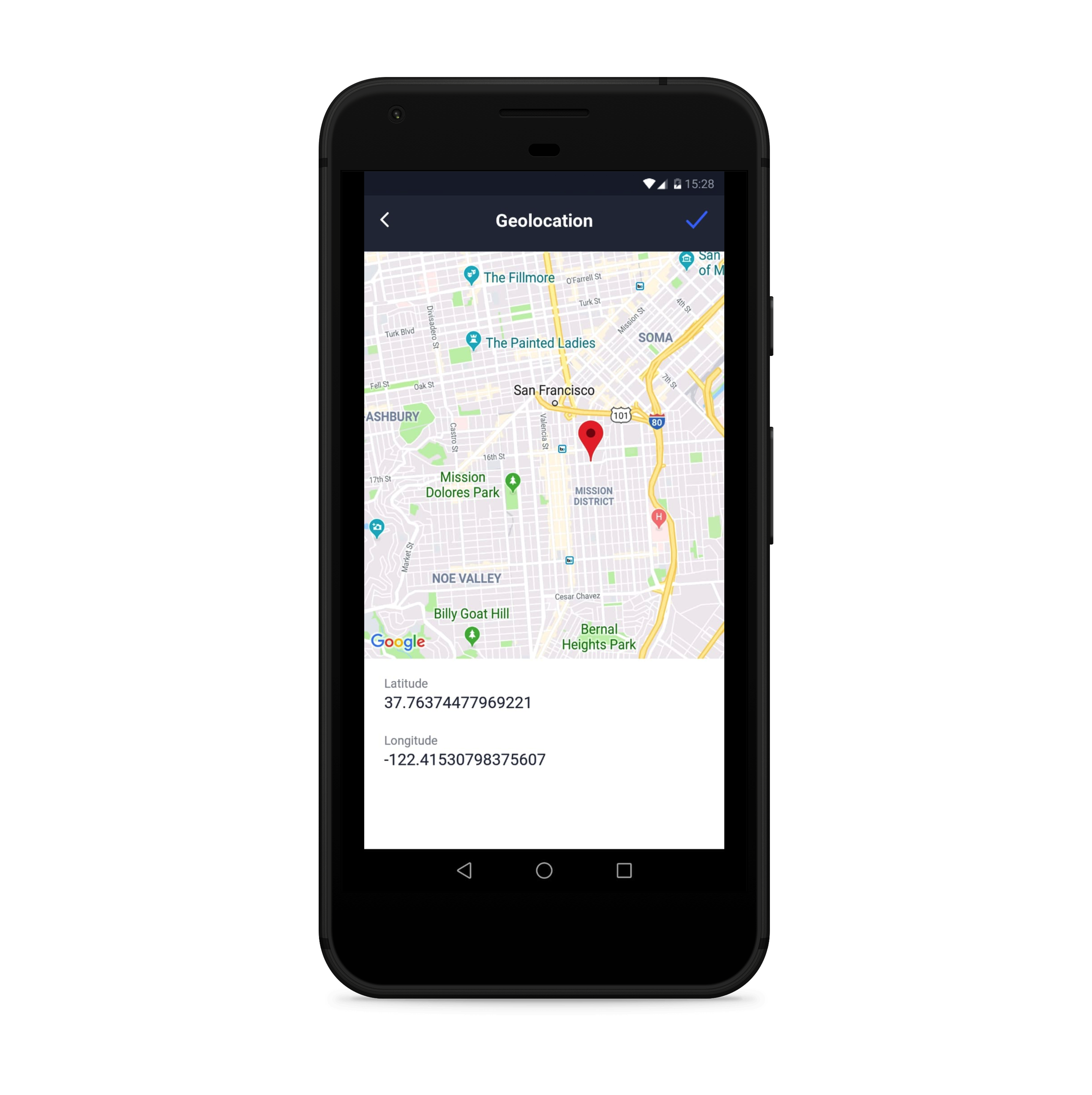
If you’re out in the field, you often need to enter location information. And if you’re not at a physical address, this can be difficult. The Geolocation widget solves this issue.
When you’re filling out a form using Jotform Mobile Forms, this widget automatically pins down your coordinates using Google Maps. In your inbox, the form shows an image of the map with your submission location marked.
Barcode Scanner widget
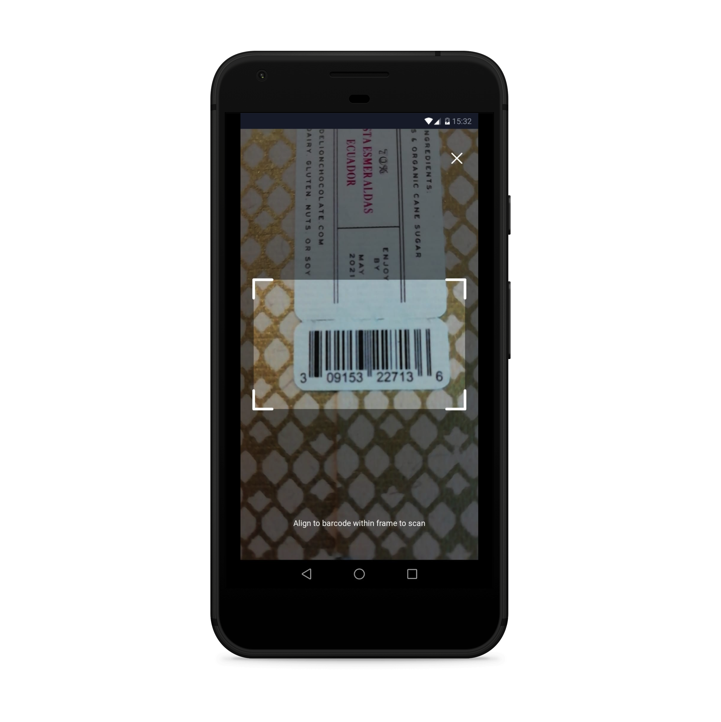
The barcode scanner allows you to effortlessly scan barcodes directly from your form. Logistics and inventory management employees can use this widget to collect more accurate data and reduce costly mistakes.
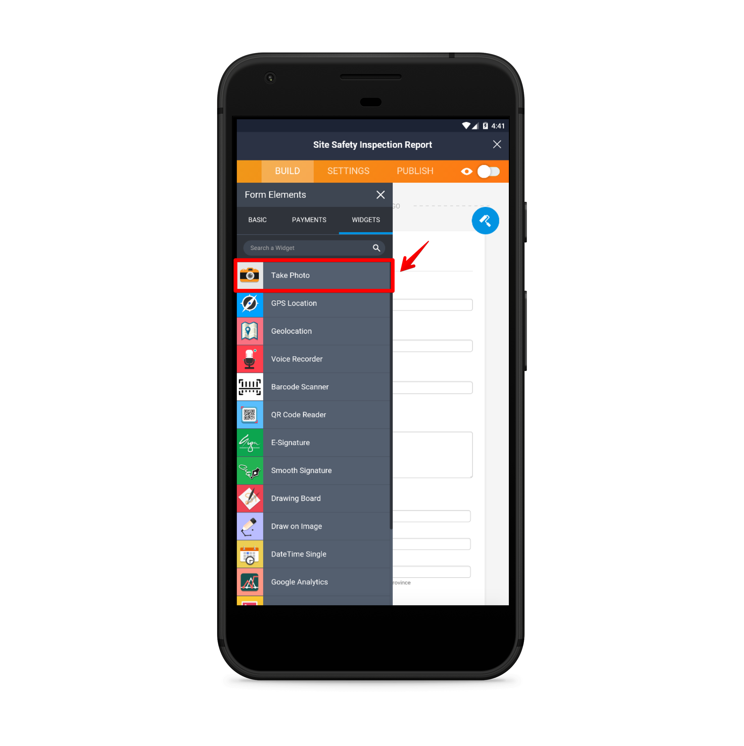
Take a Photo widget
Field workers, inspectors, and anyone reporting an incident will benefit from this widget, which allows them to take a photo and submit it directly through the form app. Once the widget is enabled, the form respondent clicks on “Take Photo” from their form, which accesses the device’s camera.
The first photo taken automatically attaches to the form and is sent along with the rest of your submitted information.
You don’t have to close the form, snap a picture, and then return to the form to upload a picture. Instead it’s all part of the same process.
E-Signature widget
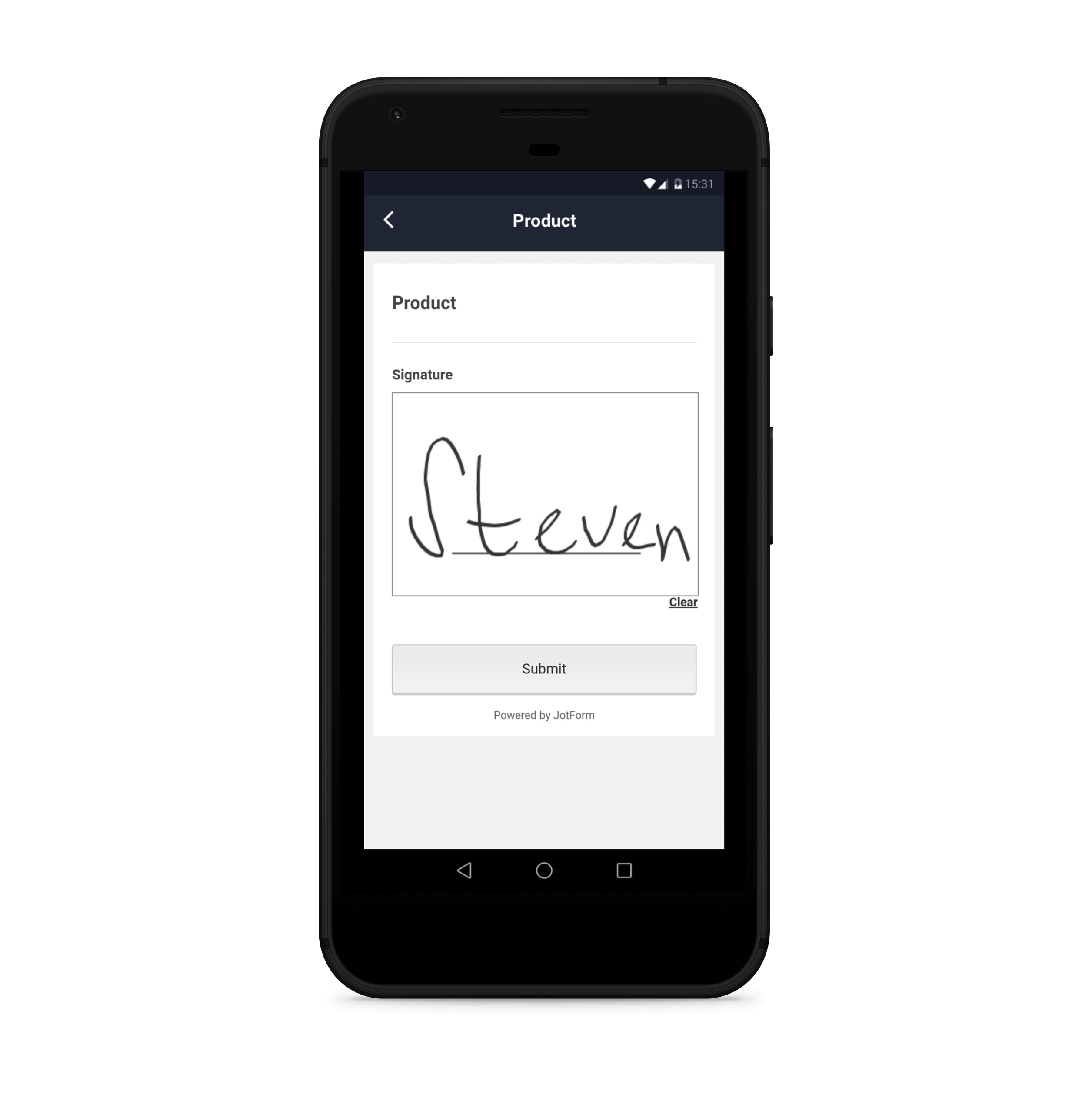
We wanted to make collecting electronic signatures a lot easier with Jotform Mobile Forms. Signing using your finger on a mobile device is a little more intuitive than using a mouse on a desktop, and it looks better.
Jotform Mobile Forms improves the process, whether you’re signing yourself, sending the form to someone else to sign, or asking people to sign from your device.
Below is a video that explains some of these useful widgets and how you can benefit from them.
All of these special form field widgets are great add-ons for forms that your remote teams use.
Form creation and editing
In 2017 we released Jotform 4.0, which introduced everyone to the concept of building a form using a mobile device. Now this functionality is seamlessly baked into our mobile app so that you can edit an existing form or create a new one with the same ease that you can using a desktop.
The Form Builder on mobile is the exact same one you use on the desktop, only modified to fit any device size. An “Add” button pops up on the left side of the screen and opens the Form Elements panel. From there, just tap on the fields you want to add to your new or existing form. All of the mobile-specific widgets are shown at the top so you can easily find them.
Form assigning
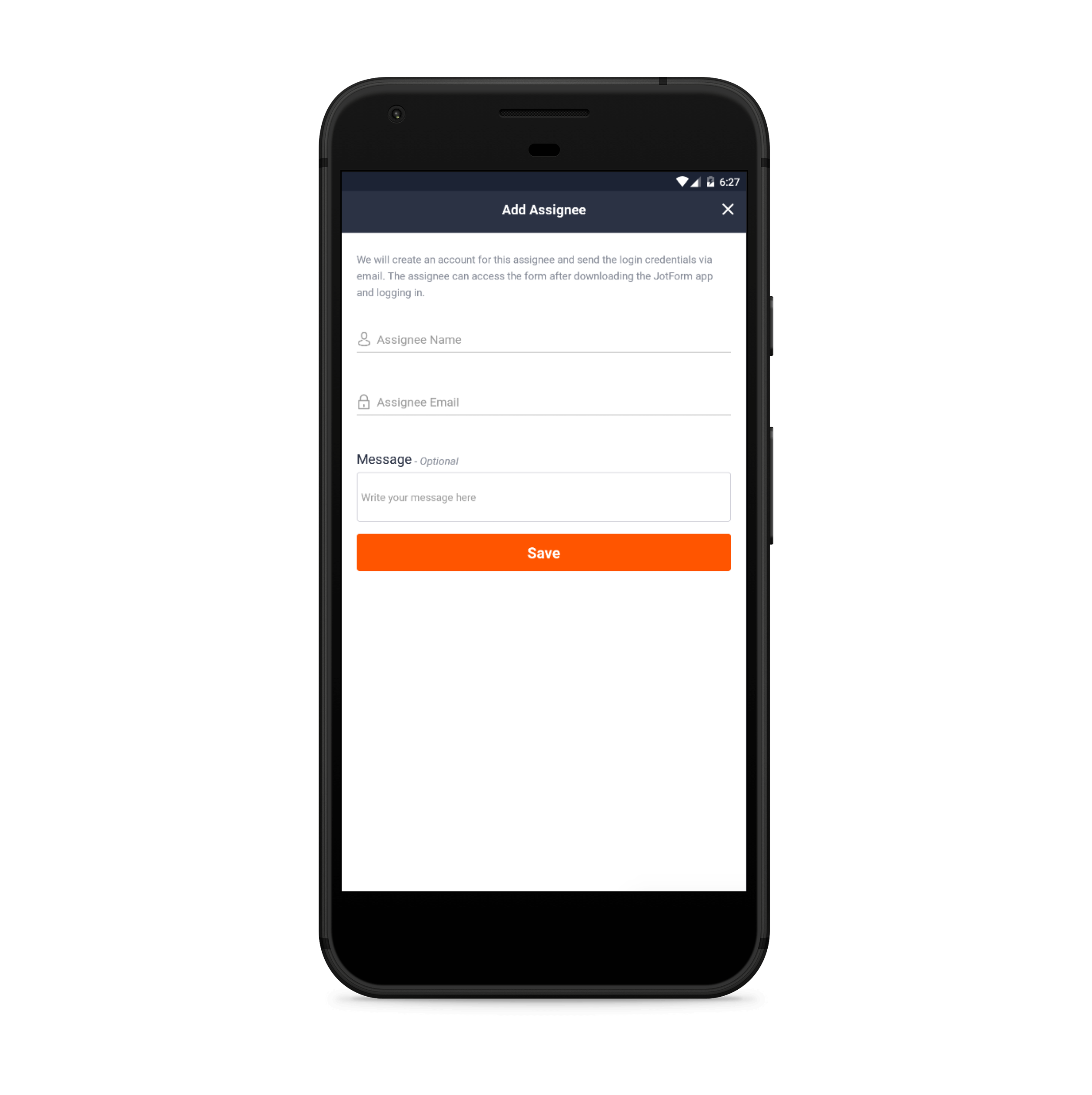
Our form assigning feature is all about collaboration. When you assign a form to someone, you allow that person to not only fill out the form but to edit the form and manage submissions for it as well.
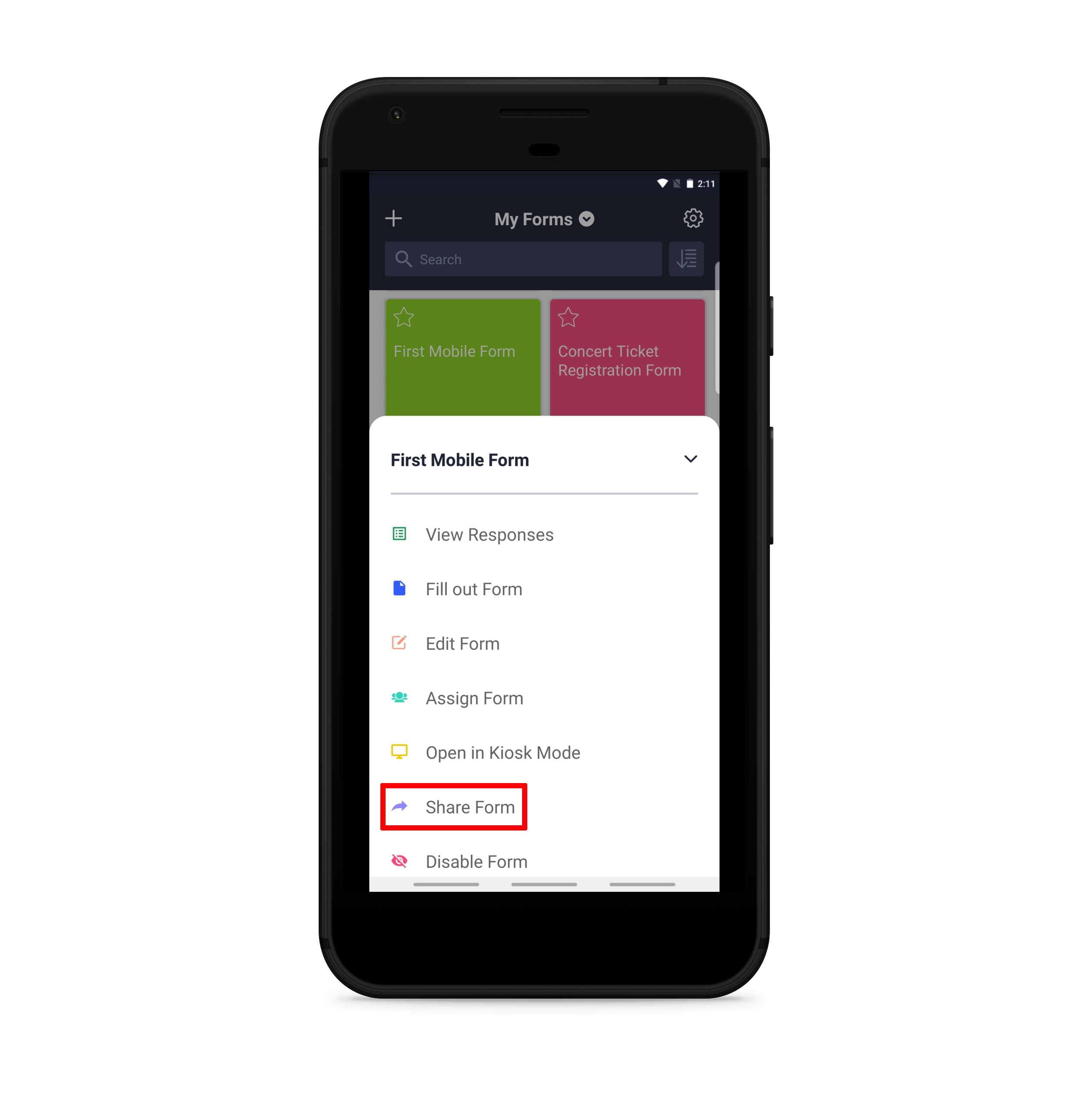
Select any form in your dashboard and assign it to someone just by typing in their name and email. If they don’t already have a Jotform account, they’ll be prompted to download the app.
Form sharing
One-tap sharing options make it significantly easier to get your form in front of the people who need to fill it out. This feature makes it possible to share the form through the channel that works best for you, including
- SMS text
- Slack
- Social media
- Google Hangouts
- Asana
- Trello
It was important to make this feature as seamless as possible. If you’re out and about and want to send a form to someone else, it helps to have options.
An example that immediately comes to mind is when our marketing team visits other businesses to do video shoots and needs to collect responses to our model release form. Being able to quickly send the form to respondents so they can fill it out on their own devices saves us significant time.
Jotform Mobile Forms also enables form submission sharing. Using the same sharing options listed above, you can send a form response to anyone.
Customizable notifications
One of the most helpful features for all types of users is the ability to customize notifications. You can set up your form so that you receive push notifications whenever someone responds.
On the other hand, you can elect not to receive push notifications. This is good news for users with lots of forms, because it means they won’t be bombarded with incoming responses.
The ability to create a contact
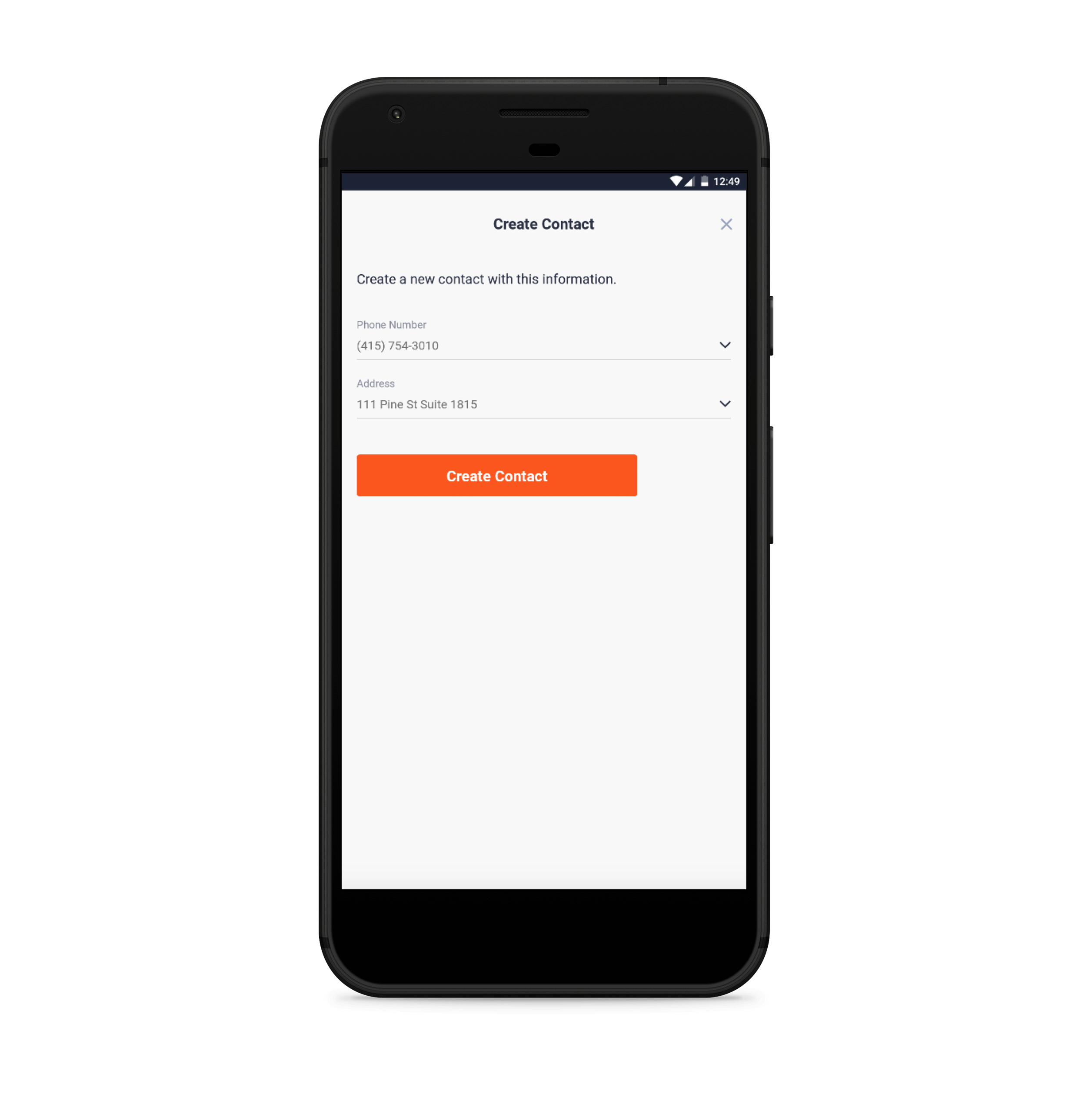
With a single tap, you can turn an incoming form response into a contact on your phone that includes all of the necessary information (phone number, email, address, etc.). This feature shows up as a person icon in your mobile inbox above each submission.
This feature is great for quickly adding sales leads, customers, partners, job applicants, or colleagues to your phone once they submit a form.
Inbox maps
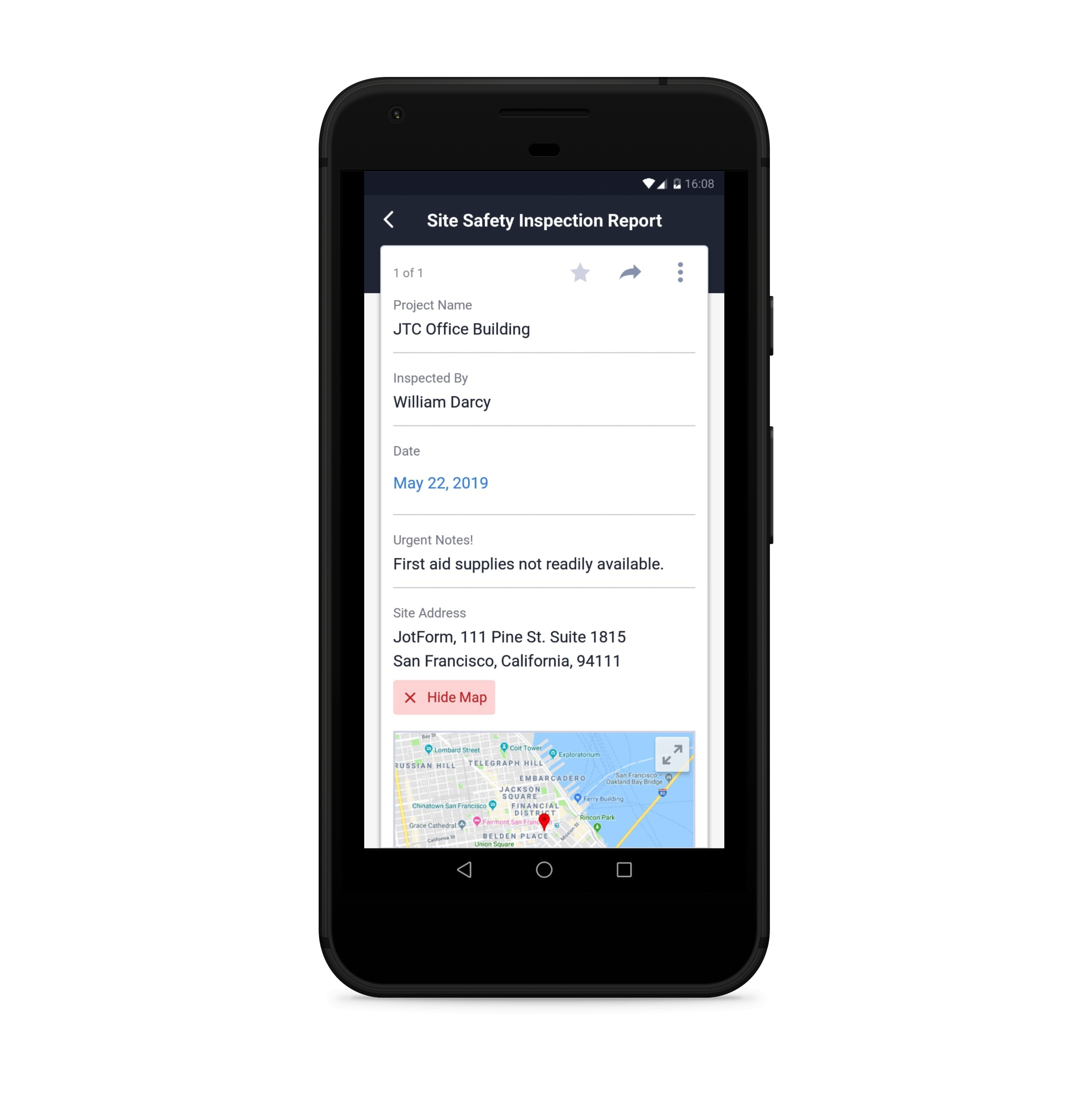
Whenever someone submits an address through your form, you can instantly see where it is on a map straight from your mobile inbox. Directly under the submitted address you’ll see a “Show on Google Maps” option, which immediately displays the address on a map within the submission, so you don’t have to navigate away from the app to see where it is on a map.
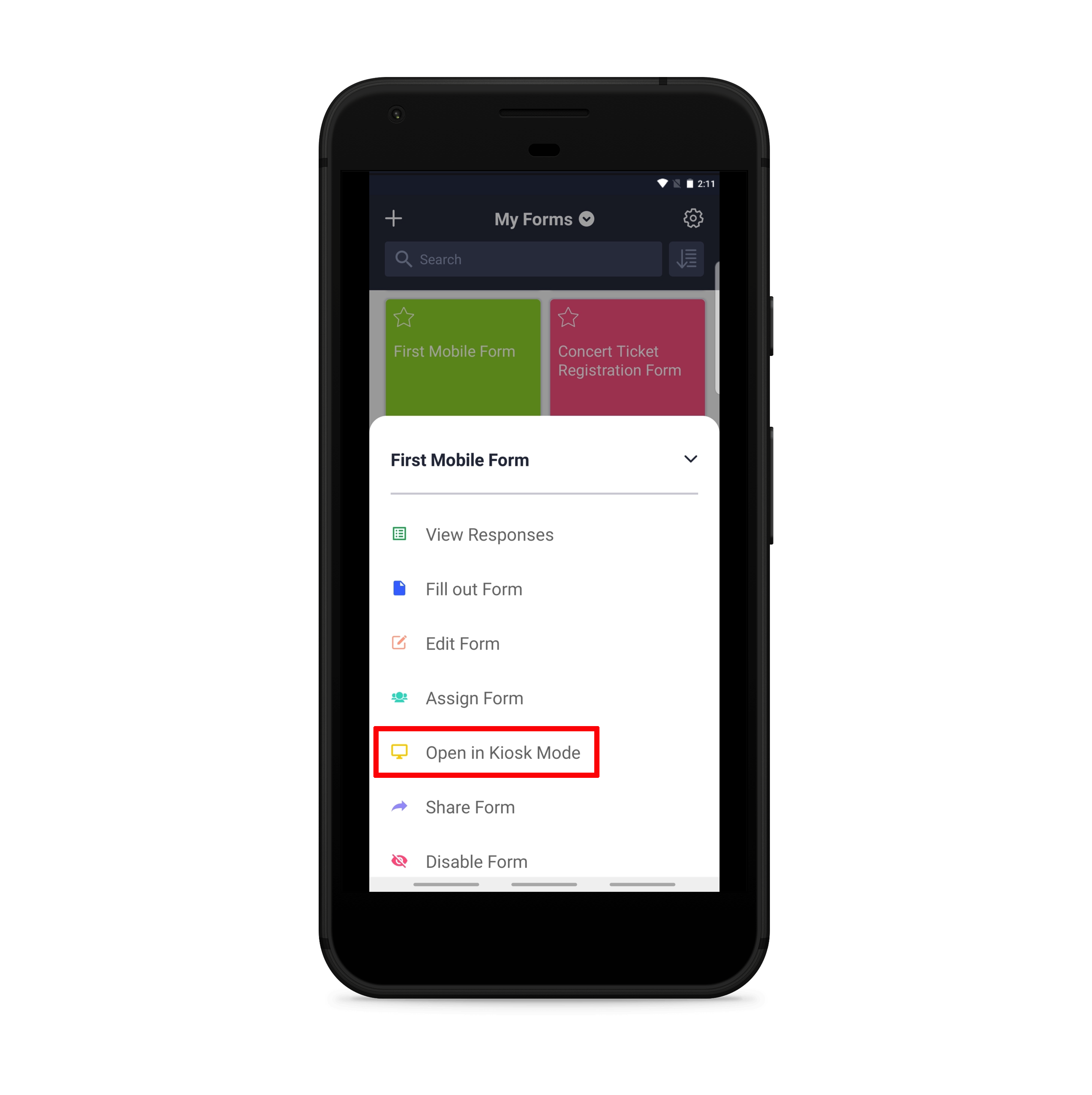
Kiosk mode
Users who wanted to turn their devices into public survey stations or get people to fill out forms in public places needed a form solution that would automatically reset after a form was submitted.
Kiosk mode makes this possible. Set up your tablet on a stand with this feature enabled, and the moment someone completes your form, it resets for the next respondent — you don’t have to do a thing.
That means your tablet turns into a critical part of your exhibitor booth at trade shows or as a feedback form at stores. You could even use this feature if you’d like a small group of people to fill out a release form or a waiver.
Kiosk mode also gives you the option to lock your screen so that no one responding to your form can close out of the Jotform Mobile Forms app and access anything else on your device.
Here’s how a San Francisco-based lemonade stand uses kiosk mode to gather important customer feedback (OK, not really):
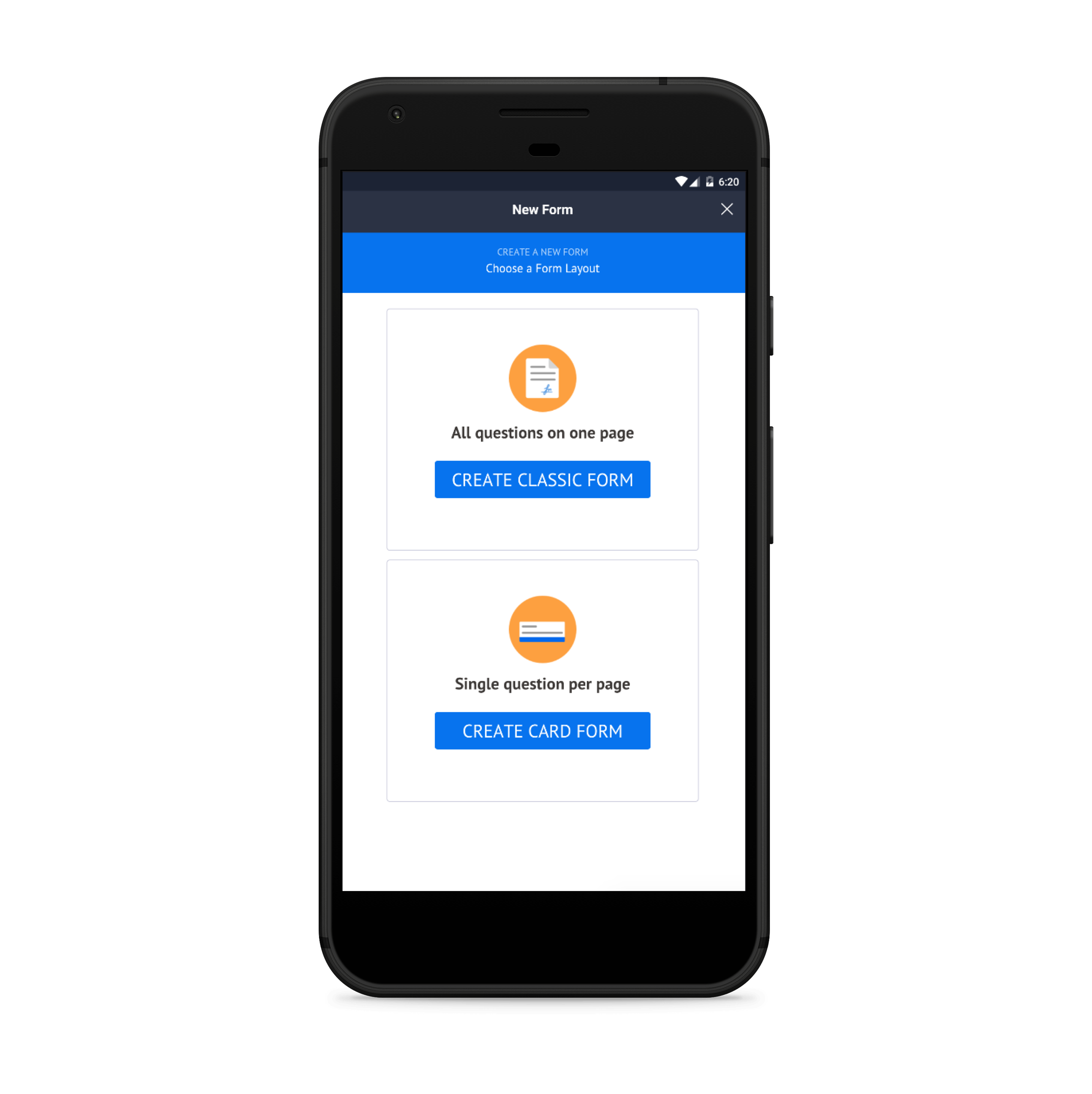
This mode works particularly well with Jotform Cards, a form style that displays form fields on a screen one at a time.
The top benefits of Jotform Mobile Forms
More accurate data collection
Digitizing remote data collection improves the accuracy of your data. Whether it’s using widgets that pinpoint the exact location you’re entering, photos that you’re including to enhance your form submission, or the mere fact that you’re eliminating illegible handwriting on paper forms, you’ll see an improvement in overall accuracy.
The ability to access data anywhere
Jotform Mobile Forms gives you the entirety of your Jotform Inbox on the go. And if you have hundreds of forms, and thousands of submissions, it’s still a breeze to find exactly the information you’re looking for. You have the option to sort your list of forms alphabetically by title (A to Z or Z to A), creation date, last edit, submission count, unread, or last submission.
Once you’re on a form that you’d like to review, you can use the search bar at the top to find the specific submissions you’re looking for.
Paper reduction
Using online mobile forms to collect data remotely means you don’t have to use paper. And that’s no small improvement.
Paper is expensive, inefficient, and bad for the environment.
And it’s not just that the paper itself is expensive (although it adds up), but paper requires additional costs for copying, storage, printing, and postage.
Instead of printing a single form over and over again for different respondents or incidents, keep it on a single device that fits into your pocket.
Improved productivity and speed
Online forms are already a proven timesaver. The ability to access, distribute, and modify them on the go makes them more powerful than ever. In fact, the fastest way to get someone else to fill out one of your forms is now through your mobile phone.
Beyond that, mobile forms instantly send form response information where it needs to go, whether that’s an email inbox or a third-party business app like a CRM or cloud storage software — no more manually inputting data that’s been written down on paper.
No need to reprint revised forms
Paper workflows don’t offer a lot of flexibility when you need to revise a form after it’s already been printed. Your options are pretty stark: reprint altogether or handwrite the changes.
Jotform Mobile Forms fixes this problem. You can edit any of your forms on the go. Changes save in real time, so as soon as you make a change on your form, it’s live.
The power to future proof your business
Not only is the world going paperless, but younger generations expect to be able to use their smartphones for certain business processes. If your business is going to compete for future generations of talent, the smart move is to stay ahead of trends that will keep your company on the cutting edge. Jotform Mobile Forms tackles this head on.
Mobile phone vs tablet
Apart from its unique features, one standout quality of Jotform Mobile Forms is its ability to offer the same range of functionality across mobile devices and operating systems.
That means anyone who views, edits, builds, or fills out a form in the Jotform Mobile Forms app can expect a seamless experience, regardless of whether they use it on a mobile phone or tablet, an iOS or Android device.
The app’s general appearance and navigation are essentially the same across mobile devices, although there are a few minor differences when an app is accessed on a mobile phone vs a tablet.
- Because of their larger screen size, tablets will have a larger menu and display more form icons on the Jotform Mobile Forms home screen than their smaller smartphone counterparts.
- The settings and form submissions menus in the app will look different for tablet users. Those menus will list options as blocks on the left side of the screen, and display the contents of a selected option on the opposite side. Mobile phone users, meanwhile, will only see the menu of options displayed as blocks and must make a selection to view the contents in another screen.
People will likely notice a few more subtle differences in functionality if they use an iOS or Android device to access the Jotform Mobile Forms app.
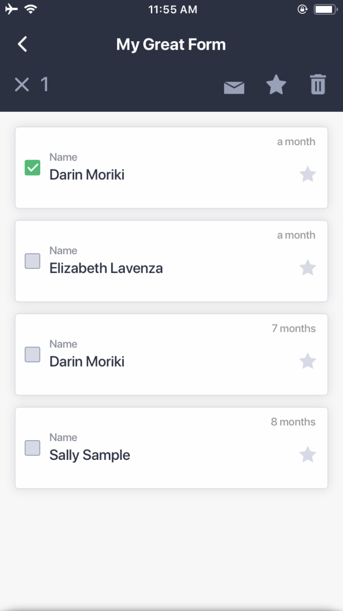
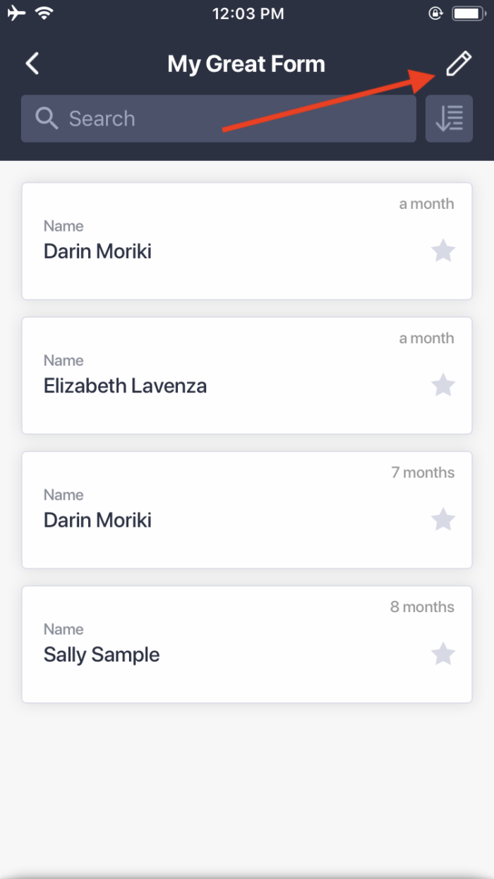
- Android and iOS users can conduct long-press (touch-and-hold) actions in the form submissions menu to delete multiple submissions and mark them as read or important items. A long-press action takes place when someone presses on an icon and holds it for an extended period of time. iOS users can also use a pen icon at the top right side of the submission list menu to make multiple selections — this option, however, is not available for Android users.
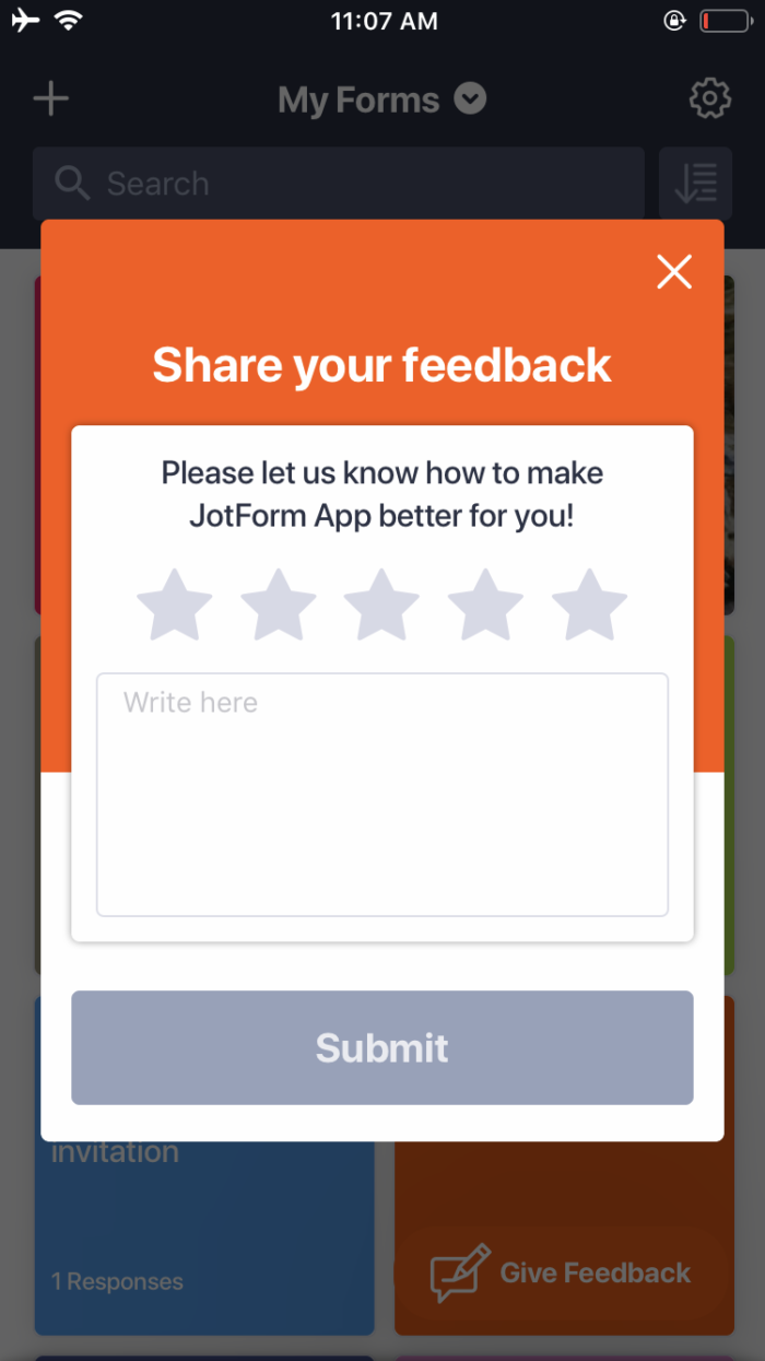
- If someone presses the “Give Feedback” icon on an iOS device, a dialog box that asks for a star rating and detailed feedback will appear. Android users, meanwhile, will be prompted to write feedback but will not be asked to provide a star rating.
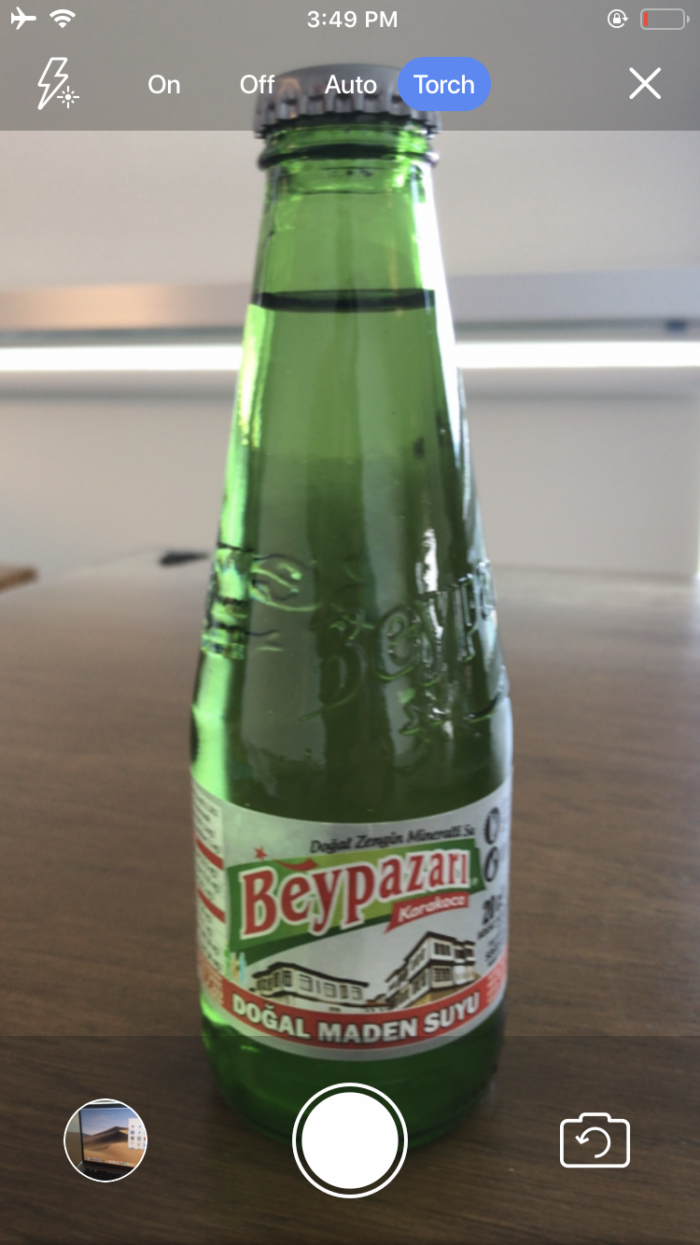
- If someone uses an iOS device to take a photo and add it to a form, they can take advantage of the native “Torch” option that activates the flash on a device’s camera until it’s turned off.
Useful Jotform Mobile Forms integrations
Imagine you’re a maintenance supervisor for a railroad track. On a routine inspection, you spot a track switch that needs lubrication. No big deal. You whip out your phone, input the work needed for the job, and then continue inspecting the rest of the track. And because you’ve integrated with Asana or Trello, that request is added to a collaborative project management board that assigns the task to a maintenance worker.
If you’re planning to use kiosk mode at a trade show to collect information from potential leads on your tablet, you can integrate your form with a powerful CRM. HubSpot is free to use and mighty enough to power companies of any size.
Constant Contact and Mailchimp
What good is collecting all of that prospect information at your trade show booth if you don’t have a powerful email marketing program to send those new contacts follow-up communications? Constant Contact and Mailchimp are two of Jotform’s most popular email marketing integrations. Both make it easy to segment email lists, design emails, and analyze the performance of campaigns.
Wondering what happens with all of those signatures and images you collect with Jotform Mobile Forms? If you sync them with a powerful cloud-storage system, whatever data you collect, in whatever format, automatically goes to the secure drive that your team depends on.
If you’re collecting data remotely, there is probably someone you’d like to share that data with. Or maybe you’re the one back at the office waiting on data from workers in the field. Either way, it’s great to have a way to sort and share the information collected through Jotform Mobile Forms. Google Sheets and Airtable are both terrific ways to generate simple-to-view, sortable lists of the information you collect.
Jotform Mobile Forms tutorials
We’ve provided several clues about how to make the most of Jotform Mobile Forms. But if you need more assistance, our Mobile Forms tutorials are here to help.
- How to Download and Start using the Jotform Mobile App?
- How to Create Your First Form with Jotform Mobile Forms
- How to Use Kiosk Mode in Jotform Mobile Forms
- How to Take a Photo and Upload It to Jotform Mobile Forms
- How to Customize Notifications in Jotform Mobile Forms
- How to Record Audio and Video on Mobile Forms
- How to Collect GPS Coordinates with Mobile Forms
- How to View Your Forms and Submission Data in Jotform Mobile Forms App
- How to View and Let Users Fill the Forms Using The Jotform Mobile Forms App
Using your forms and submission data while on your computer is a great tool to have but why not take it a step further to supercharge that ability and take your data with you on the go!
Creating your first form with Jotform’s mobile app is very similar to building a form on the desktop version. With our new app, you can now create forms on the go.
We’re excited to introduce a great new feature included in our reinvented mobile app — kiosk mode. You can use this feature on a smartphone or a tablet, whether you’re online or offline. Kiosk mode is available for both iOS and Android.
Imagine the convenience of taking and uploading a photo to a form without leaving that form. Thanks to Jotform Mobile Forms, you can do just that.
Jotform Mobile Forms allows you to customize your form notifications so that you can get notifications as soon as someone submits your form, or not.
You can add fields for recording video and audio in Jotform Mobile Forms just as you would in the desktop version.
You may need to record GPS coordinates on forms such as incident reports, order delivery forms, and more. You can now do this with Jotform Mobile Forms.
You’ve logged into your Jotform account through the app. Now what? Along with many other things, you can easily view your forms and submissions.
With Jotform Mobile Forms, it is much easier to view your forms, fill them and turn your mobile device into a station in which forms would be filled by many people.
In addition to tutorials, we have published several blog posts to give even more details on Jotform Mobile Forms and real user testimonials.
- How to get work done on the go with offline forms
- What is kiosk mode, and how can you use it to collect data remotely?
- Use Jotform Mobile Forms to assign forms with ease
- How to use Jotform Mobile Forms to customize form notifications
- How mobile forms keep an outdoor adventure group in the loop
- How to do XYZ with special form fields
Jotform’s new mobile app, Jotform Mobile Forms, is changing the game by allowing users to view and fill out their forms, even when they have limited or no internet access.
Jotform Mobile Forms’s kiosk mode locks a form onto the screen of your phone or tablet and turns your mobile device into a public survey station.
Our Assign Form feature comes in handy when more than one person needs to access a form and collect submissions but doesn’t need their own admin account.
Our new app, Jotform Mobile Forms, gives you the option to enable or disable form notifications for one or more of your forms, so you get reminders for what’s important and cut out the rest of the noise.
Jotform’s new mobile app, Jotform Mobile Forms, is particularly useful since most of the group’s activities and work occurs while they’re on the go.
The mobile app also includes a lineup of special form fields that are designed to help Jotform users collect a wide range of data while they work remotely — not just information typed into empty form fields.
Jotform Mobile Forms will have NO LIMITS until 2020
We’re excited about Jotform Mobile Forms and want to sweeten the deal for our users. That’s why we’ve unleashed NO LIMITS on Jotform Mobile Forms until 2020. What exactly does this mean?
Within the mobile app, users can create unlimited forms with as many form fields as they like. They can also receive unlimited form submissions and form views within the mobile app. And they get unlimited form storage space until 2020. With unlimited access to form features, users can take their mobile data collection to the next level and get information anywhere, anytime.
No matter which Jotform plan you’re on, you’ll have an unlimited mobile account until 2020.
Please note that the unlimited mobile account will only be valid if you’re using the mobile app — it doesn’t apply to the desktop version. Learn more about this offer in our FAQ section.
Conclusion
Jotform Mobile Forms is everything that’s great about Jotform but without restrictions on location or device type. It’s brimming with features that are useful to any existing Jotform user, while offering something new to remote workers who need an efficient way to collect and manage data on the go.
Millions of people have jobs that require them to get out of the office. And until now, Jotform didn’t have a way for them to administer forms or manage data. Jotform Mobile Forms solves this problem, and we’re excited for you to give it a try.
Do your company employees need to access forms away from their desks? Are you already using Jotform Mobile Forms? Let us know what kind of forms you’re using in the comments below!
…..
You can download Jotform Mobile Forms from the App Store or the Google Play store.
















Изпратете коментар:
45 Коментари:
Преди повече от година
I am humbled and would like to become part and parcel of the system. However,we are a newly established nonprofit charity organization that needs a push up
Thank you
Jimmy
Преди повече от година
I’ve filled out the jot form and waiting on the contract sheet to sign. It has not arrived yet.
Преди повече от година
hi iam dont have money to start
Преди повече от година
How do I apply for the jobs with Jotform
Преди повече от година
How do I crate a form?
Преди повече от година
Merci pour votre information, c'est interessant!
Преди повече от година
Can we have the element widget on jortform.
Element widget eg stickers, gifs, graphics, animation and the likes. I use these elements in other apps to create beautiful works.
Thanks.
#luchiegreen
Преди повече от година
I really love the app but i can't approve submitted lease agreement
Преди повече от година
Please more highlight
Преди повече от година
I just downloaded the mobile app on my phone and can't seem to be able to log in with the same login details I used to signup on this website. Kindly help to fix this please.
Also, will everyone who I send the mobile form link have to also download the mobile app before they can fill in their info on the form?
Преди повече от година
How can a person be full member of Jotform ?
Преди повече от година
I not understand what kind of business jotform or mobile forms and how can I do ? What is a benefit in future . If not I am sorry this is my mistake thanks
Преди повече от година
I do not want Any Jotform account.
Ny mistanke have I added this app. Thought it was something Else.
Thank yoy
Преди повече от година
Necesito ayuda de ustedes
Преди повече от година
Jotform ka kabi bi kam nae ke hai
Преди повече от година
I replied about a house for rent and the landlord is sending me this information for me to fill up my name and email and address and asking for a $50 deposit is this secure to do the Zelle?
Преди повече от година
Satu laman iklan gratis terbaik yang pernah saya cuba. Terima kasih kepada penyelia
Преди повече от година
Just created an account and download the mobile app and the mobile app won’t open.
Преди повече от година
Questions please...
1. Is it possible for an organization to have both a web version as well as the app version?
2. What operating systems are required on PC and Mac?
3. Does the offline feature work for user clients that don't have an account? Or do both users/service providers and clients need accounts for this feature to work?
4. Does the app or online/desktop version integrate with any Content Management Systems or any marketing email services? If so, which ones?
5. Is the information secure?
Thank you,
Cate
Преди повече от година
Parabéns! Eu já gostava do JotFor, agora muito mais.....
Преди повече от година
Omg ten years later I finally I think get it
Преди повече от година
Mobile forms is blocking access to my forms????
Преди повече от година
Are the forms encrypted so confidential information can be collected?
Преди повече от година
I'm not sure that this app would benefit me in my situation but it does sound convincingly o.k
Преди повече от година
Sounds like a great App and one that I could use- thanks